The Yu Lab Website
The Jin-Quan Yu Lab at The Scripps Research Institute is home to some of the most groundbreaking C–H functionalization research in the world. I was brought on as web designer to fully refresh the lab's site, which included modernizing its visual identity, improving navigation, and ensuring a polished experience across desktop and mobile.
*This project is still in active development, so some visuals and design assets aren't available to share just yet. Placeholder imagery has been used in the meantime.
❋ Role
❋ Timeline
Web Designer
3 months
❋ Skills
❋ Tools Used
UI Design
Information Architecture
Content Strategy
Figma
Elementor
The Challenge
The Jin-Quan Yu Lab’s website design has not been updated for years. It was built with hardly any consideration for UI or UX. The site was cluttered, outdated, and doing a disservice to one of the most prestigious research labs in the world. I had a conversation with a current lab member who mentioned that he had been loosely tasked with updating the site, but the project didn’t move forward due to a lack of time and design expertise. That opening led to my involvement! The challenge was to modernize the entire lab website from the ground up, and trade the old cluttered site for a fresh, new, user-friendly experience.
Screenshots of the current Yu Lab website
Comparative Analysis
Before opening Figma, I conducted a thorough comparative analysis of lab websites across Scripps Research, and peer institutions including Harvard and Princeton. The goal was to understand the design language of academic lab sites, as it is its own genre with its own conventions around restraint and professionalism. I documented how each site handled key sections like research presentation and lab member profiles. This research became the foundation for all the layout and compositional decisions in the project.
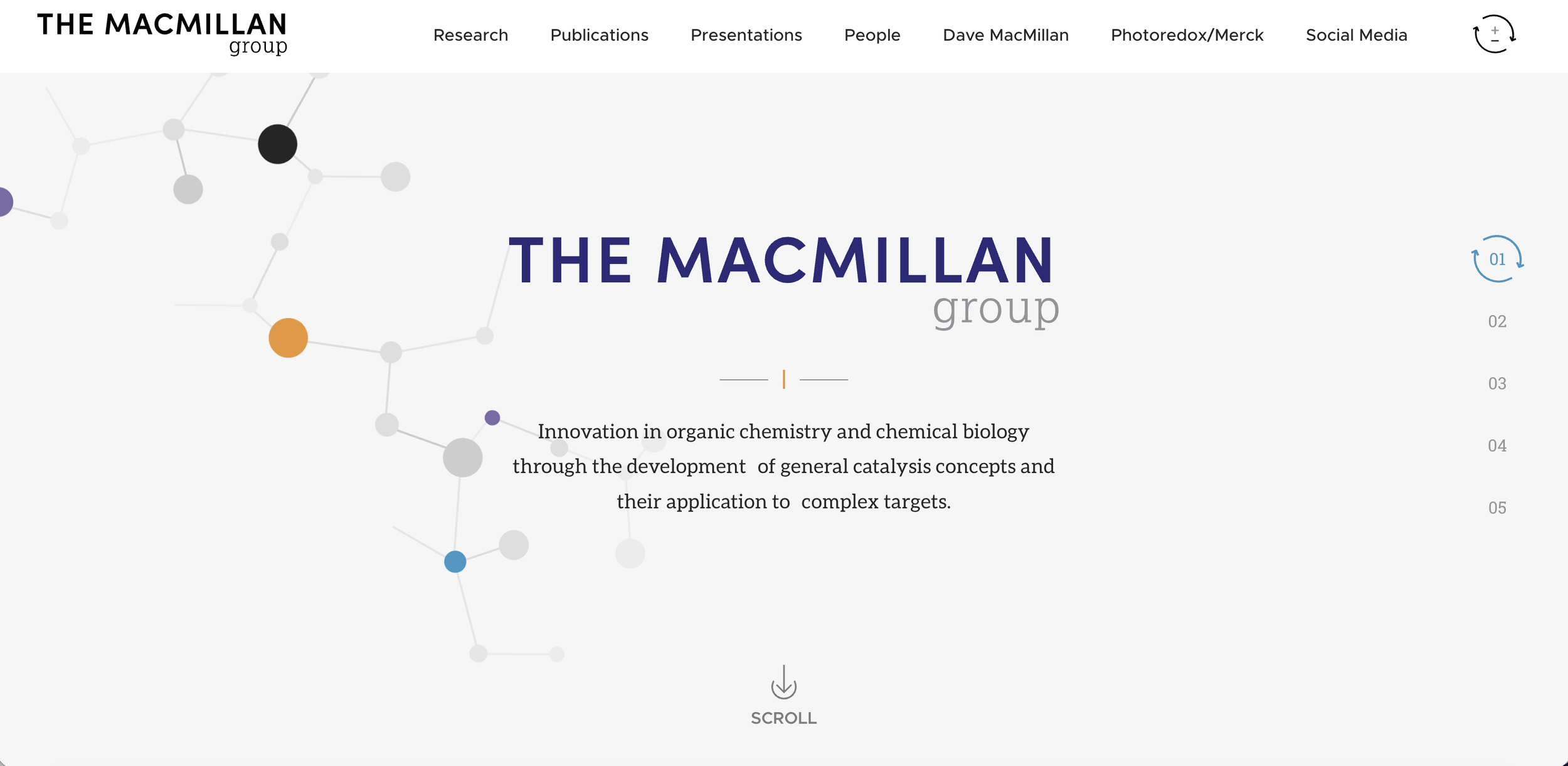
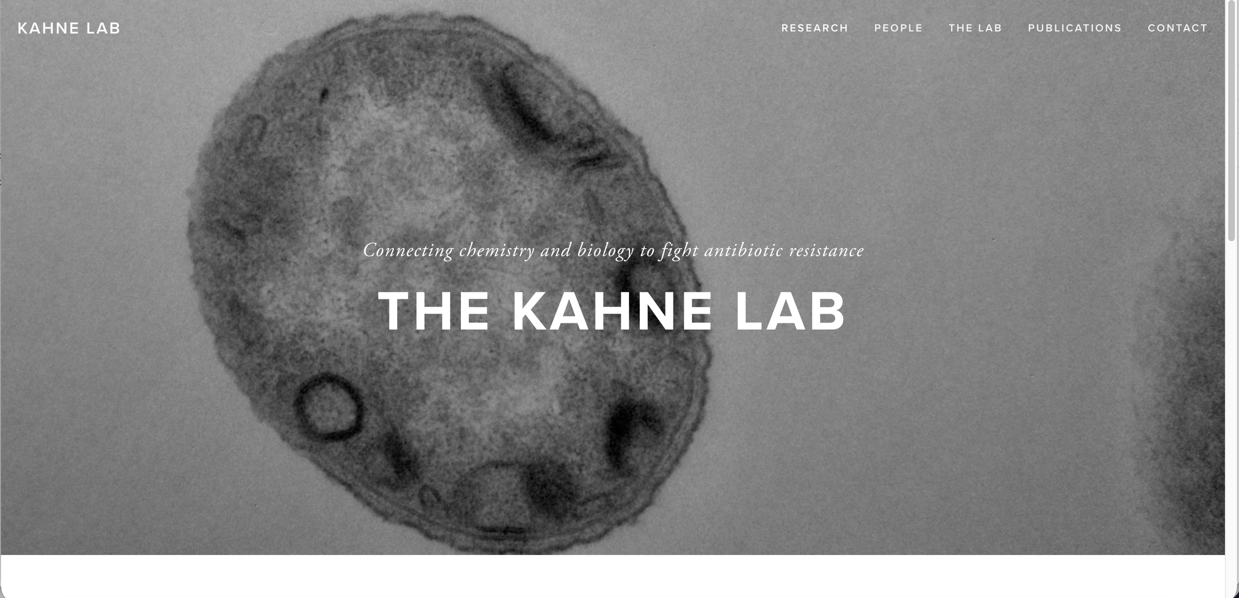
Documentation and analysis of other lab websites
Screenshots of other lab website landing pages
Visual Design Overhaul*
*Because the existing site provided a structural foundation to build from, I moved directly into mid-fidelity wireframes rather than starting from scratch with low fidelity wireframes.
One of the visual guides was a lab member’s drawing of the C—H bond that the Yu Lab is known for. I noticed that in all of the lab’s chemistry visuals, bright red and bright blue were used. I then applied those colors to the C-B bond drawing, and that became the new face of the lab website.
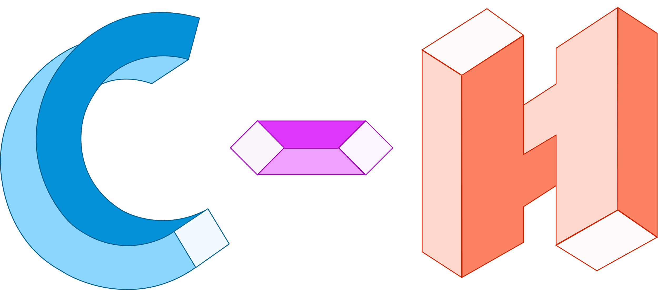
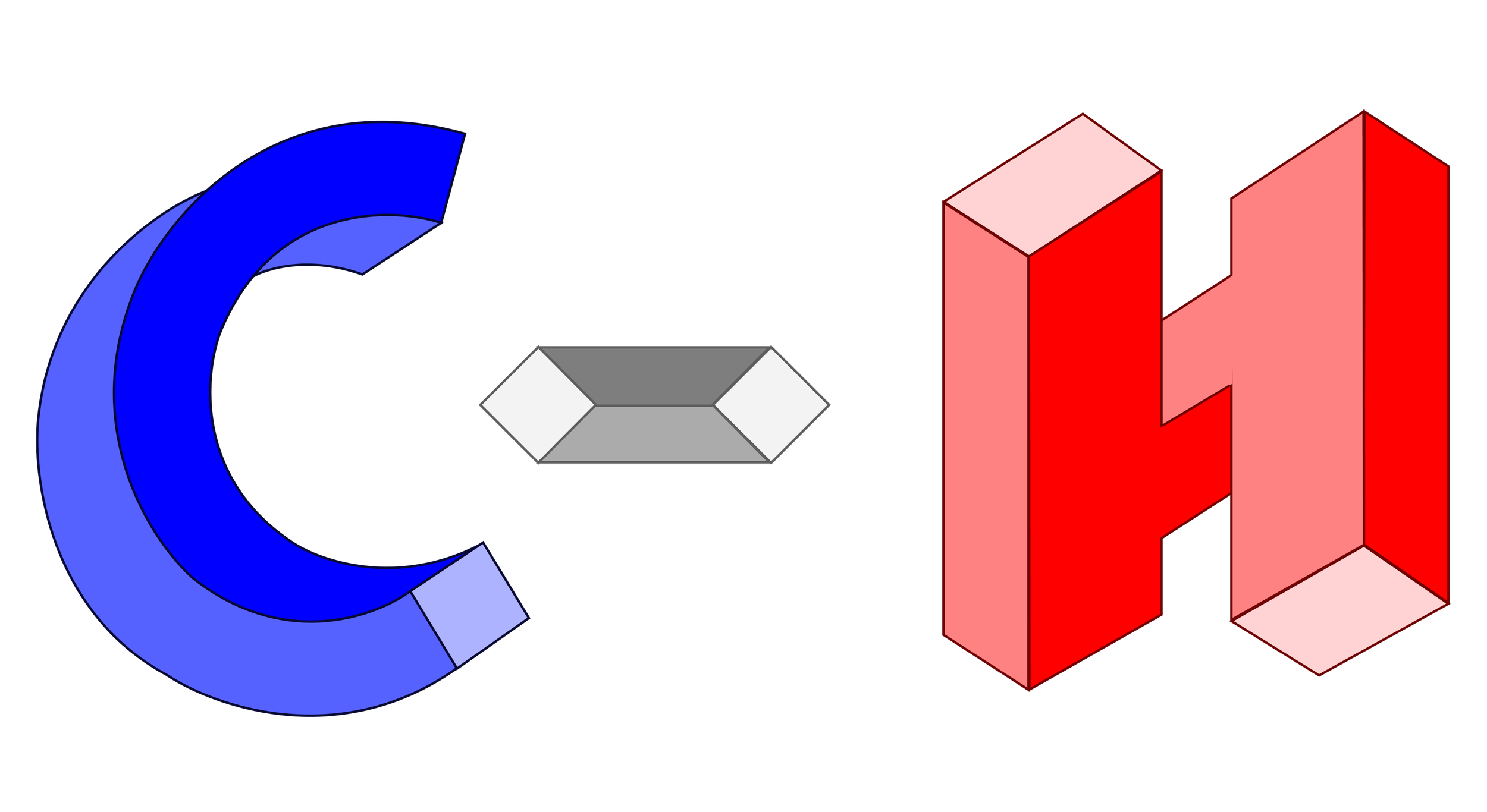
Lab member Yukun Lin’s drawing of the C—H bond
New color palette reflecting the colors most commonly used in Yu Lab research visuals
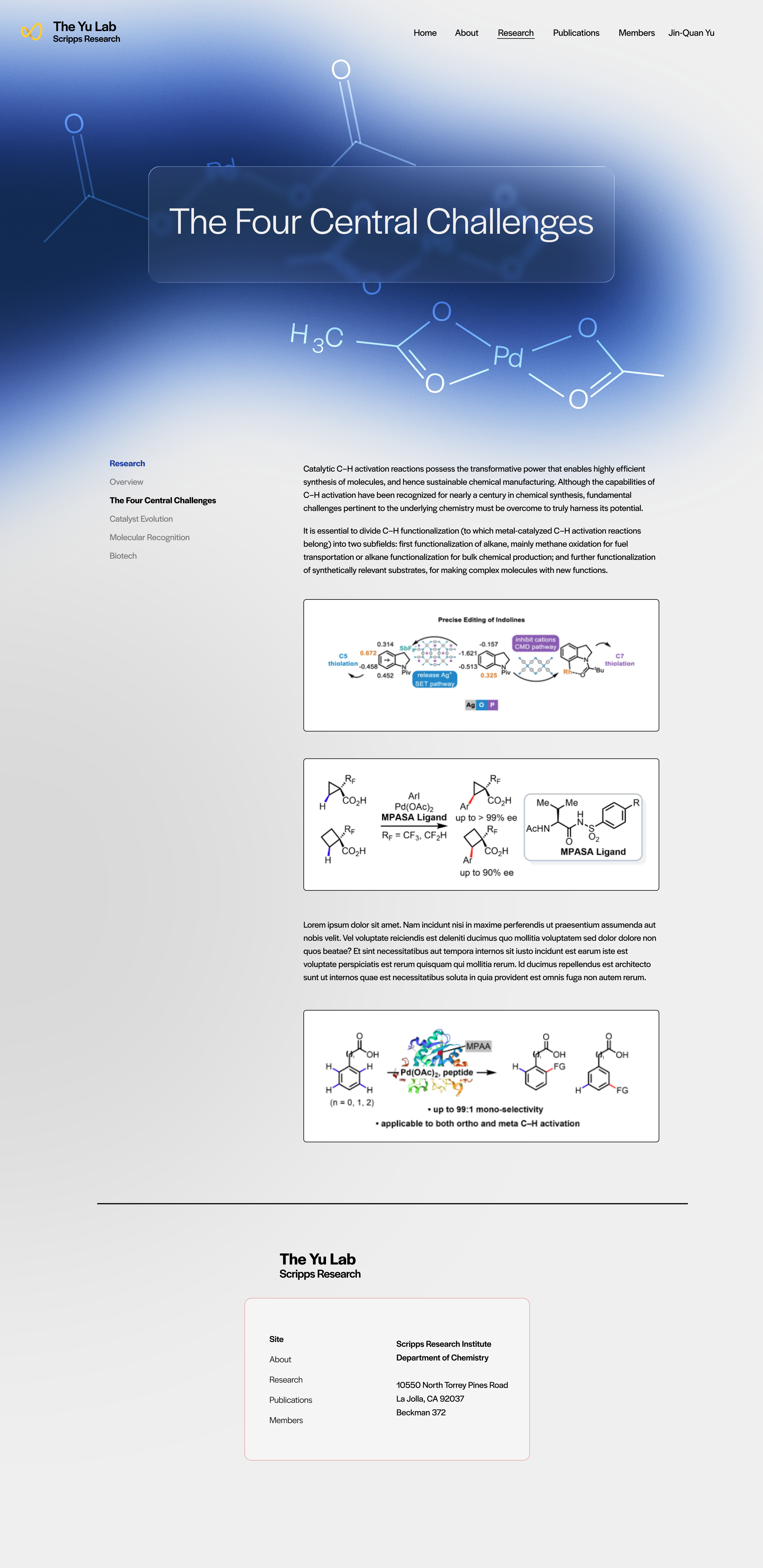
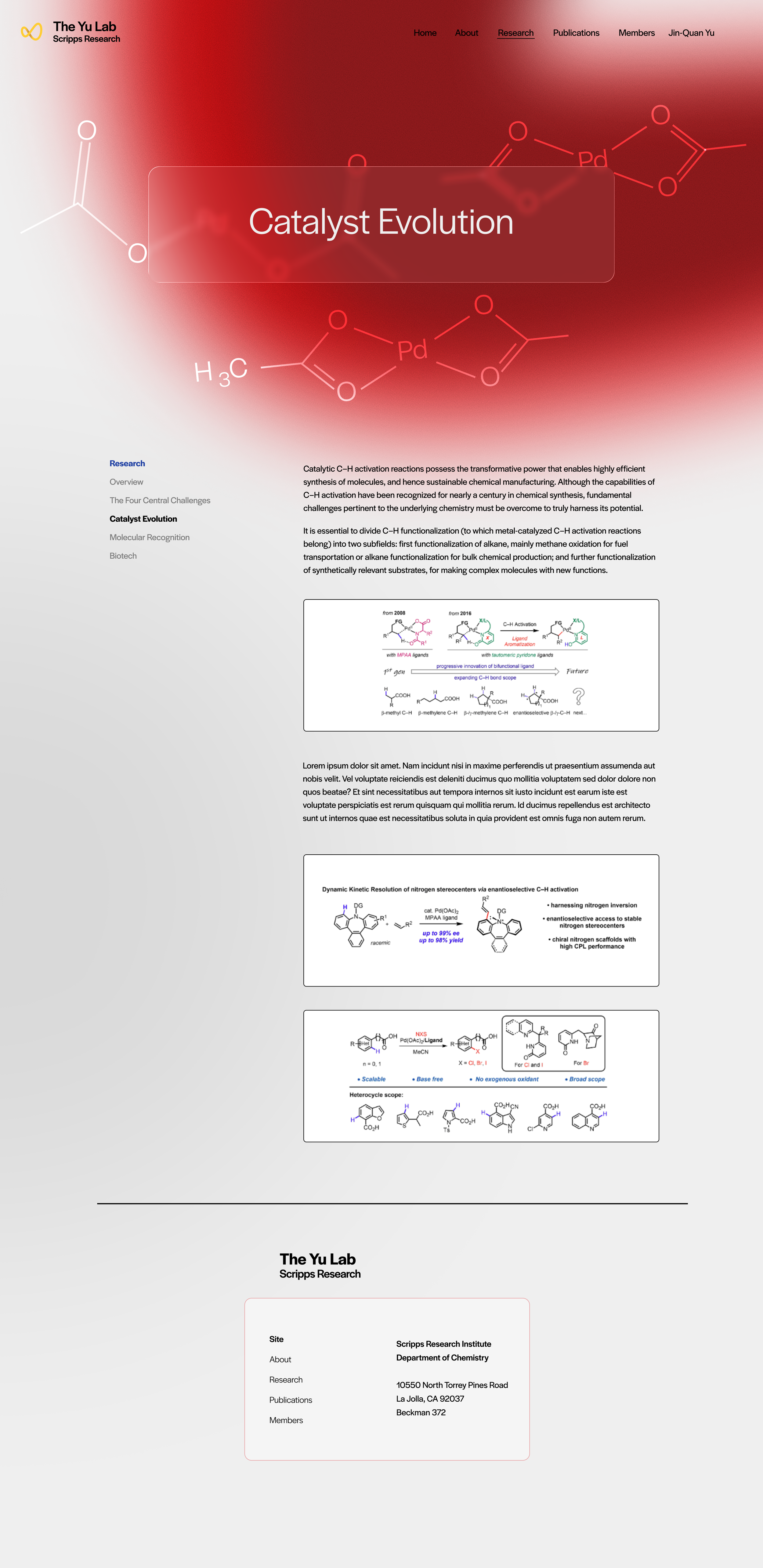
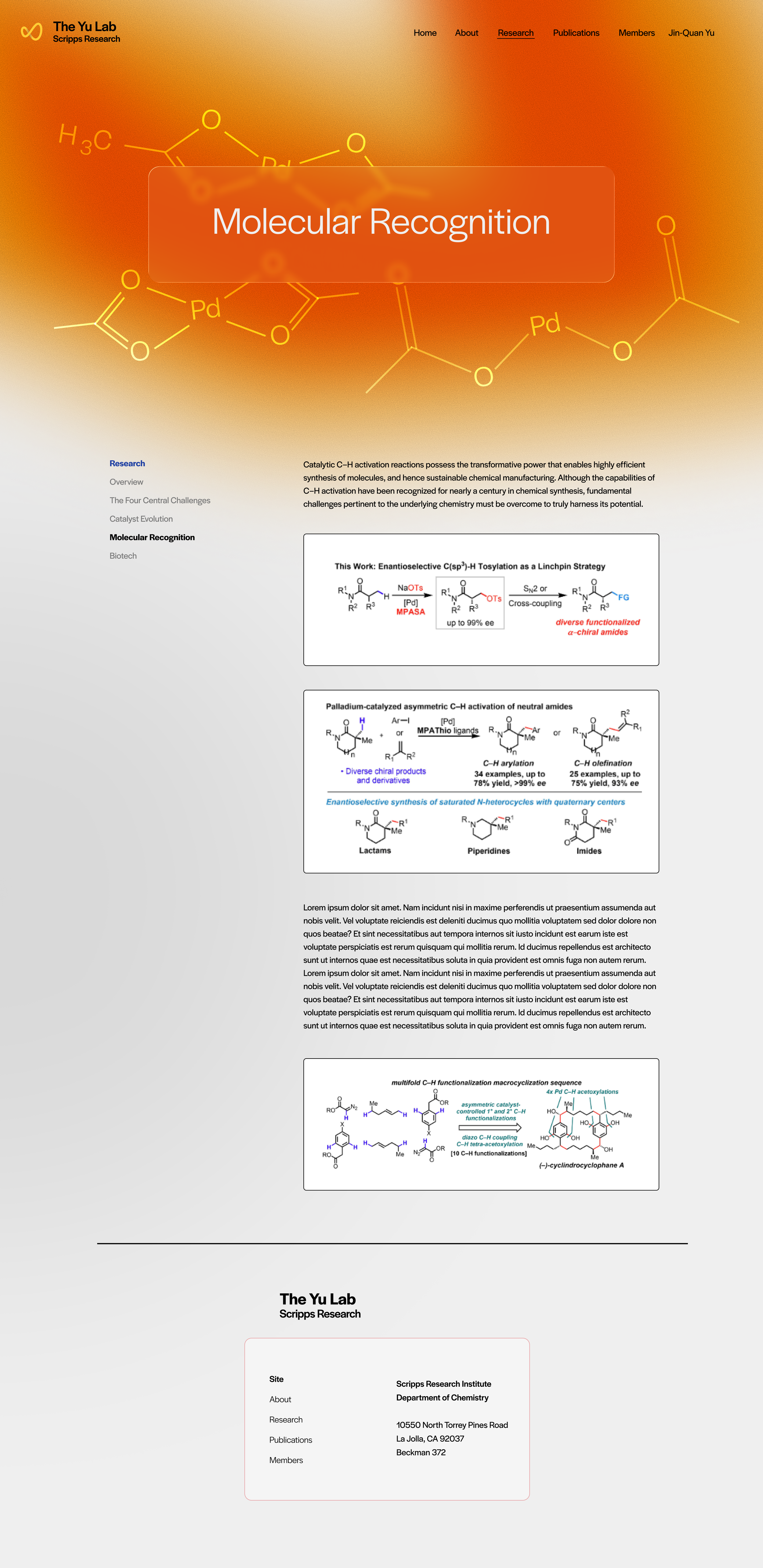
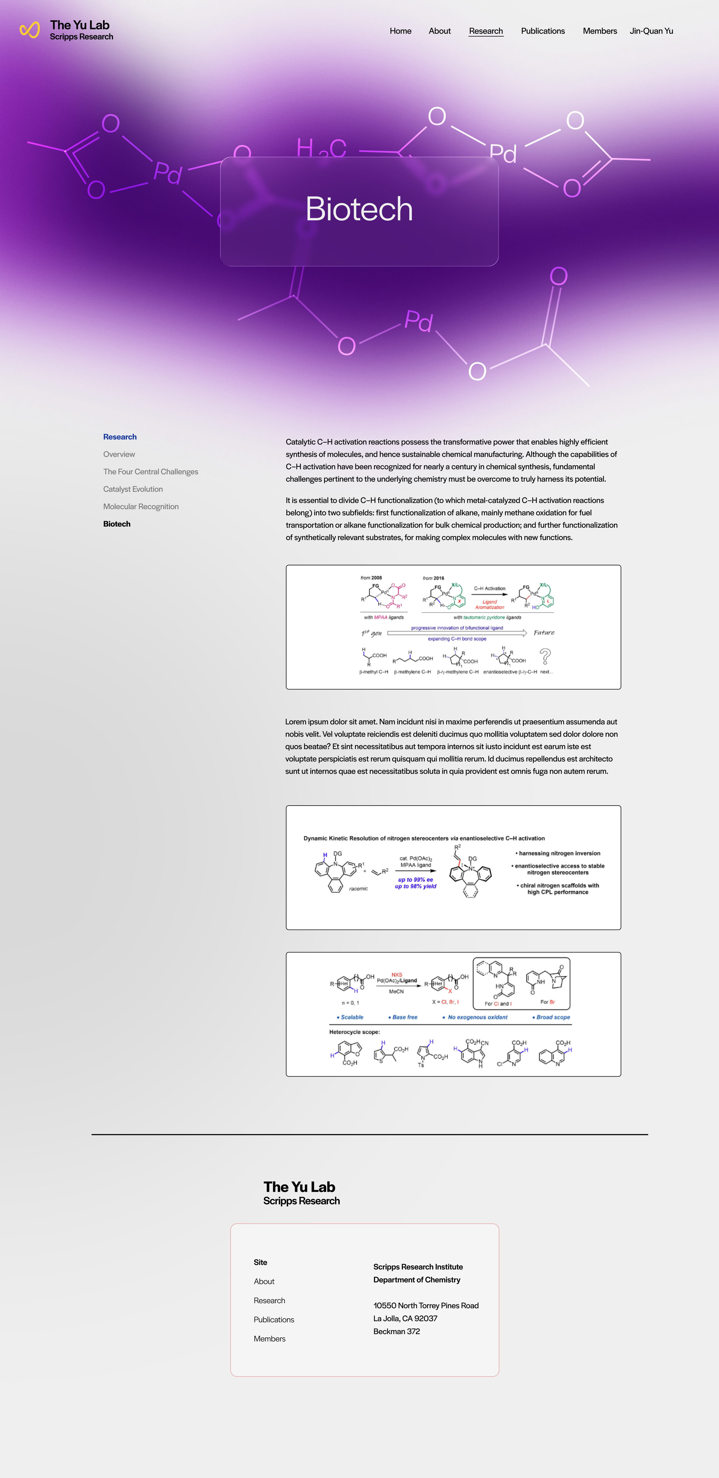
From Outdated to Intuitive: The Research Pages
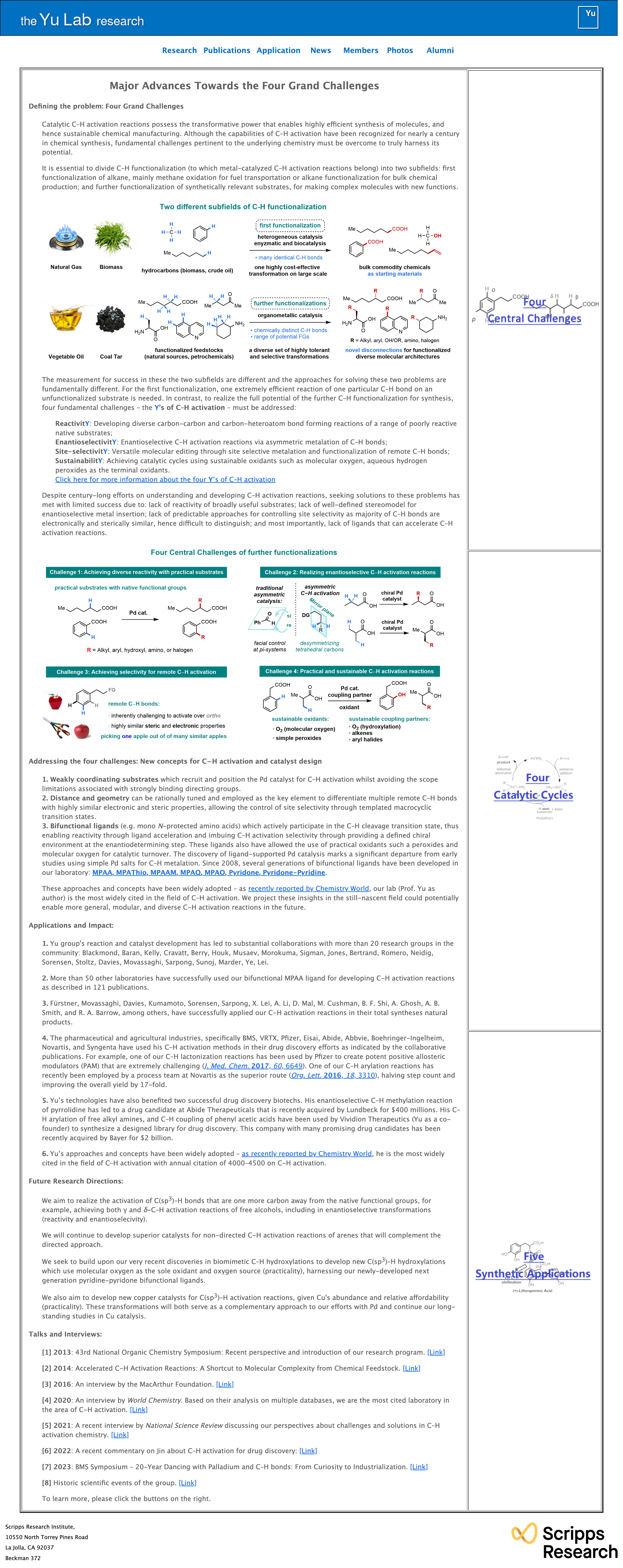
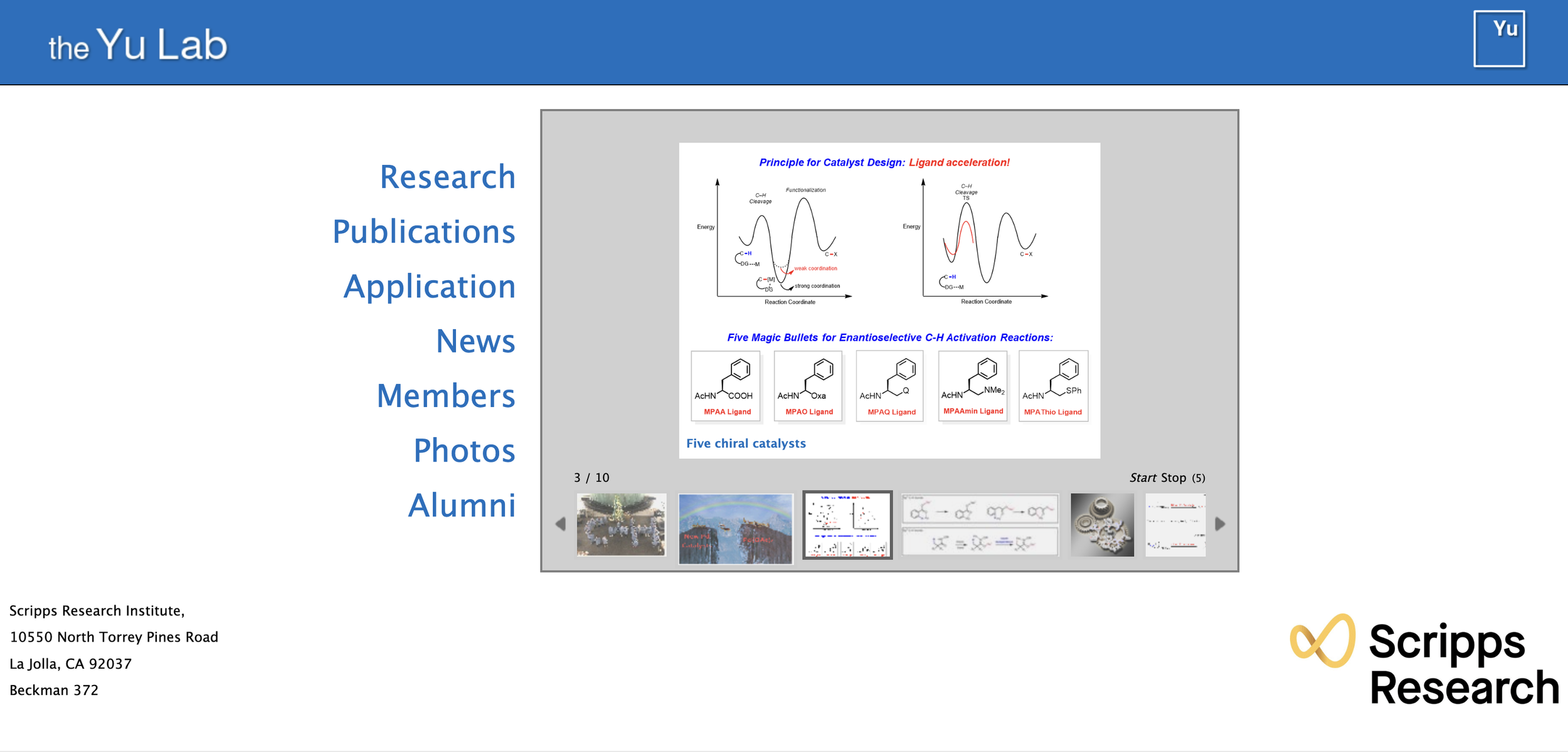
The research page is arguably the most important page of any lab website. It communicates the lab’s scientific identity and pursuits. But the original Yu Lab research page had dense walls of paragraphs, occasional schemes here and there, with no visual hierarchy, no clear sectioning.
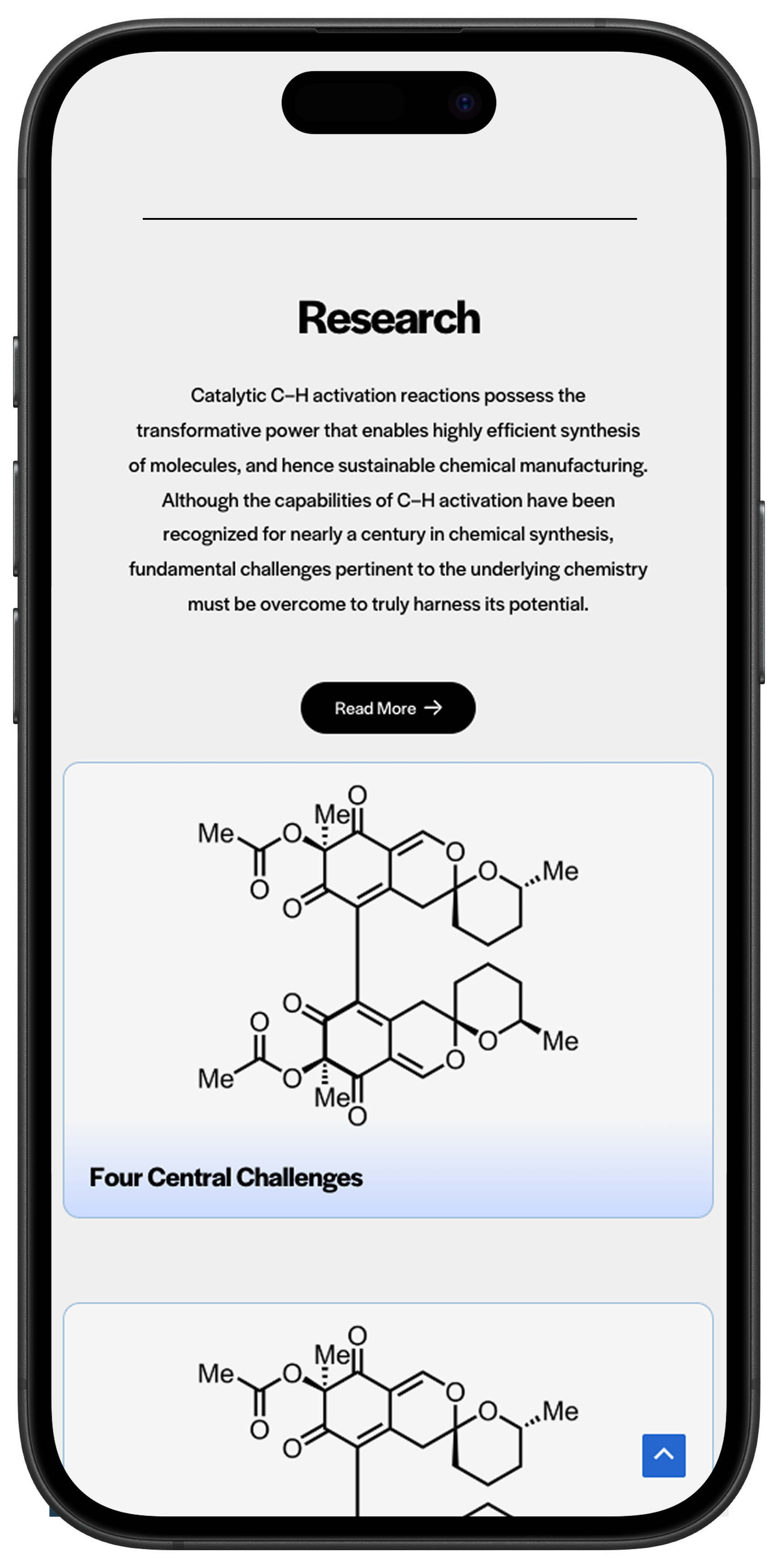
My solution was to implement a sticky side navigation menu that breaks the research content into clearly labeled subsections. Instead of scrolling through a sea of text, visitors now can immediately see the structure of the research at a glance and jump directly to what interests them. The content didn’t change, but now the presentation finally does it justice.
Old Yu Lab research page
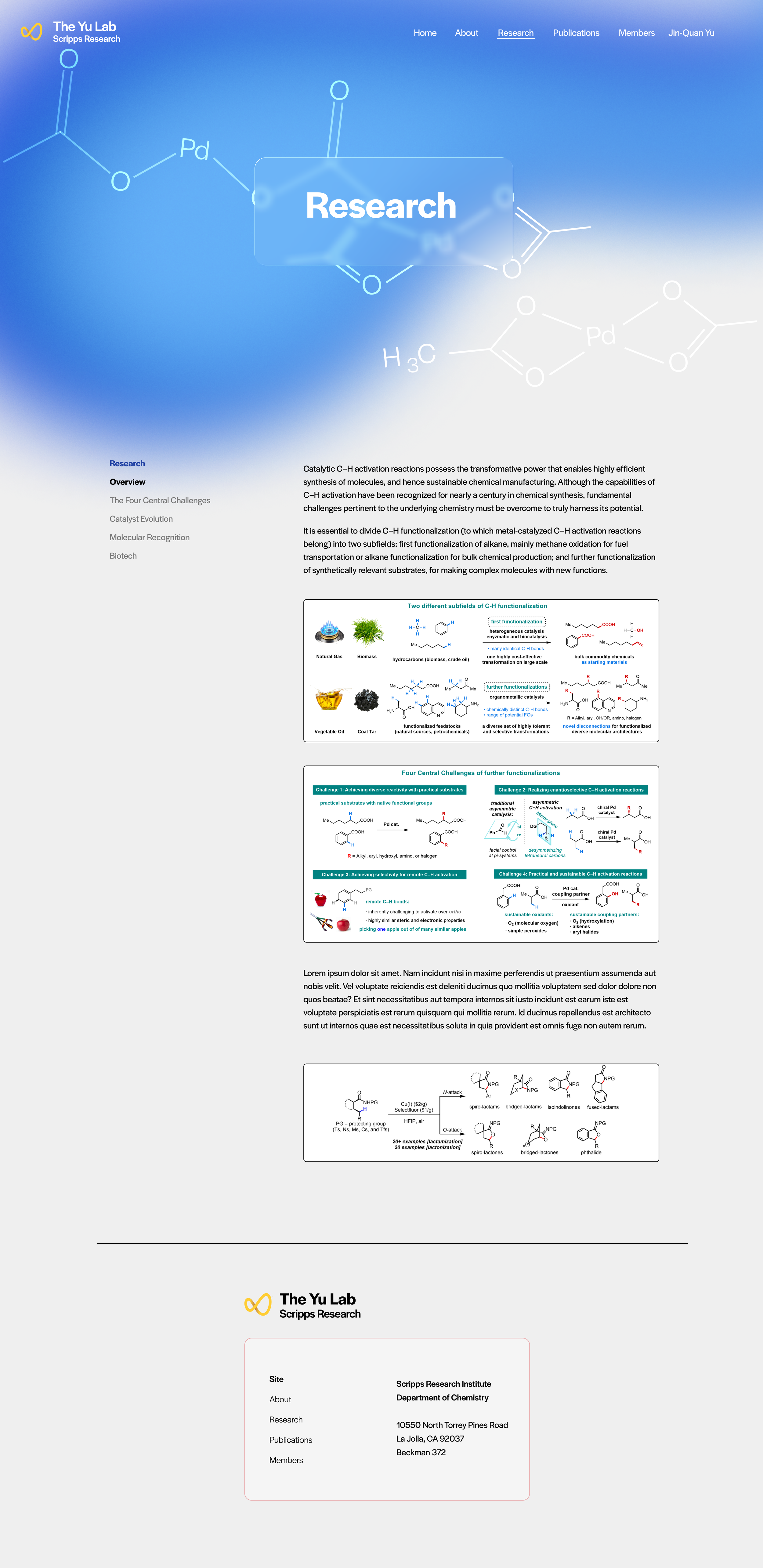
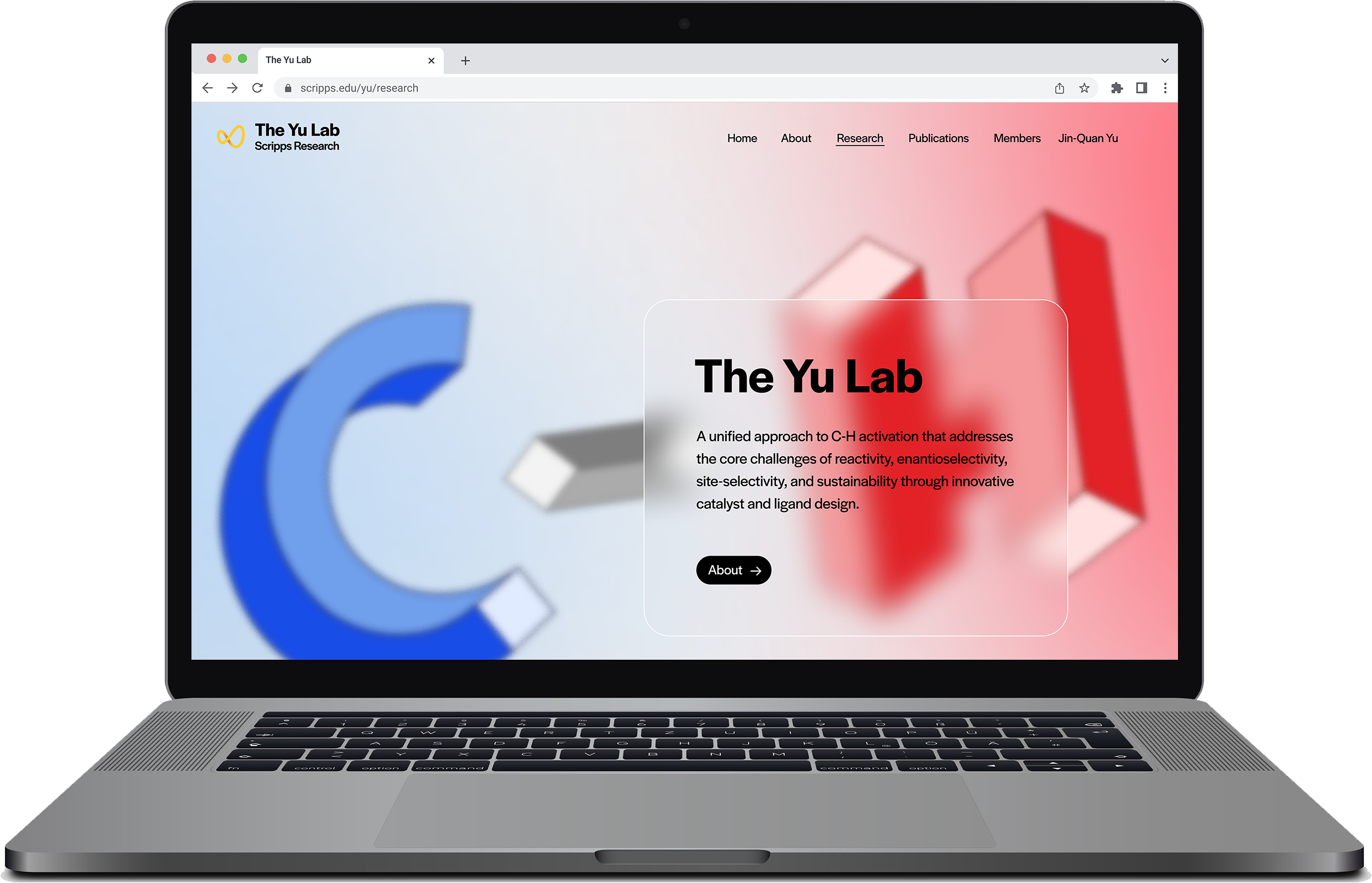
Redesigned Yu Lab research page
Final Designs: Research Pages
Representing the People: The Members Page
The members page of a lab website serves an important social function. It’s how prospective students get a sense of the people behind the lab. The original Yu Lab members page failed at this almost entirely. At the top of the page was an auto-advancing carousel of photos of members that were at inconsistent zoom levels and angles, running in no particular order. Further down the page was a plain list of names of members, their raw email URLs, and their undergrad institutions. There was no visual connections between a name on the list and a face in the carousel, and it forced users to scroll back and forth to make that match themselves.
Old Yu Lab members page
My redesign centered on the goal of humanizing the lab. Each member now has a circular profile photo displayed at a consistent zoom level. Shoulders are visible, face clearly readable, uniform across every single card. This was to make the page feel cohesive and professional. The members’ names, university names, and year of study are directly beneath each photo, and the email URL was replaced by a clean email button. For graduate students, I added their current year in the program so users don’t have to do the mental math of calculating how long someone has been at Scripps.
Redesigned Yu Lab members page
The biggest structural change was the introduction of a tabbed navigation system at the top of the page. Current members, alumni, and the photo gallery are all now accessible within the same page by simply clicking a tab. What was previously buried in the main navigation is now intuitive, immediate, and contained.
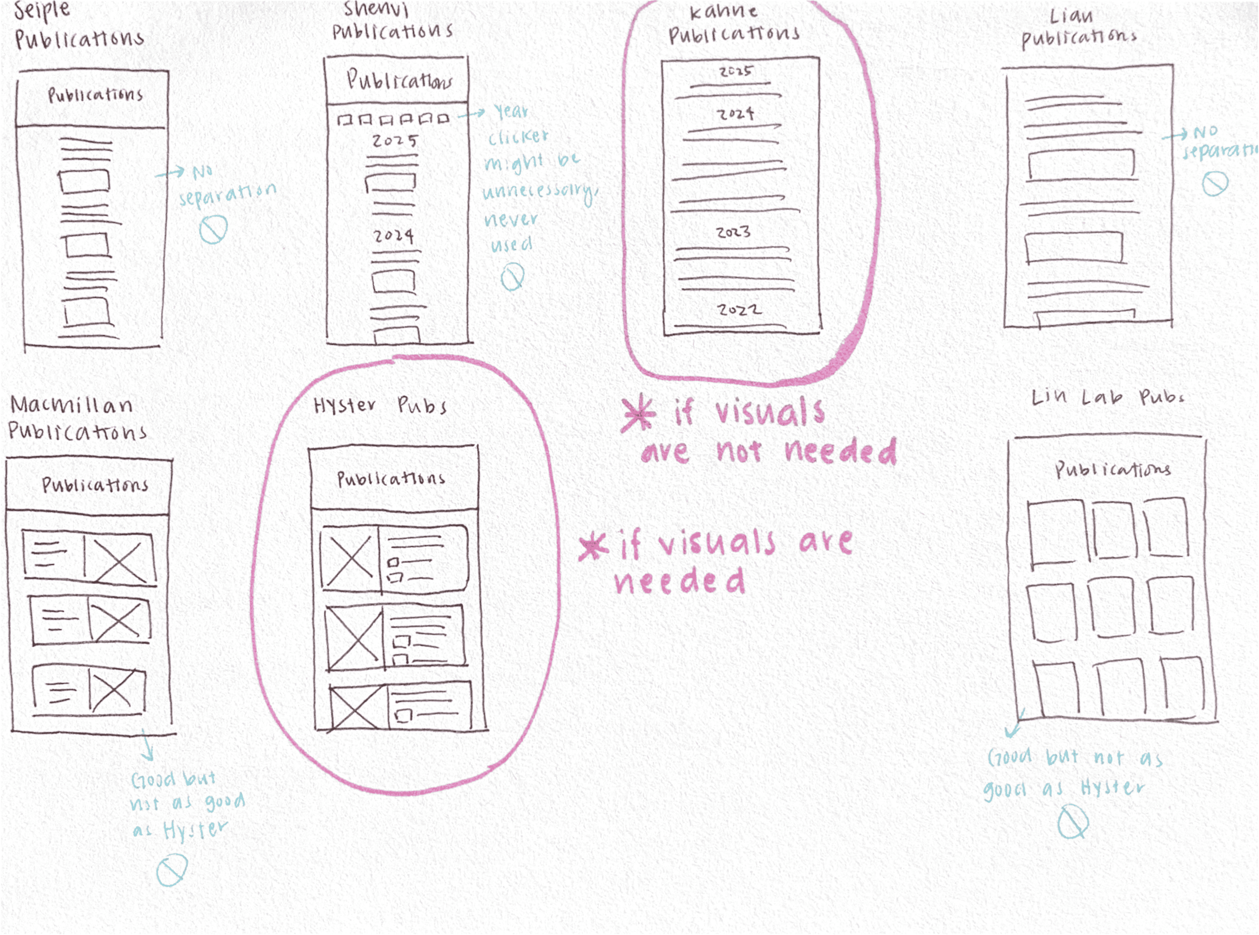
The Archive of the Lab: The Publications Page
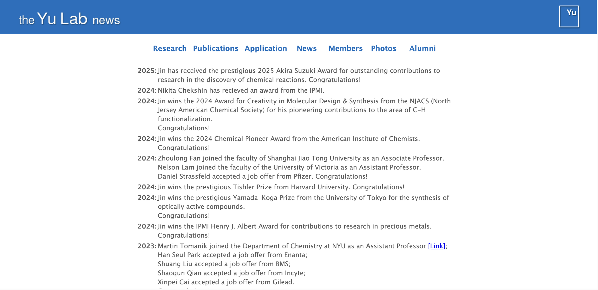
A lab’s publications page contains all of its published history in journals and scientific papers. It’s where decades of research goes, and for a lab as prolific as the Yu Lab, that is an enormous amount of content to navigate. The original publications page was not very good at helping the user find anything. It was an unbroken scroll of citation text and chemical schemes. The one navigation that did exist was a year sidebar that did not stay fixed, but rather it bounced and followed the user down the page on every scroll. Needless to say, that page needed to be fixed.
Old Yu Lab publication page
My redesign approached the publications page as an archive. I designed a clean dropdown year selector and search bar to sit together in a contained and unobtrusive module at the top of the page. There, a user has everything they need to find a specific publication. I made large year headers to give clear visual landmarks as you scroll, and a thin line between each entry to give every publication breathing room. I contained chemical schemes into cards to reinforce the visual identity of the website and help the page feel intentionally designed.
Redesigned Yu Lab publications page
Final Design: Home Page
Takeaway
The Yu Lab project taught me that good UX isn’t always about building something from scratch. Sometimes, it’s about looking at something that already exists, understanding why it isn’t working, and utilizing design instincts to fix it thoughtfully. Working with scientists also sharpened my ability to take feedback from people who aren’t designers, and translate their needs into design decisions. I was given many opportunities to think in systems, and collaborate outside of my discipline.
This project is currently in development and will be live soon. But the process and work behind it are complete!