Save Our Sharks
Save Our Sharks is a semester-long campaign project consisting of a brand identity, a website, business cards, letterheads, a brand collaboration, an album cover, a receipt design, a vinyl wall sticker, and an experiential stand. I was given the task to create a campaign centering around a social issue — so I decided on the issue of shark-derived ingredients ending up in some of the daily cosmetic products that we use. This campaign serves to spread awareness and ignite action from those of us who may be unknowingly using shark products.
❋ Role
❋ Timeline
Graphic Designer
5 months
❋ Skills
❋ Tools Used
Figma
Adobe Photoshop
Adobe InDesign
Campaign Design
Brand Systems
Branding
The very first thing to figure out about designing the campaign was the branding. The typography, the color palette, and the visual elements. The ocean theme gave me the liberty to use a range of blues in all my designed assets. As for the logo and slogan, I aimed for a bold and modern look, to communicate that ‘Save our sharks’ is not just the name of the campaign; it is also a declaration that we must all aim to do.
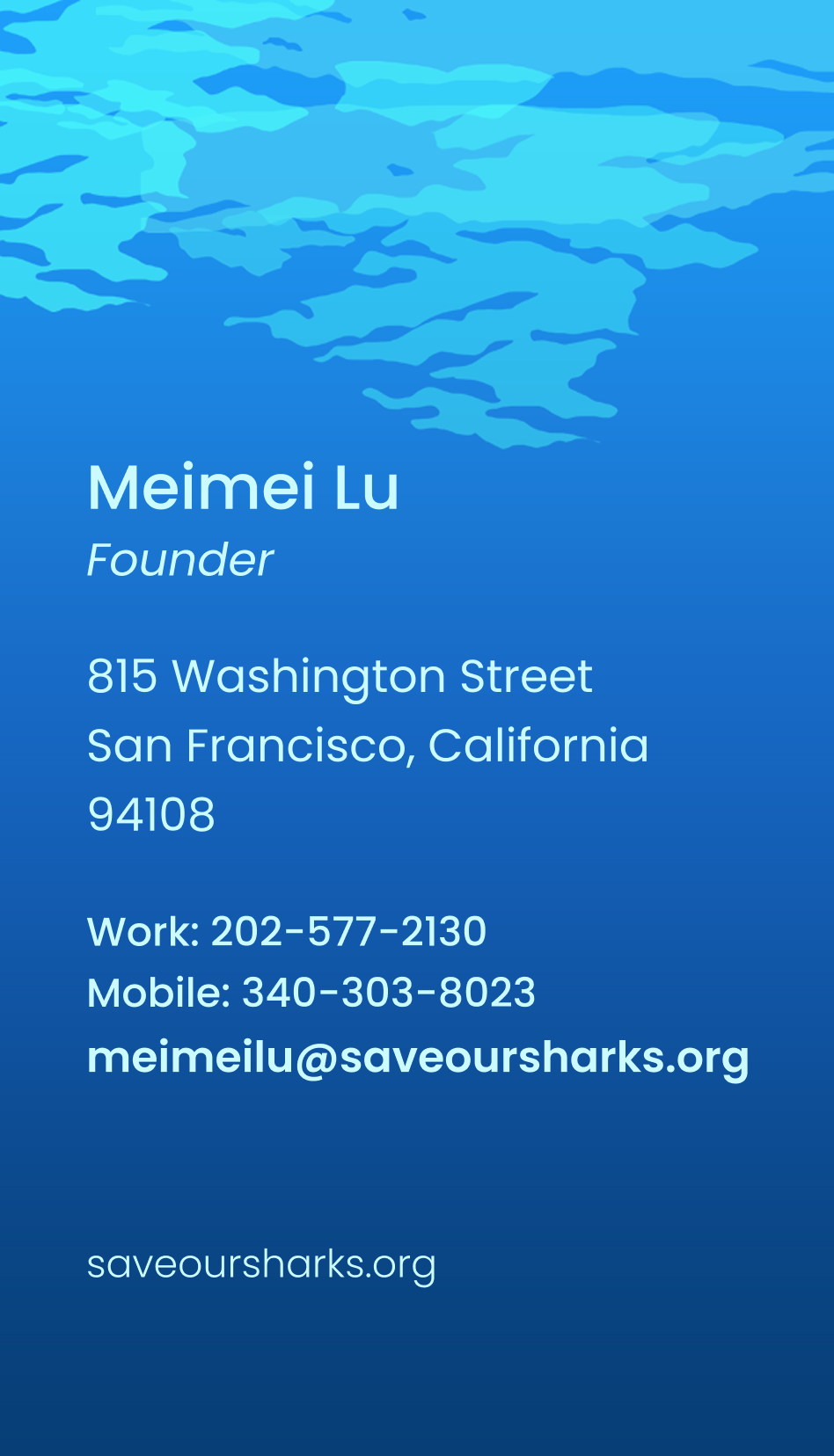
Stationery Suite
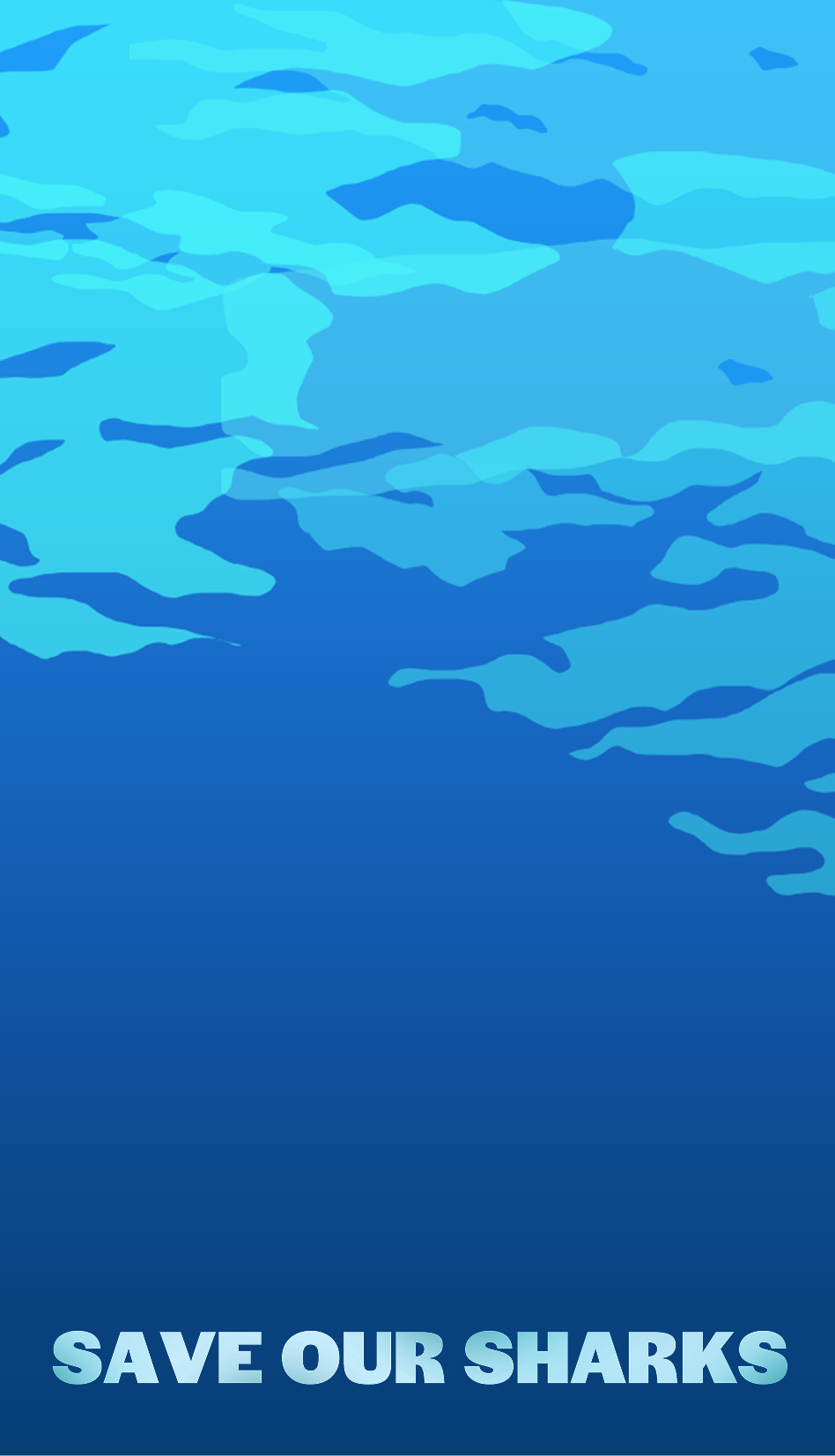
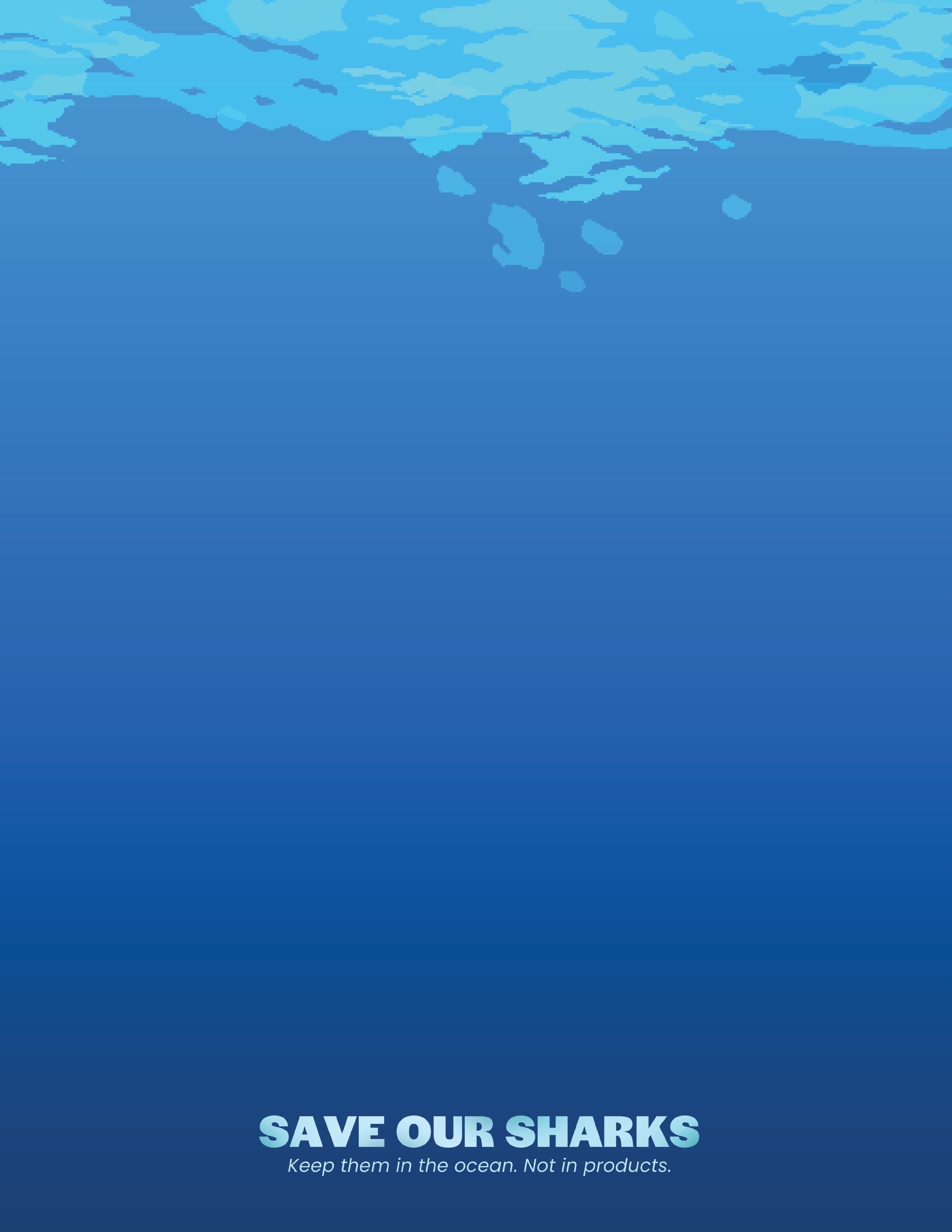
One key visual element present throughout the entire campaign was the use of a gradient that went from light blue to dark blue. It’s very effective in communicating the ocean as a backdrop for almost all of the designed assets.
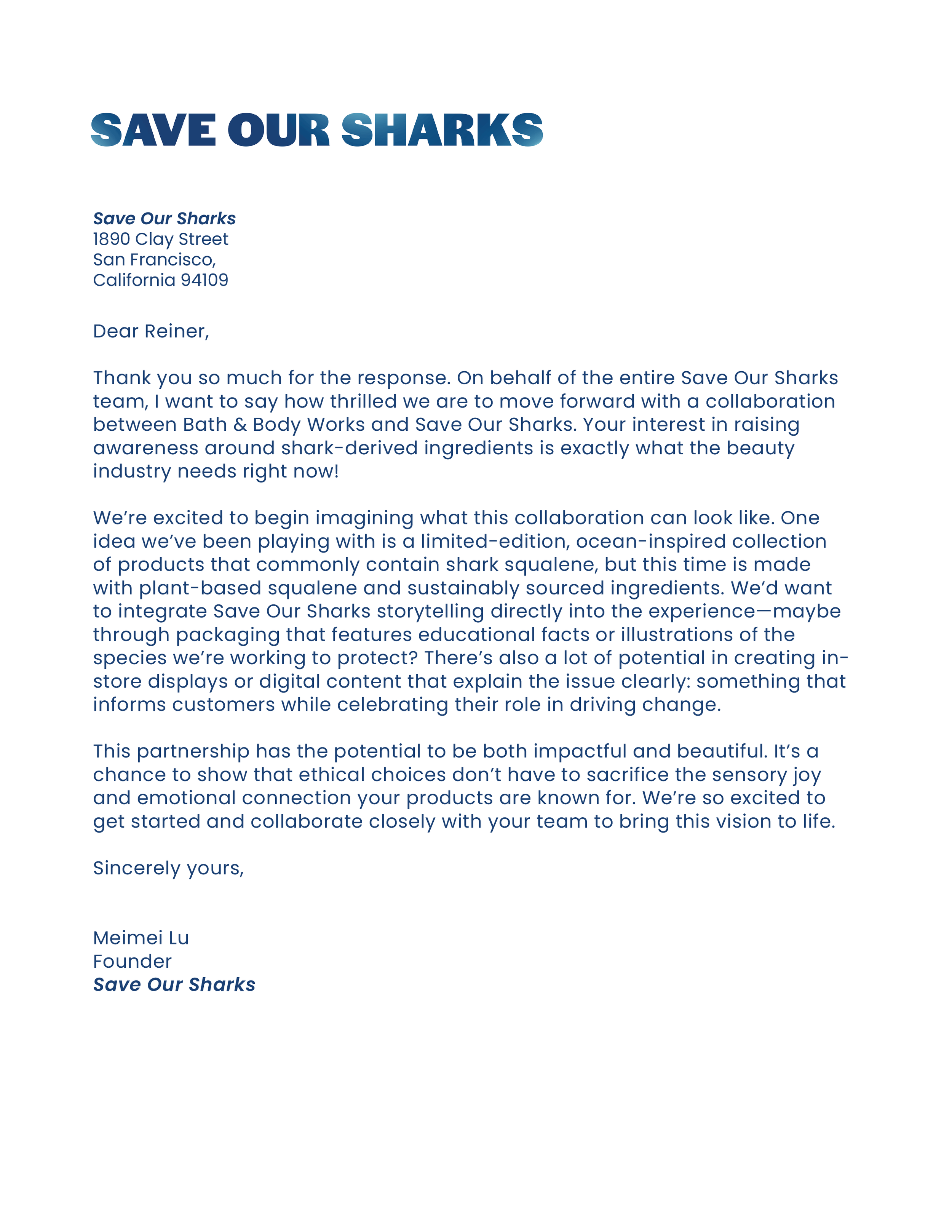
Letterhead
The letterhead follows the same gradient that the business cards do, along with the same neon blue dappled water vector illustration. I felt that hand-illustrating marine life would have changed the tone to become more playful, so instead I made dappled water vector shapes.
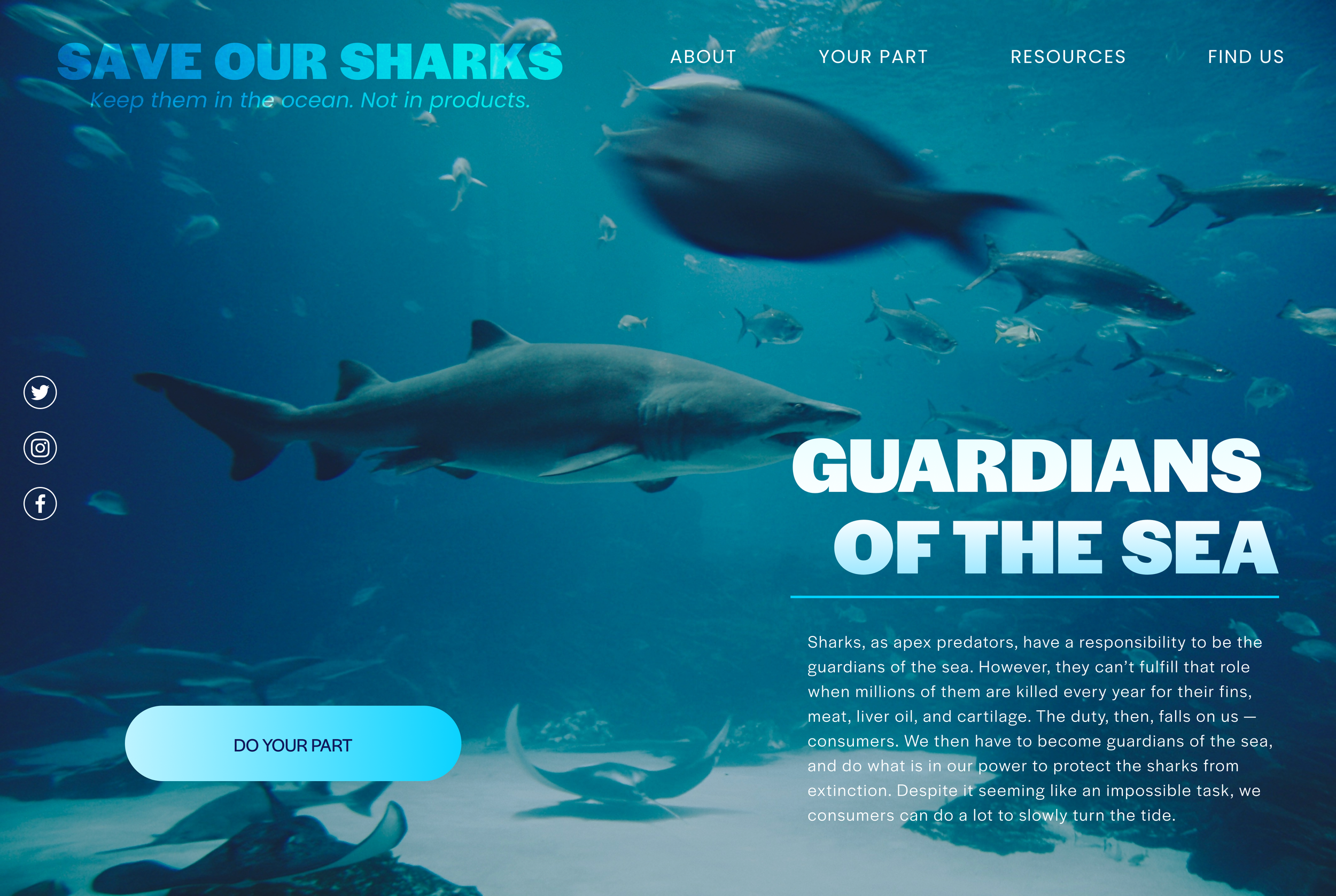
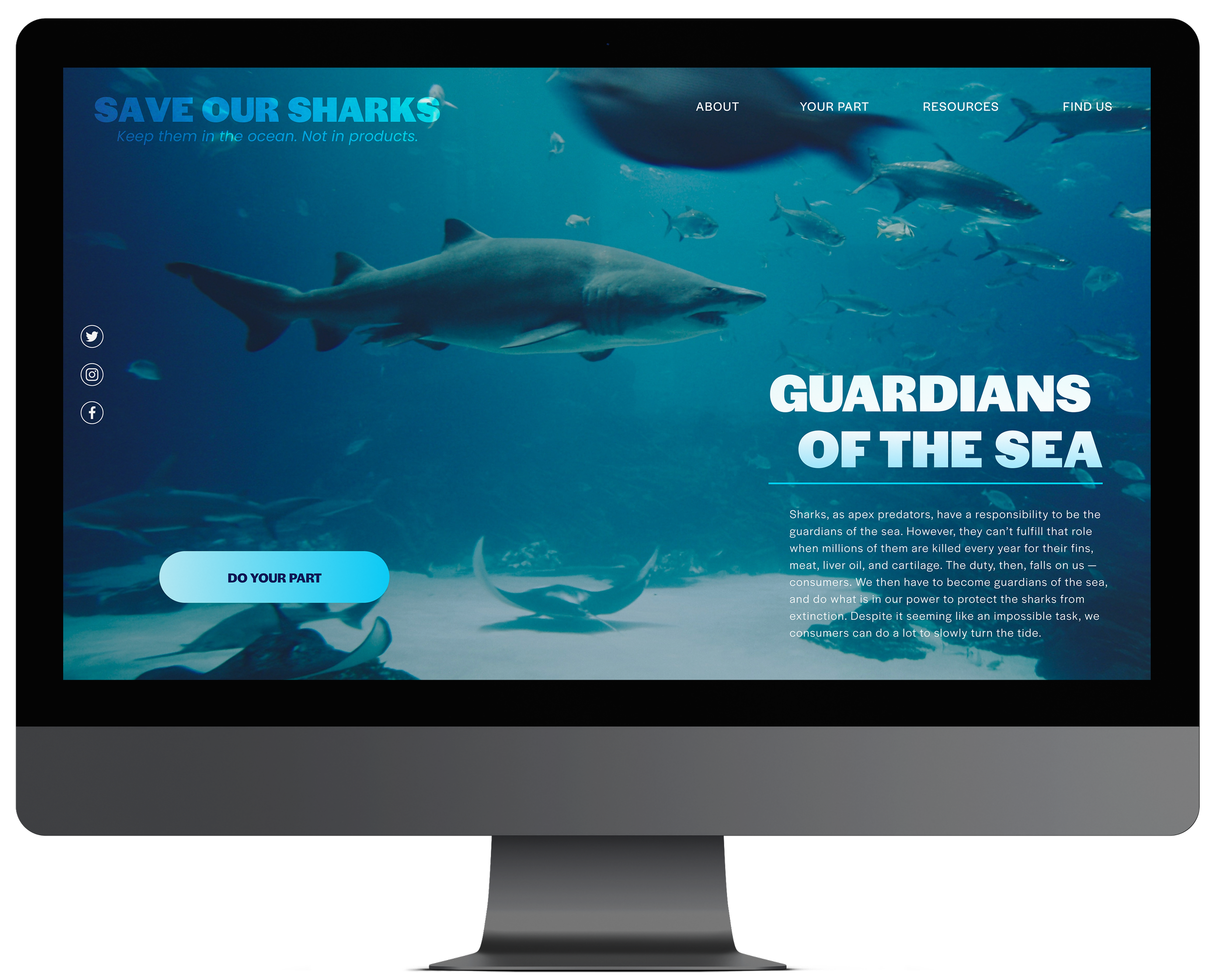
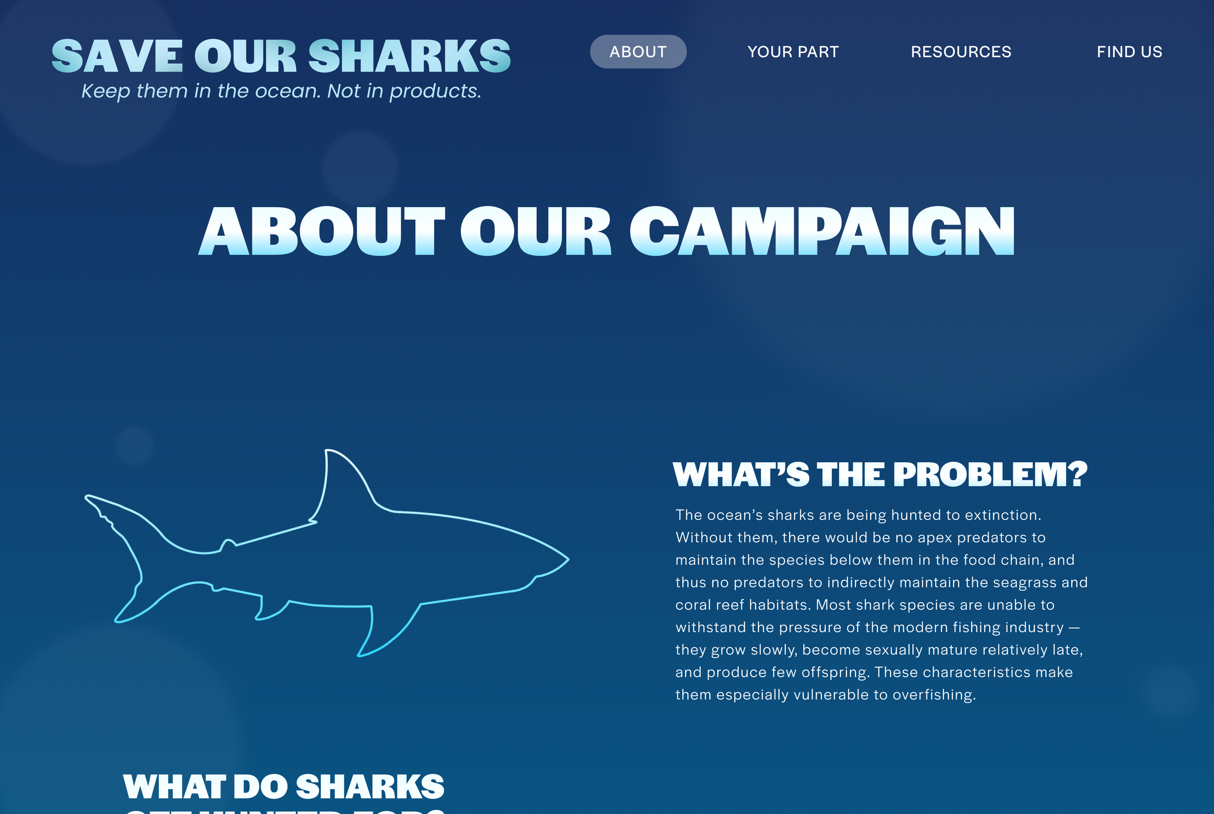
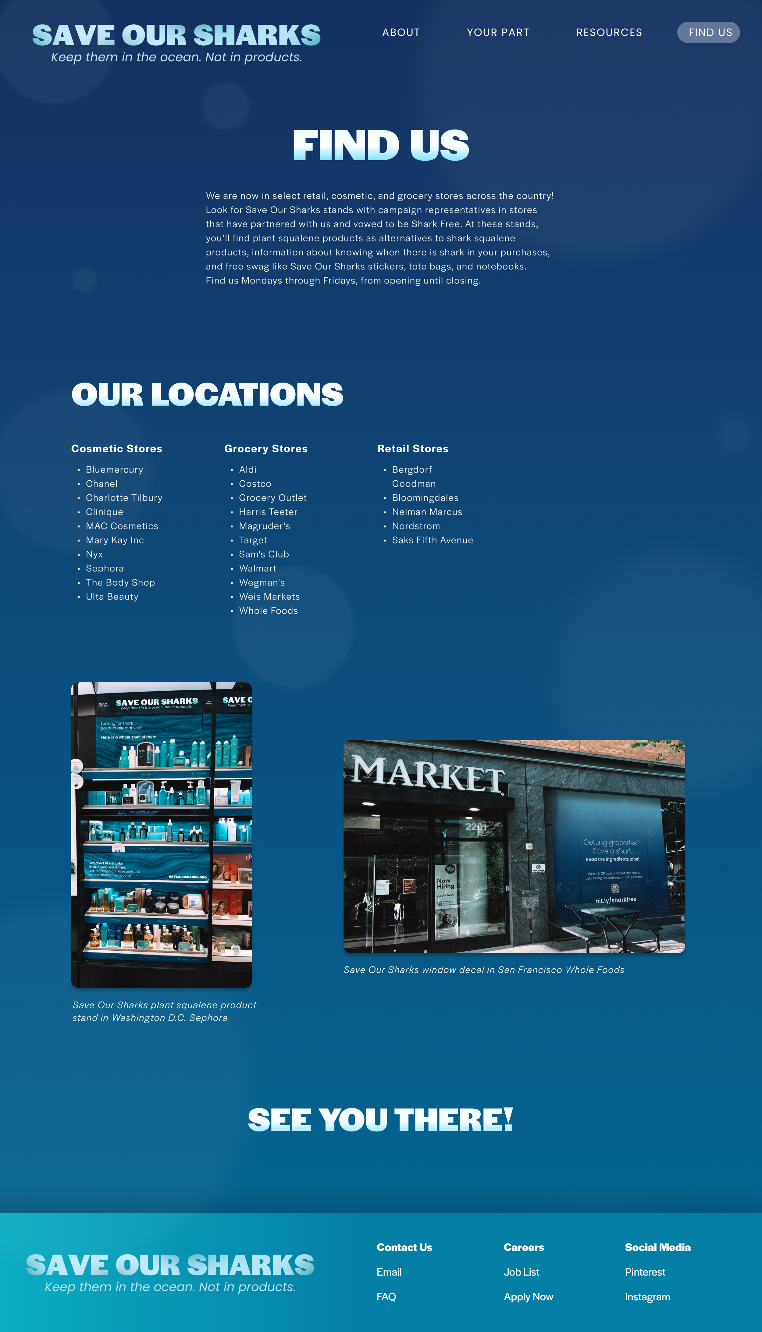
Campaign Website
The Save Our Sharks website serves as the central hub for all the research that went into the campaign. I chose a landing page photo that really captured the vast world that sharks live in, with the hopes of communicating that sharks belong in their kingdom, uninterrupted by humans.
Your Part + resources Page
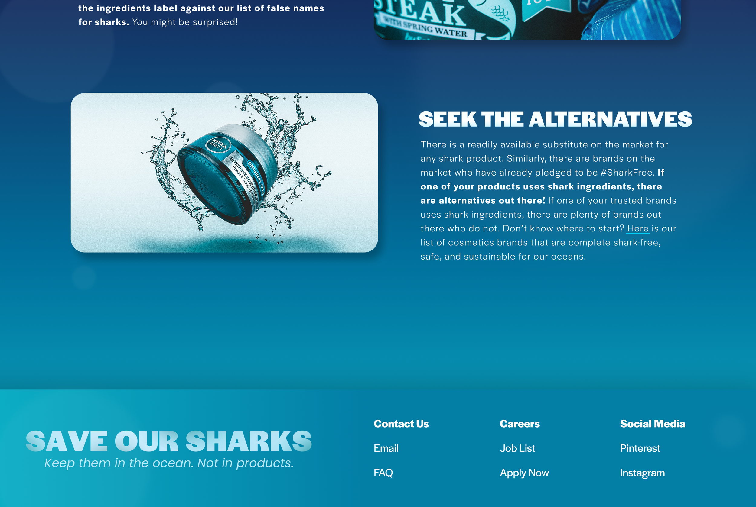
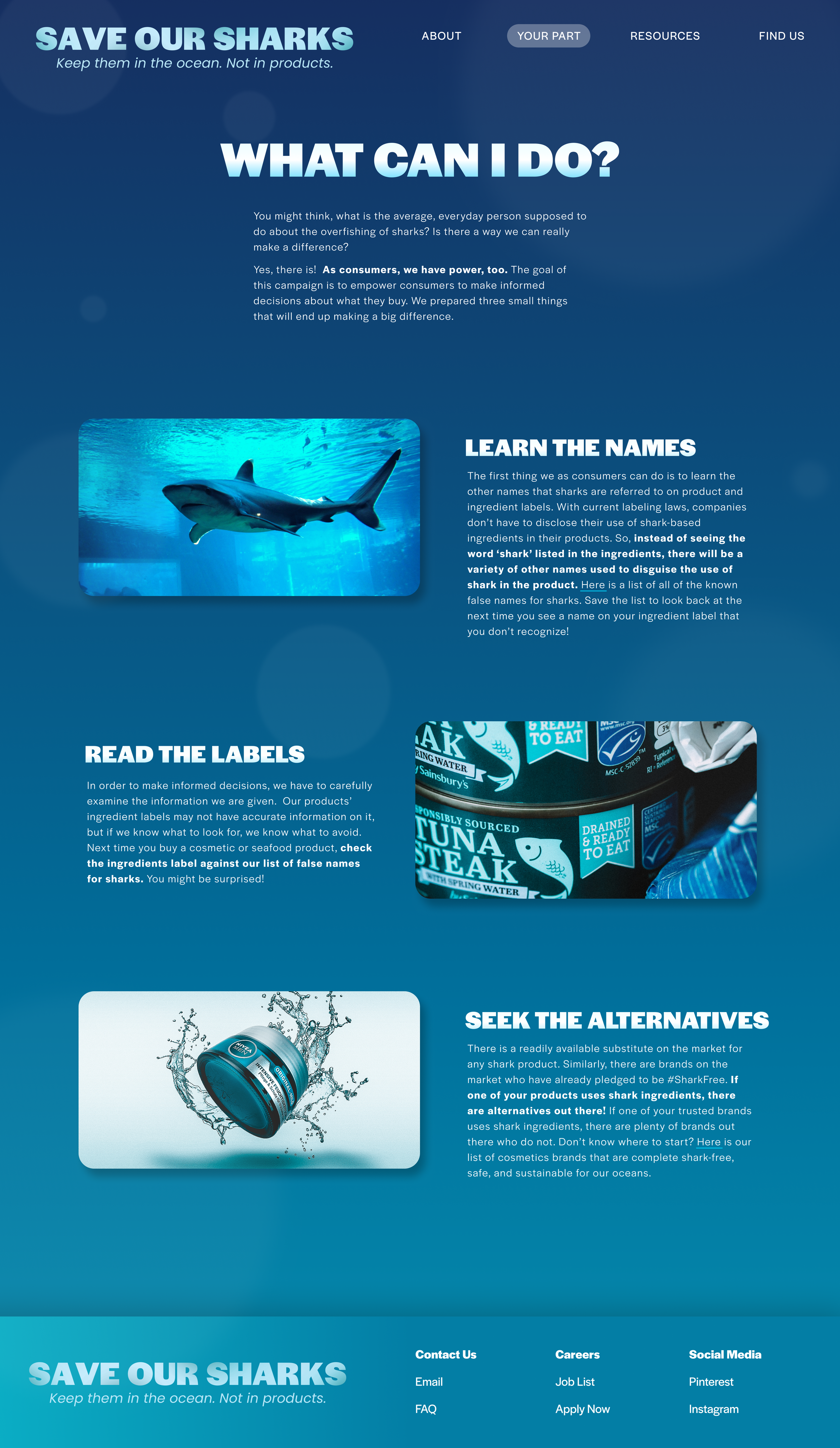
A huge emphasis of the campaign is that everyday people are capable of making a difference. There is a section of the website titled ‘Your Part’, which is where the user learns what it is they can do to live a #SharkFree life. Then, under the ‘Resources’ tab, the user can start getting names of which brands to avoid and which brands have taken the #SharkFree pledge.
About + Find us Page
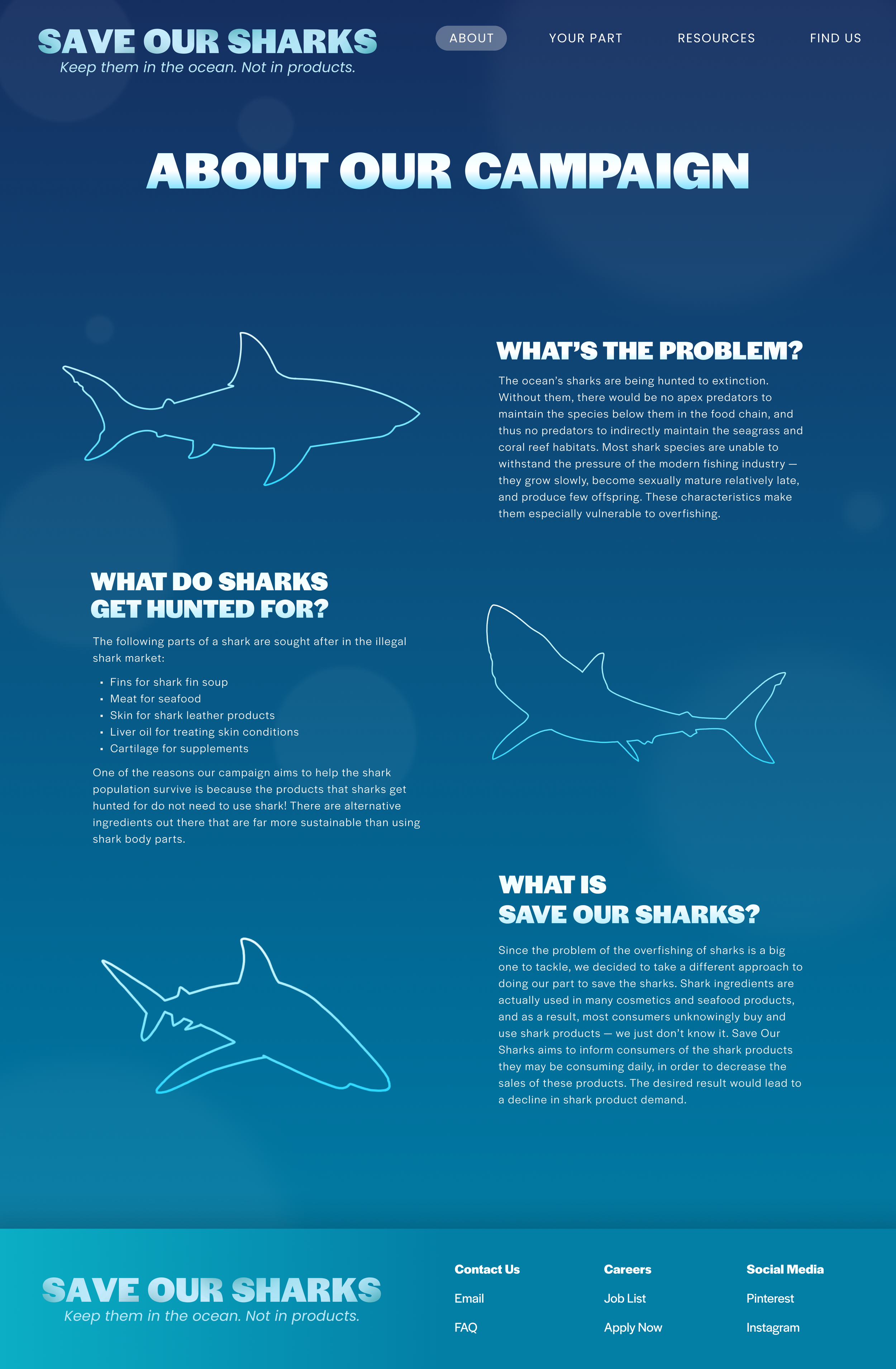
The About Us page details what exactly the issue is: the usage of shark-derived ingredients such as shark squalene in our everyday cosmetic products. Sharks get killed in the millions every year due to the illegal shark trade. That, we have no control over. But we can get informed on which products to avoid so as to not use sharks in the things we purchase.

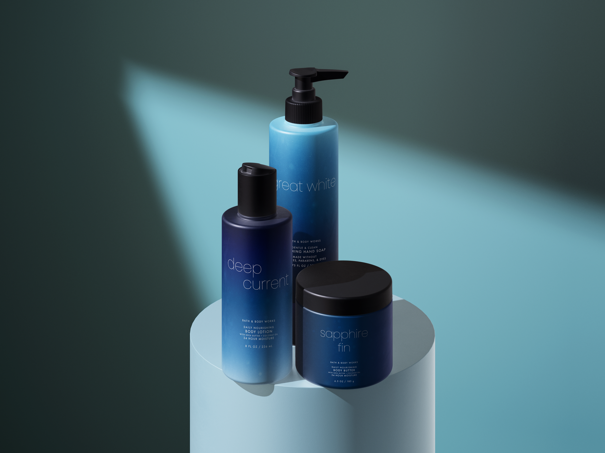
Brand Collaboration
One of the most fun parts of this campaign was choosing what to do for the designed components. I had to think deeply about what would make sense for a campaign about shark conservation and cosmetic products. A soap and beauty product store like Bath and Body Works was the perfect answer. Even if Bath and Body Works were simply to just have a limited edition line that was part of a collaboration between Save Our Sharks, it would make millions of people aware of the campaign.
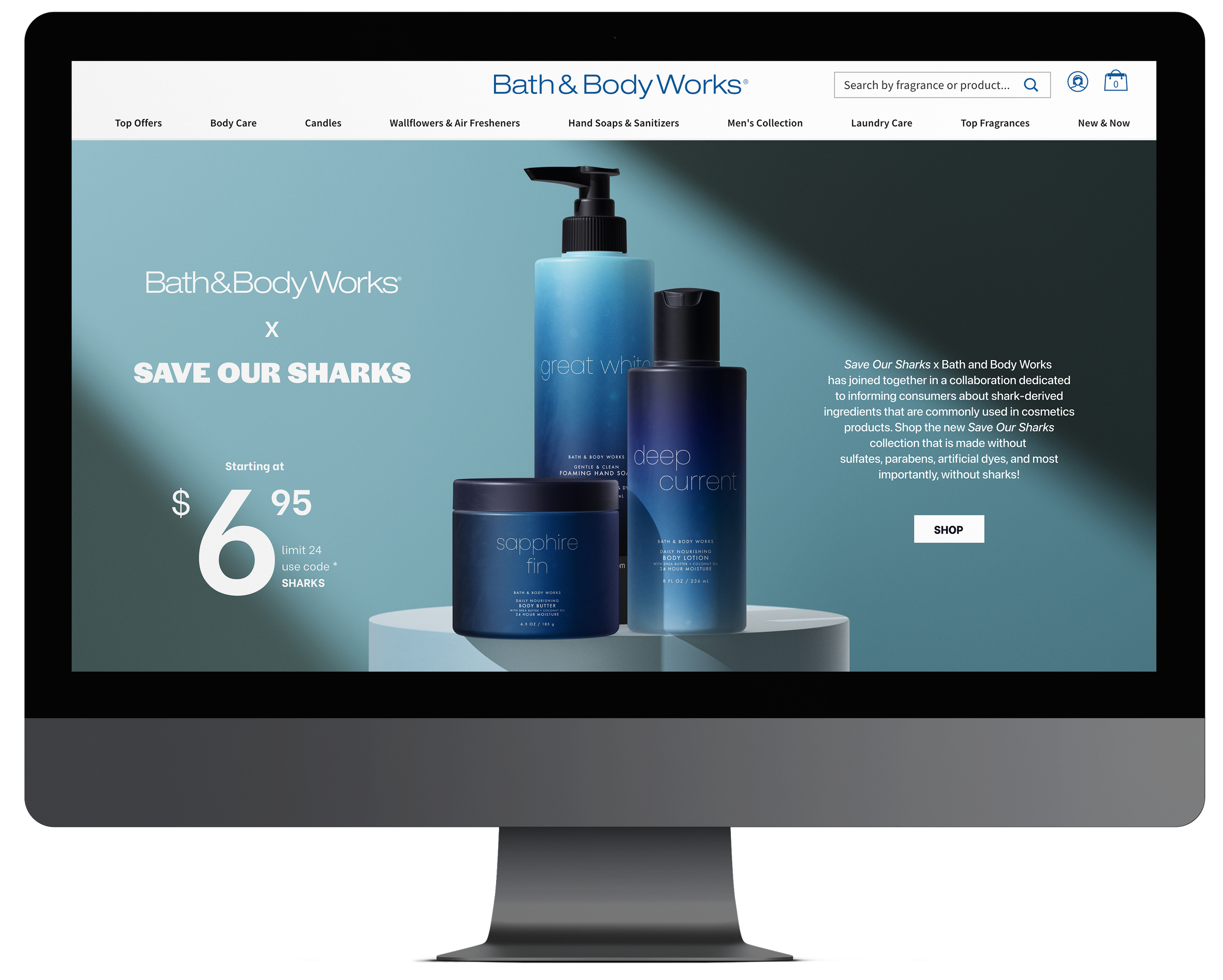
Coat Design
But as with most things in design, it has to be eye-catching. Especially with a brand like Bath and Body Works where their visual design is crucial to their sales, the Bath and Body Works x Save Our Sharks collaboration had to artfully tell the story of the campaign.
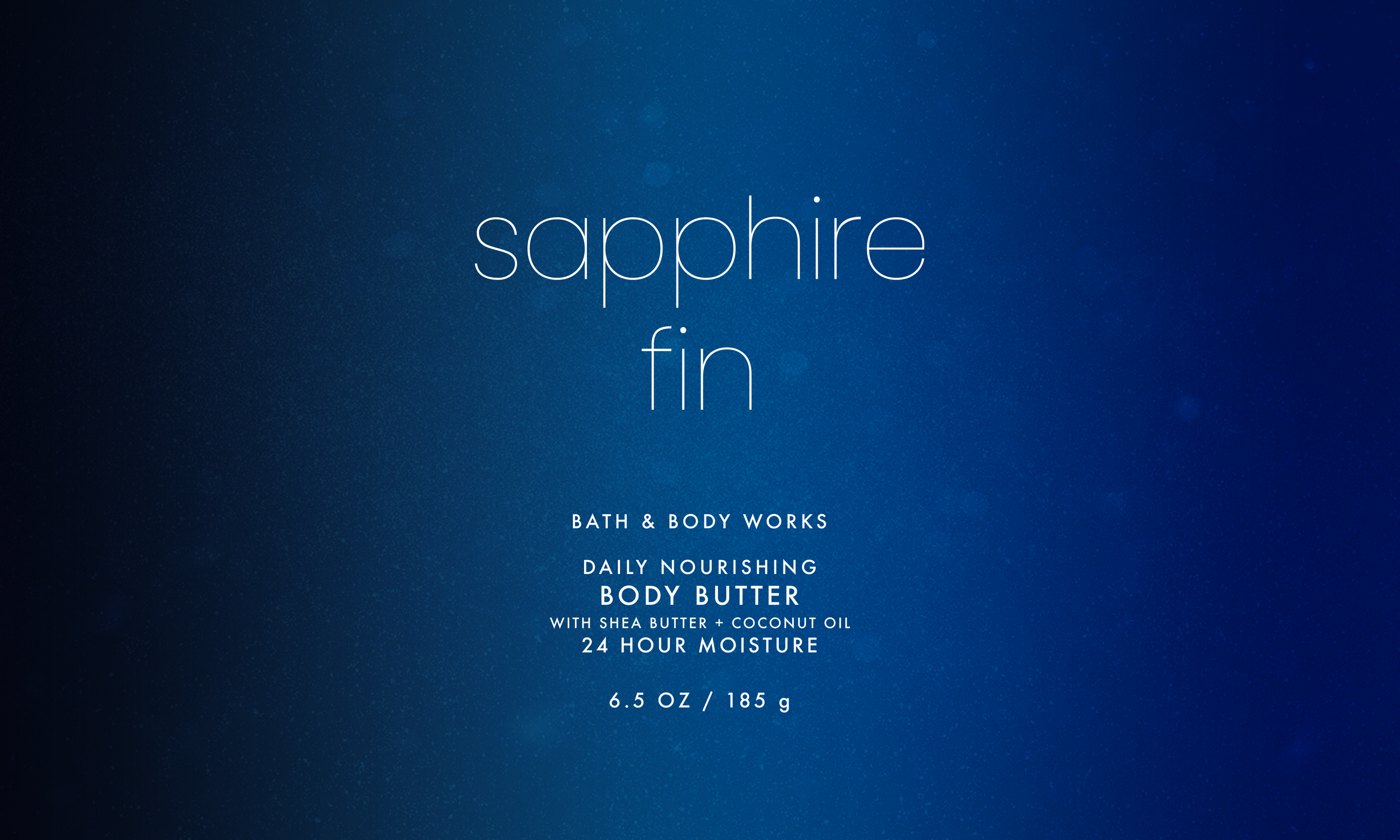
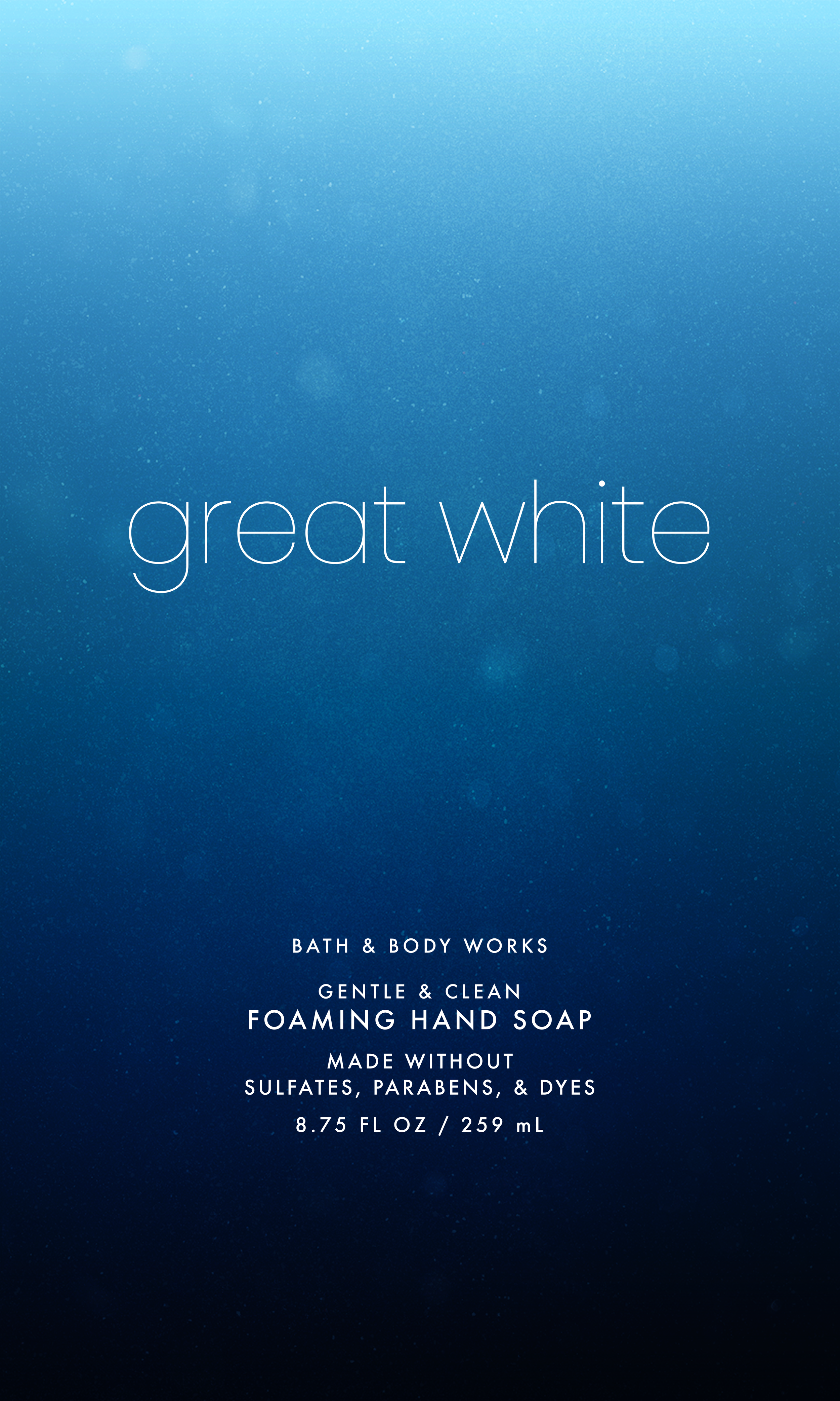
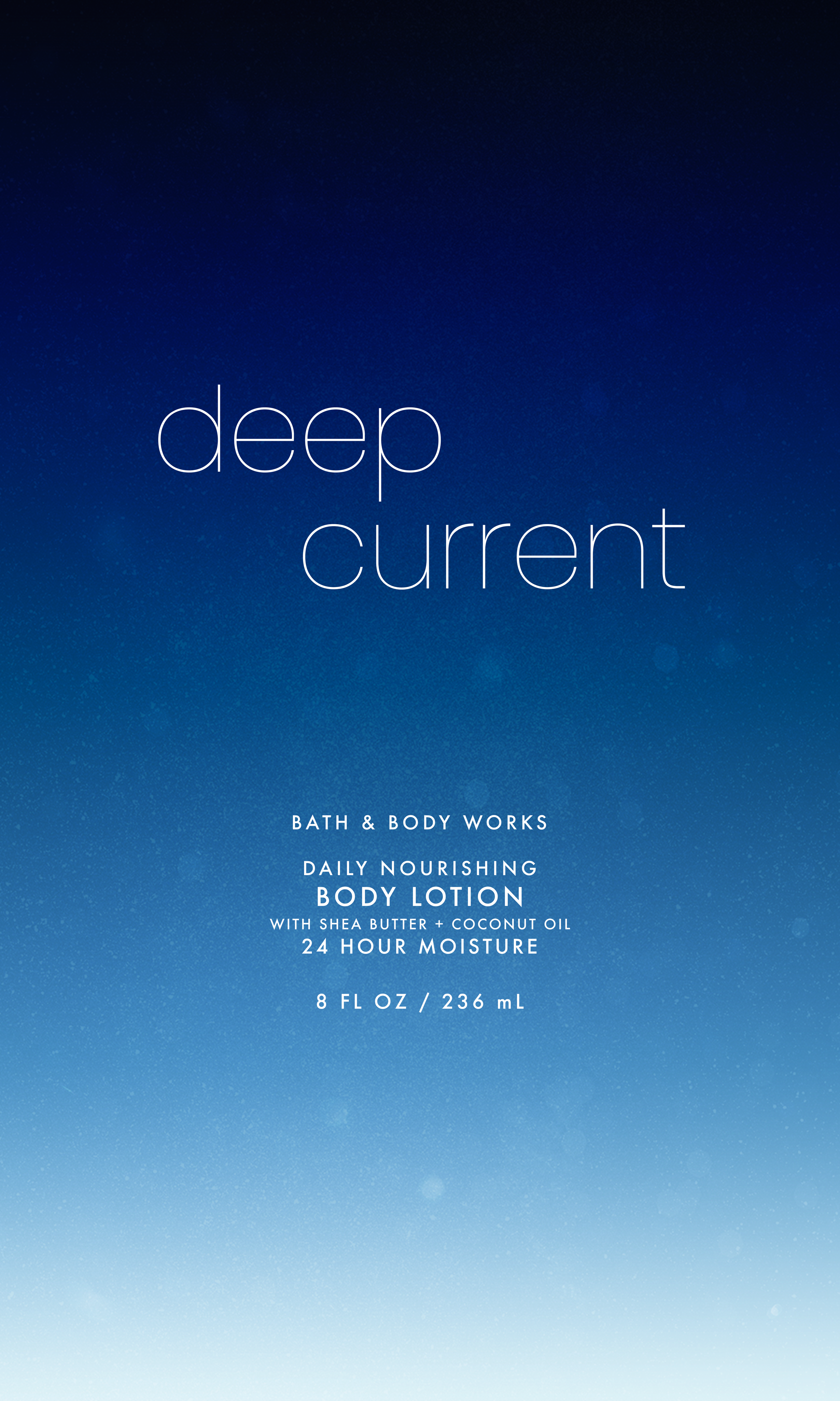
I once again utilized the deep sea gradient, except this time on soap, lotion, and body wash coat designs. Since I myself am a loyal customer to Bath and Body Works, I simply imagined what kind of coat design would stand out and catch my eye if I were browsing the store. All of their coat designs are beautifully designed, but often very maximalist. I pulled back on my own maximalist instincts and instead went for a simple but sophisticated look.

Musical Artist Collaboration
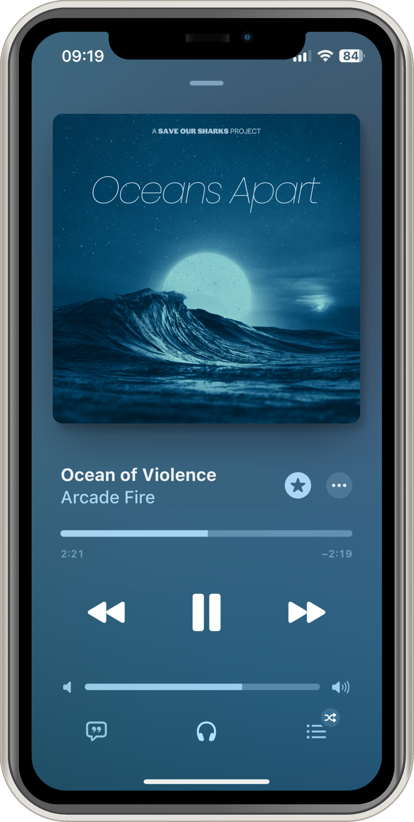
I got to choose another designed component as well, and I decided upon an album cover; specifically, an album where famous musical artists each contribute a song they wrote about the campaign, and on a larger scale, ocean conservation. This component may seem random and unrelated to the campaign’s goal, but there is reasoning behind it. In order to have an effective campaign, it needs to first reach as many people as possible. Something that people use almost everyday is a platform to stream music from. So, if there were an album about shark conservation, it would easily reach a substantial amount of people.
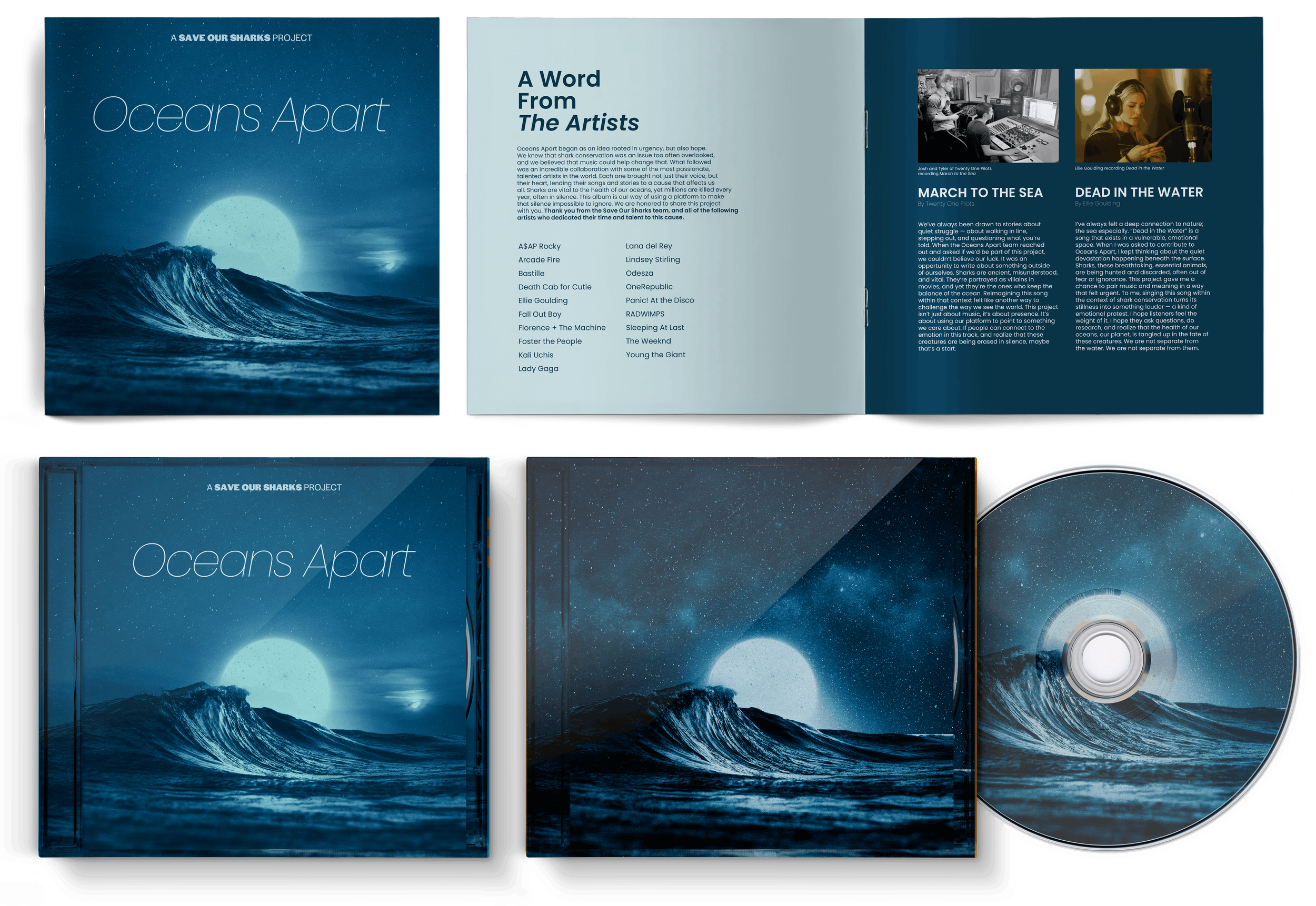
More than just reaching a certain number of people though, is a critical factor in a campaign’s effectiveness, which is influence. Celebrities have a critical amount of influence over people; actors, musicians, and content creators. I put the two pieces together and designed the album cover for an album which features many prominent artists’ song contributions, such as Lana del Rey, Lady Gaga, The Weeknd, and A$AP Rocky.
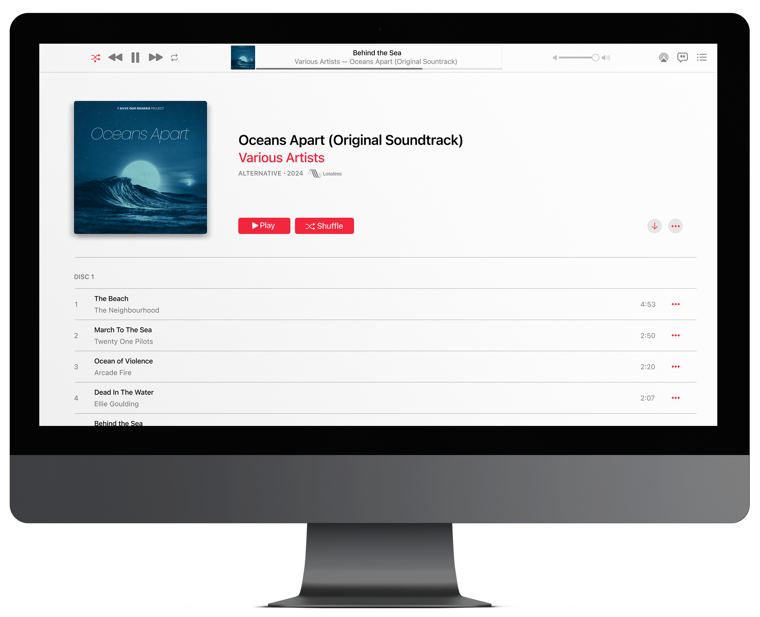
With these (and many more) influential musicians on the album, the campaign can now reach a much wider range of people; people that it would not have reached without the connection of their favorite artist supporting the cause.
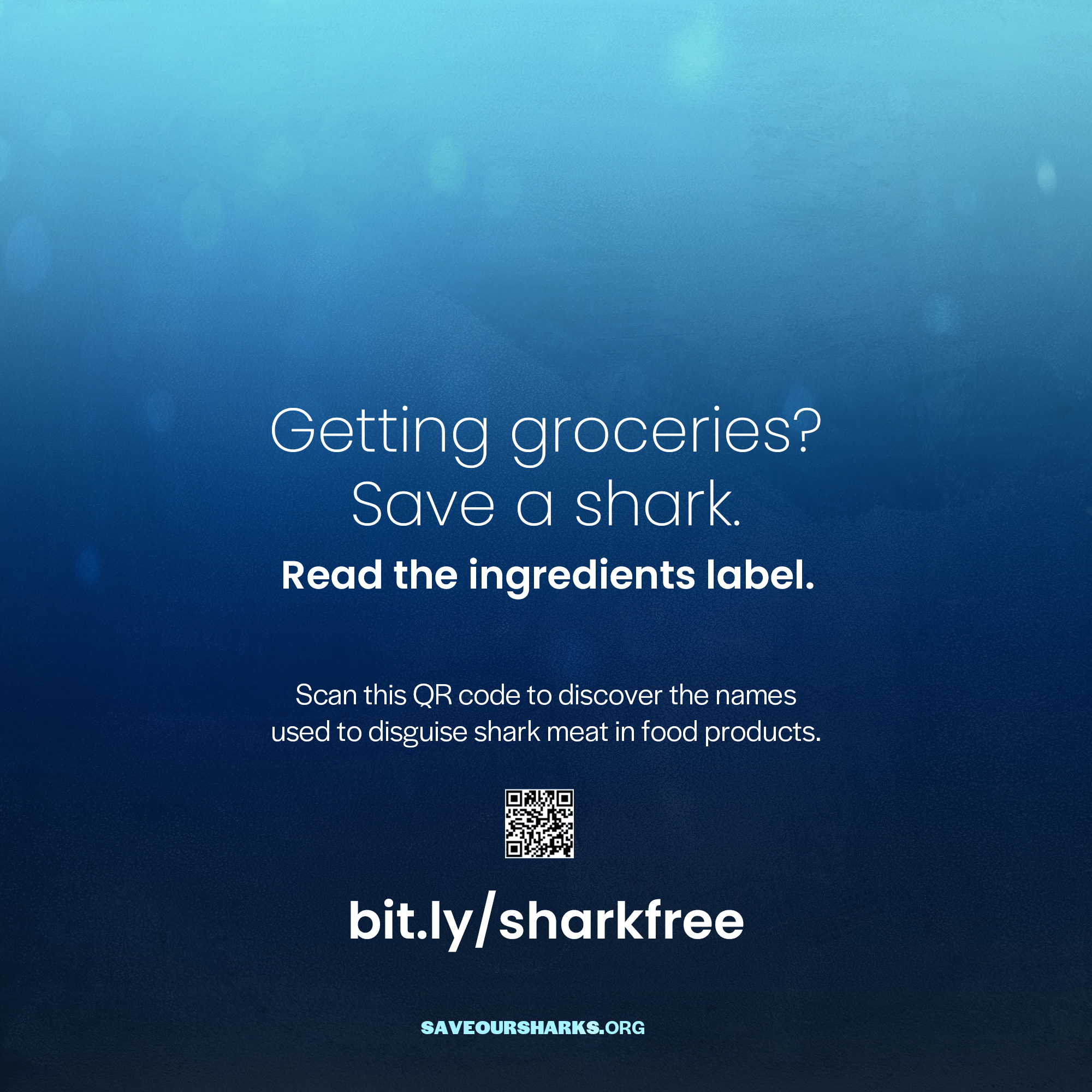
Grocery Store Component
Now that I covered two things that people partake in everyday (cosmetic products and music), the third was grocery stores. Up until this point, I’ve only discussed shark-derived ingredients being present in cosmetic products. But shark meat gets used in our food, too. Which means the next target for the campaign would be grocery stores.
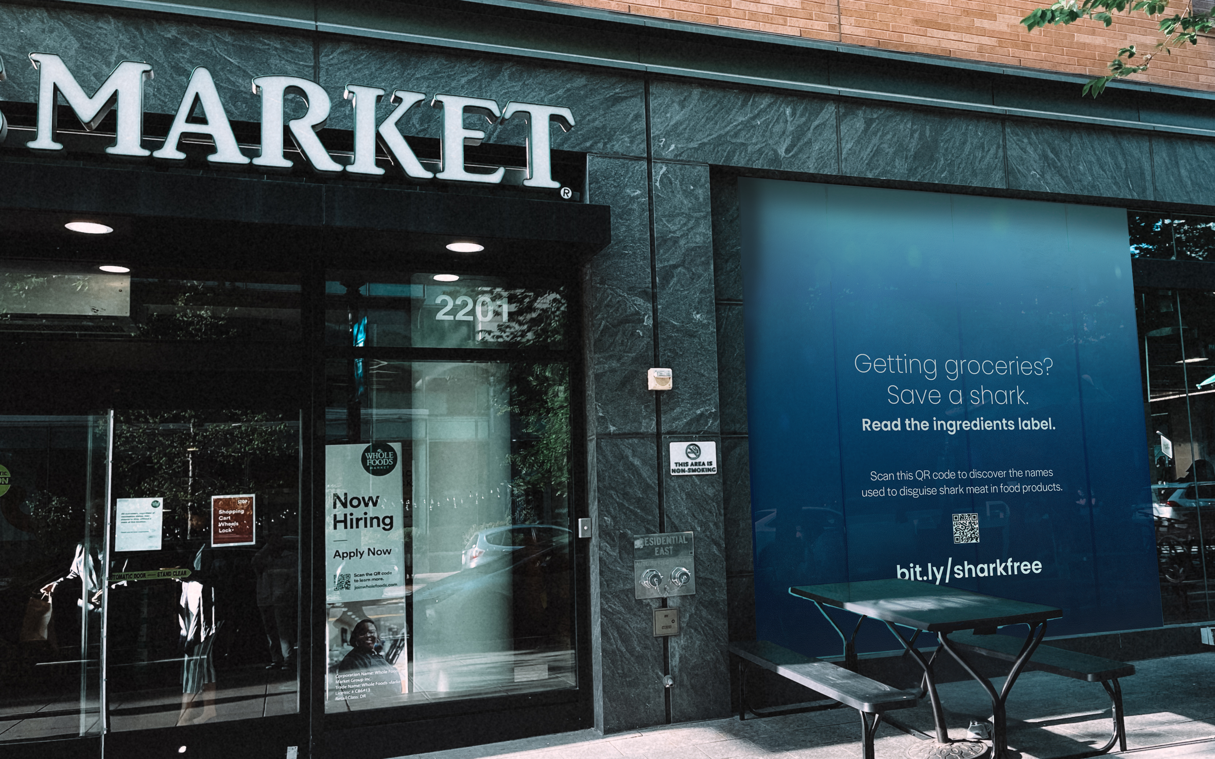
Window Decal
An easy way to do advertising at a grocery store is through a window decal. I wrote up some attention-grabbing lines pertaining to shark meat being in their purchase that would pique the curiosity of the average customer going in and out of the grocery store. In my research I learned that sometimes, shark is sold at supermarkets under a different name meant to disguise the fact that shark is being sold at the store. By scanning the QR code on the window decal, the customer would be directed to the campaign website, where they can read through the list of false names used to disguise shark meat.

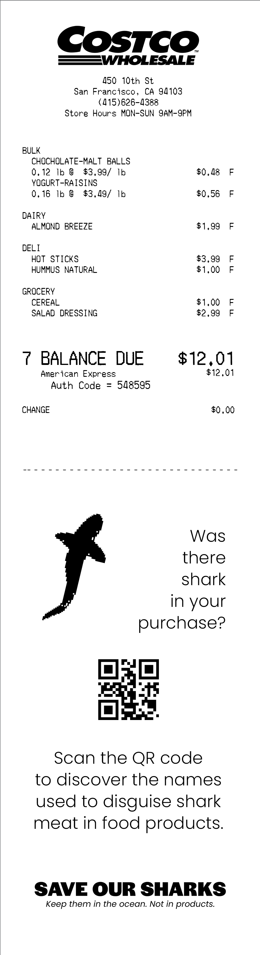
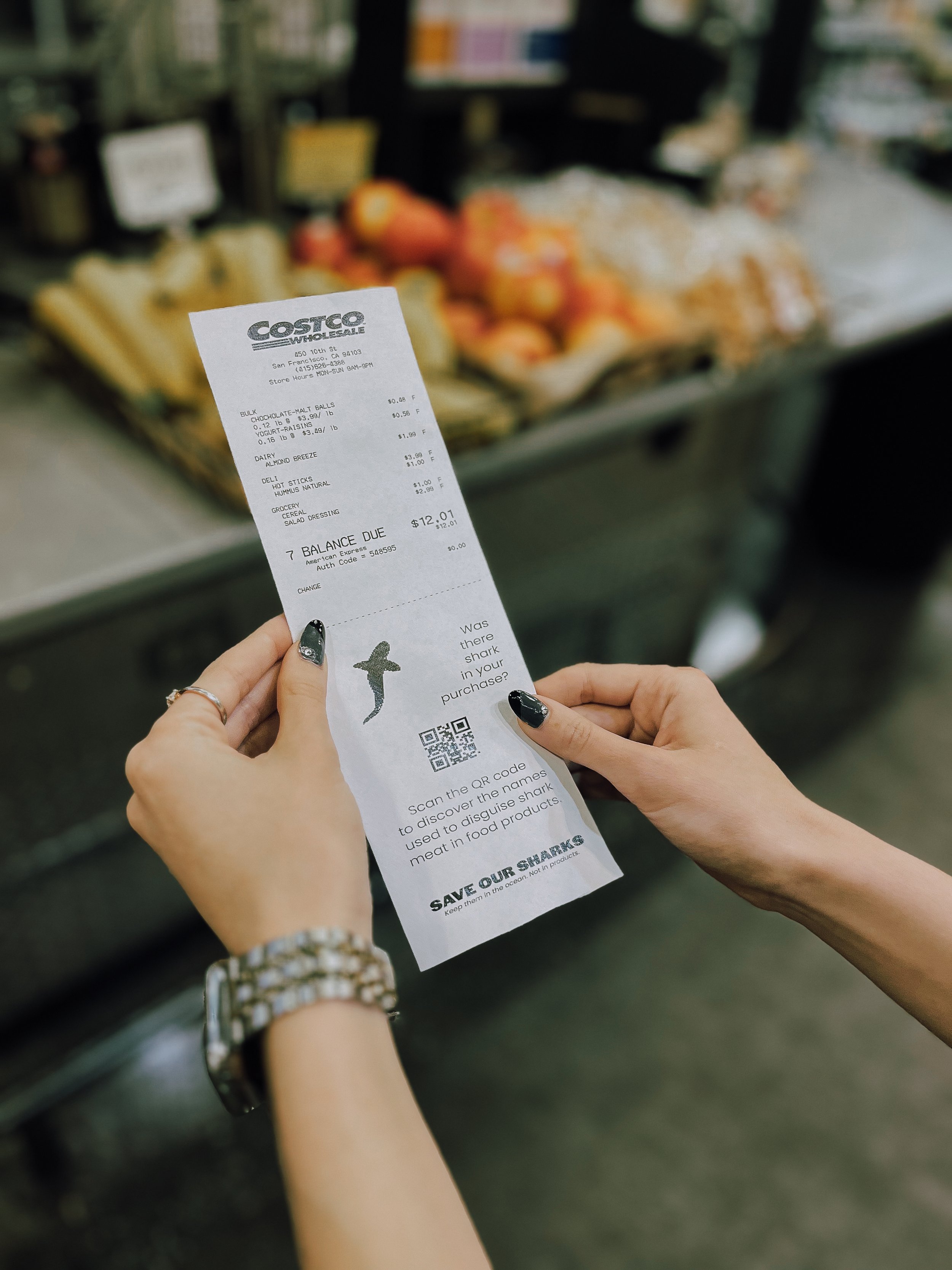
Receipt
An additional designed component that reinforces the window decal is the receipt. Every single customer from the grocery store, whether they throw it away or not, is still handed a receipt. And even if they merely glance at it for a moment, that is long enough for them to see the silhouette of a shark on the receipt.