Purslane Pottery
I designed an e-commerce Squarespace site for a master potter David Twitchell, where my challenge was to showcase his five decades of mastery through thoughtful website design. Each piece reflects a lifetime of experimentation and perfection, and the site presents his work in a way that truly stands out among other pottery websites.
❋ Role
❋ Timeline
UX Designer
2 months
❋ Skills
❋ Tools Used
Information Architecture
E-commerce UX
Product page design
Squarespace
Figma
The Problem
The challenge of this website was translating decades of diverse ceramic work into an intuitive e-commerce experience. The client had been waiting after retiring to finally make his dream of running a pottery business come true! This meant he had an extremely wide range of functional wares that needed to be organized into logical and easily navigable categories.
Another challenge was the presentation of each piece. The product photos had to meet modern e-commerce standards to accurately communicate the quality and craftsmanship of the work online.
I even took some photos of the wares out in nature in San Diego (pictured here) to put on the website and appeal to customers’ sense of aesthetics.
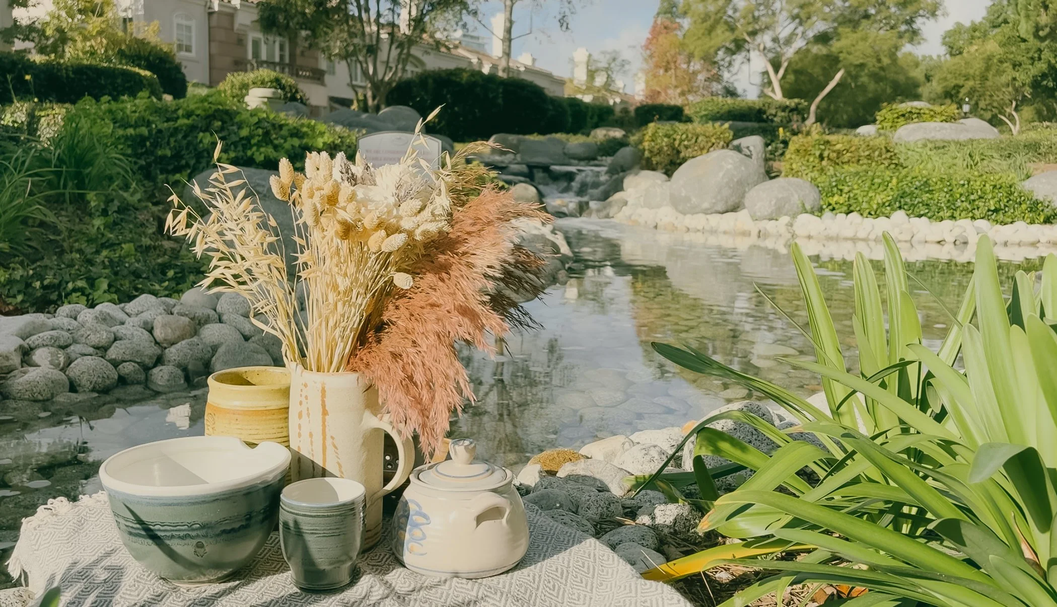
Photograph of the wares I took
Key UX Decisions
Clear Product Categorization
The wide range of products had to be split into enough categories to distinguish what they were used for, but not so many categories as to confuse the buyer.
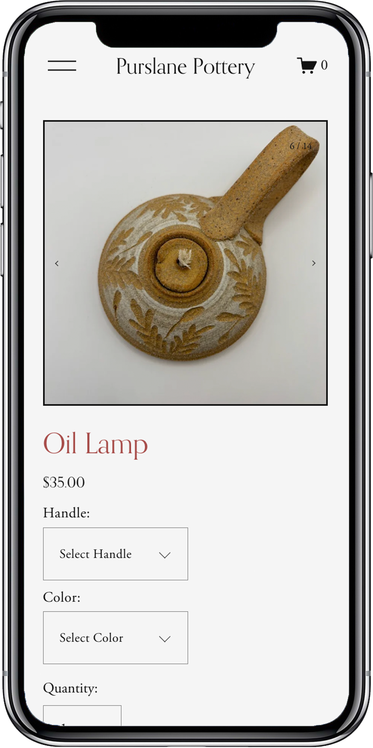
Dimension Focused Product Descriptions
The product descriptions had to include product dimensions and capacity first. This way, customers would immediately understand the scale and fit of the product, which helps reduce some uncertainty and hesitation common in online ceramic purchases.
Consistent, Beautiful Photography
There had to be a standardized photography system that was established across all products. Lighting, angles, framing, all of these had to work together to seamlessly communicate the products’ worth to the buyer through photos.
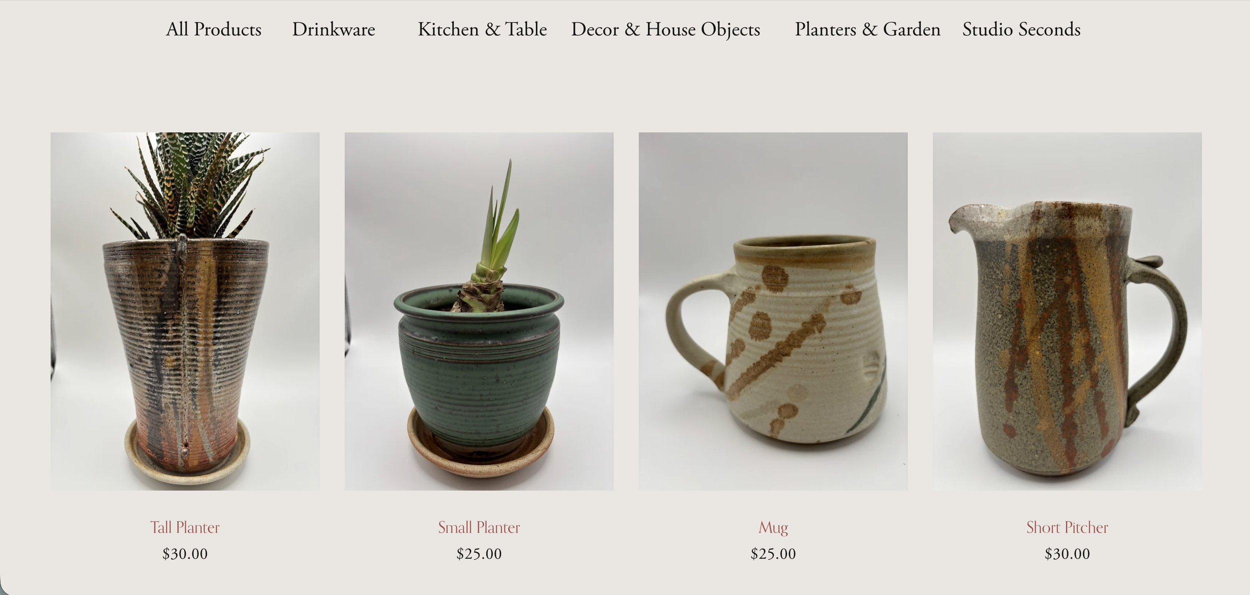
All products grid view
Implementation
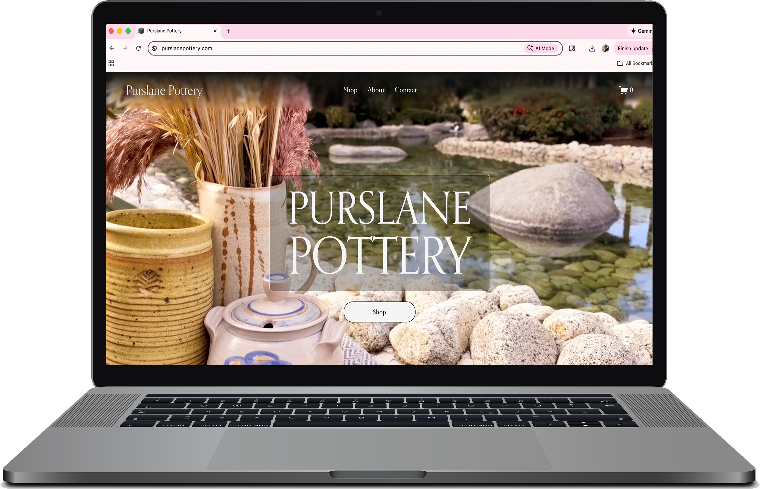
Home page
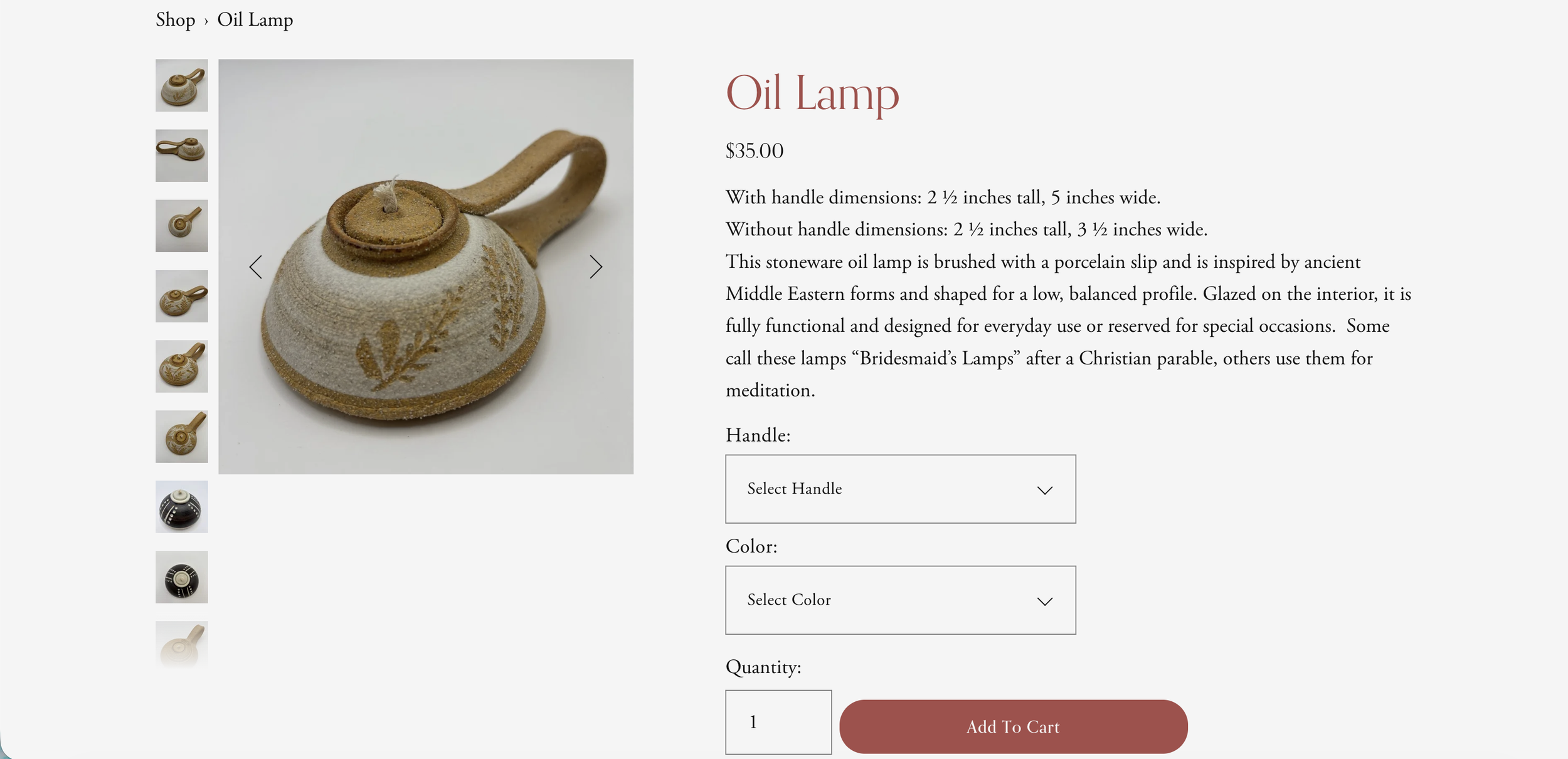
Product page

About page
Contact page (mobile)
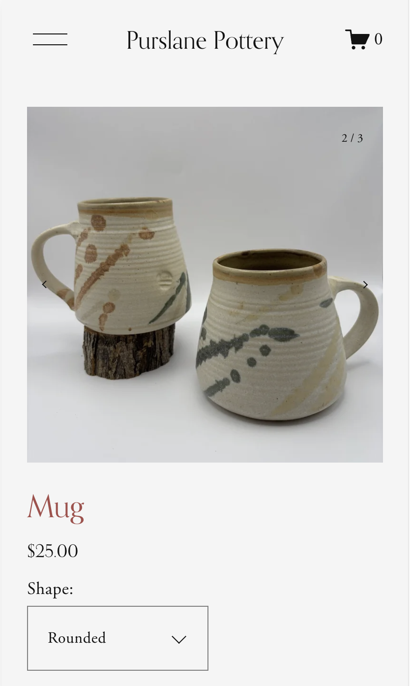
Product page (mobile)
Reflection
This project taught me how much restraint and prioritization good e-commerce design requires. I initially wanted to design for visual novelty, but at every turn I had to put the buyer’s experience as the number one priority, which meant the design could not steal the spotlight.
Working through this process made me aware of the e-commerce websites I’ve used before, and how some of them did not put my buying experience first. Using the website then became frustrating, even if the product being sold had nothing to do with that frustration. I kept reminding myself of this while designing the Purslane Pottery experience: that David’s beautiful wares deserve an equally great user experience.
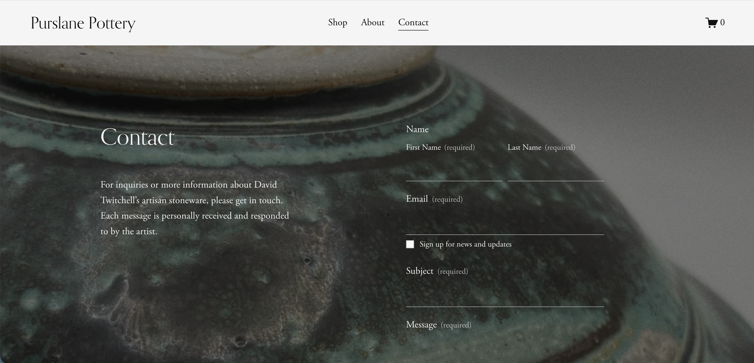
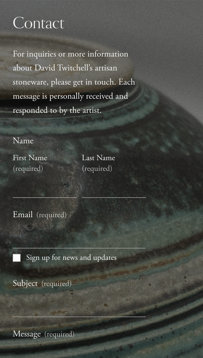
Contact page