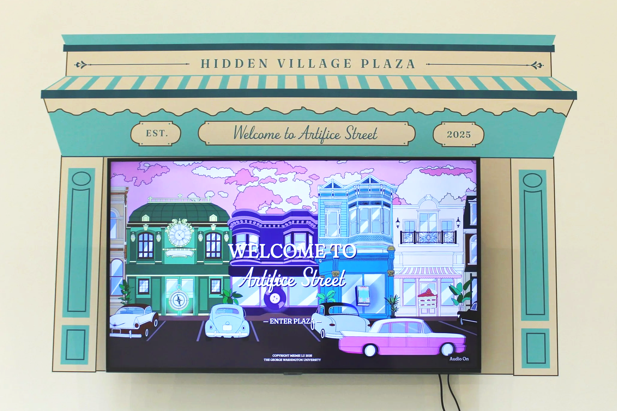
Artifice Street
Artifice Street is an original video game I designed and illustrated to help people notice and appreciate graphic design in everyday life. In the game, players explore virtual storefronts, interact with mini-games, and come to the realization that the world could not function without graphic design.
❋ Role
❋ Timeline
UX Designer
6 months
❋ Skills
❋ Tools Used
UX Research
Game Design
Digital Illustration
Figma
Godot
Adobe Suite
Procreate
Project Overview
Artifice Street is an original video game I created for my graphic design senior thesis project. In this game, users interact with different virtual storefronts and then play activities and mini-games that teach different aspects about graphic design. My senior thesis was about helping the general public more fully appreciate graphic design in the world around them. After interviewing several professional designers about what makes graphic design stand out to the general public, I gathered that it was a matter of teaching people. Thus, Artifice Street aims to teach users, in a fun and engaging way, about just how much the world needs graphic design. *All menus were designed by me, and all illustrations were drawn by me.
Ever since a young age, I’ve felt that people take art and design for granted. Or think it’s easy. But the reality is that the world runs on graphic design. People just don’t realize it. I knew I wanted my thesis to be this topic, to show everyone just how much they need design in their lives everyday.
Thus, I had to teach principles of graphic design without making it too educational. If the video game was just a matter of reading things about graphic design, it would be no different from a lecture. I wanted the video game to help the user arrive at new understandings about graphic design that they can’t get from just reading. They have to interact with the game.
The Problem
Research
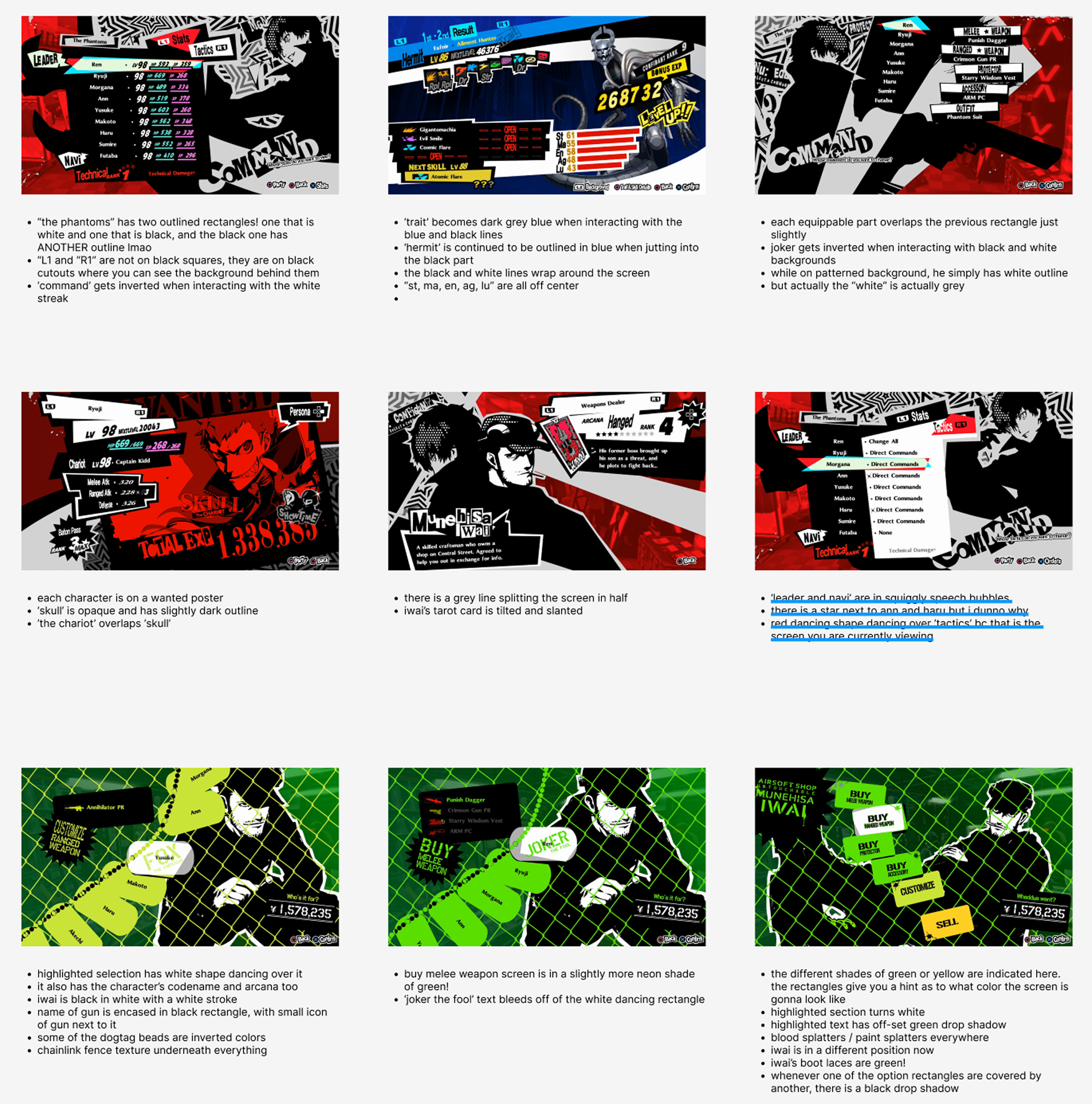
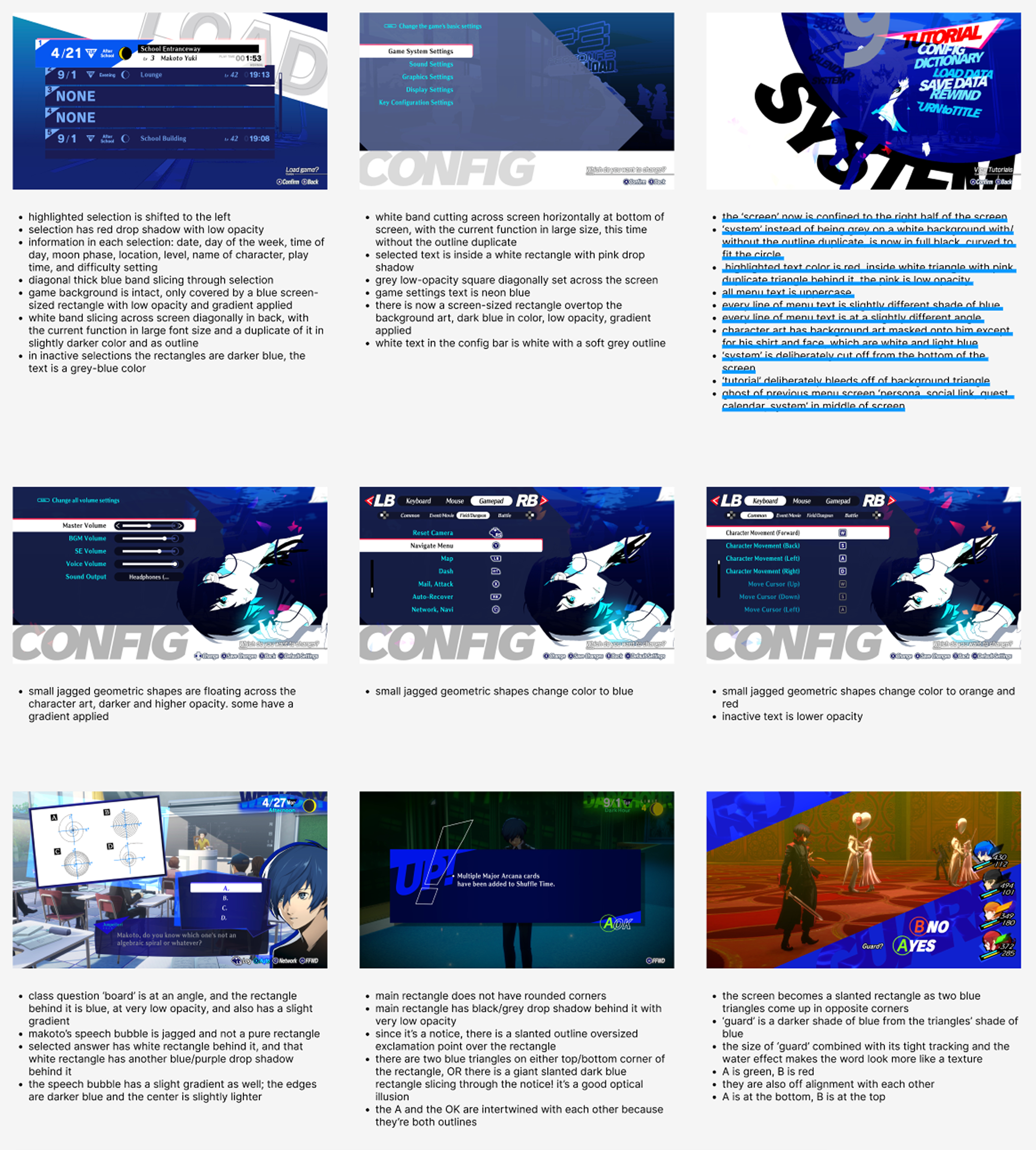
Having never designed a video game before, I decided to look to the Persona games for inspiration. These are my favorite games! Not only are the stories good, but the visual design takes a very stylized approach. Every aspect is designed uniquely and beautifully.
While observing the UI/UX design, I took careful notes on how information was communicated. Which unique button shapes were used. The feedback after selecting an option. Hover states and pressed states. How much asymmetry was used. The extent to which 2D drawings were utilized. There was a lot to learn.
Choosing the Setting
After being equipped my research, I began fleshing out what exactly it was that I was arguing. I pondered what was the X factor that made people notice design in the world around them, and felt strongly that one of the main factors has got to be when people have a positive user experience with the design and product.
But where do people have good user experiences outside of mobile apps and websites? I needed a place that was teeming with great design so as to provide a good backdrop for the game.
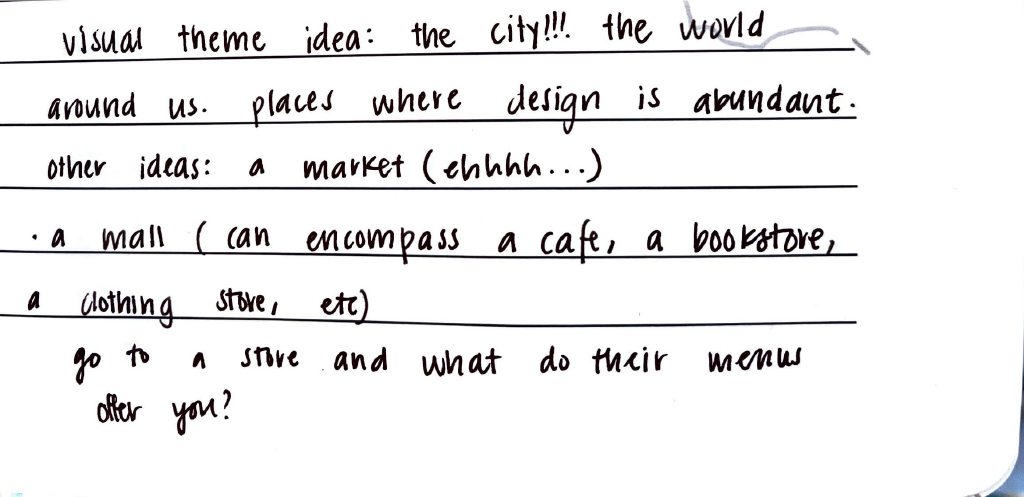
It hit me that cityscapes are the perfect places to have a video game of this nature. Malls, plazas, city centers, all of these places are brimming with design. That was how the setting of a plaza for the game was decided.
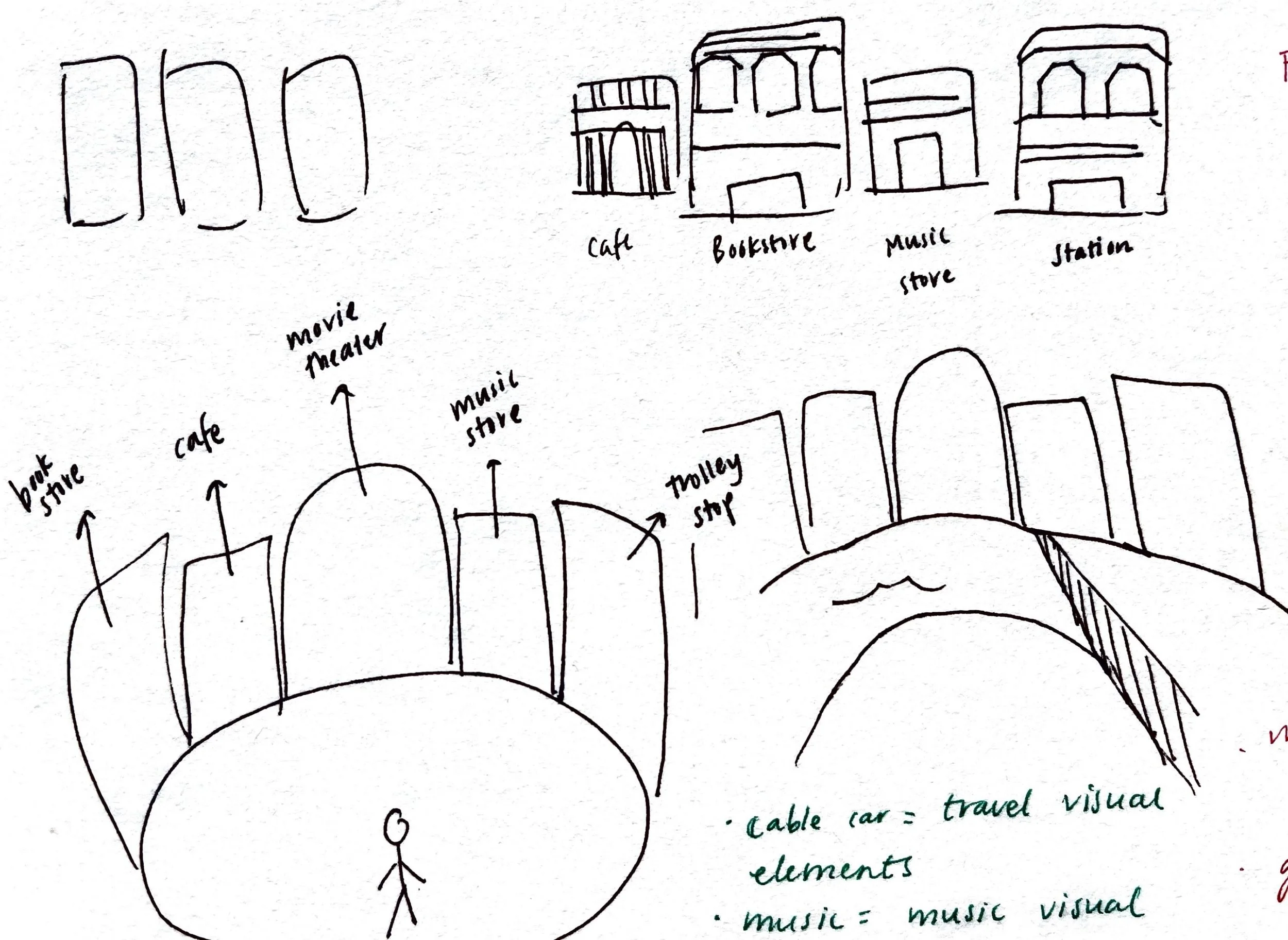
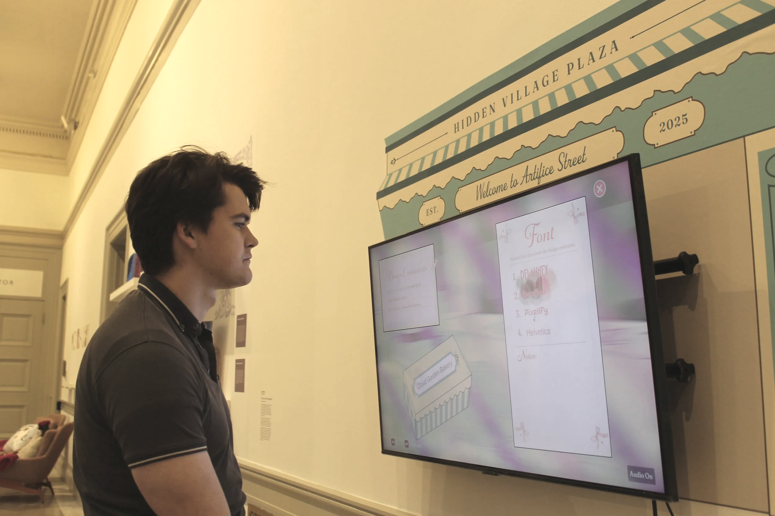
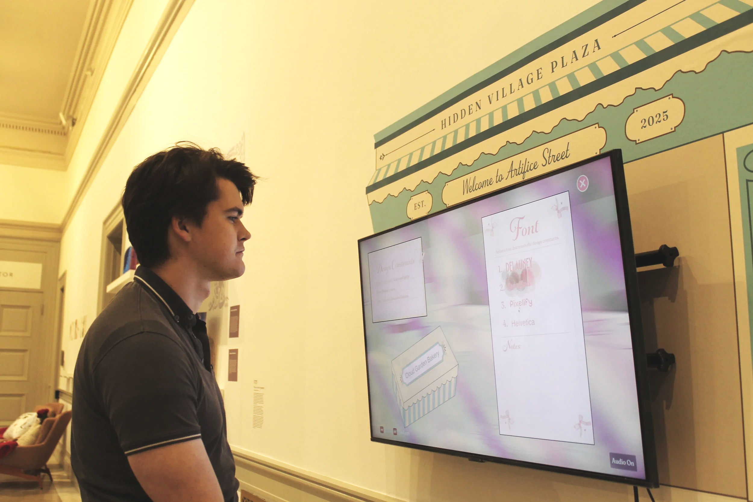
Store Showcase: The bakery
The bakery’s game is where the user is put in the shoes of a designer, and carry out the simplified version of some tasks that a designer would do. In this task, the user is asked to design the new logo for the fictitious Cloud Garden Bakery by choosing between three fonts and three colors. It’s simple, but it requires thought.
There are four different fonts to choose between, and three colors. I had to first choose which colors to present to the user, to ensure that the right choice is pretty clear, but that they could reason through the incorrect choices.
The lesson of this activity is that there is a lot of reasoning that goes into choosing fonts and colors. Each choice communicates something different. A bakery logo using the font Helvetica is a completely different bakery than one using a round and playful font. It helps teach the user that all the logos in the world around us were designed with intention and critical thinking.
One of the most time-consuming parts of creating the game was hand-illustrating all of the assets and backdrops. One reason for this was that the stores each had to be stylized to fit the store’s brand identity.
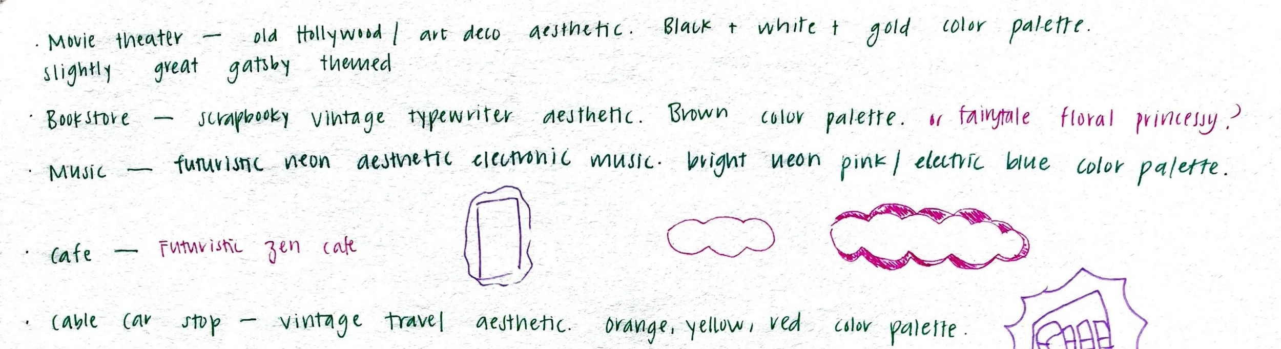
The bakery is a playful and pink themed bakery specializing in frosted desserts. It had to have a very specific look to it, otherwise the task would be much more of a subjective task with too much left up to personal taste and preference.
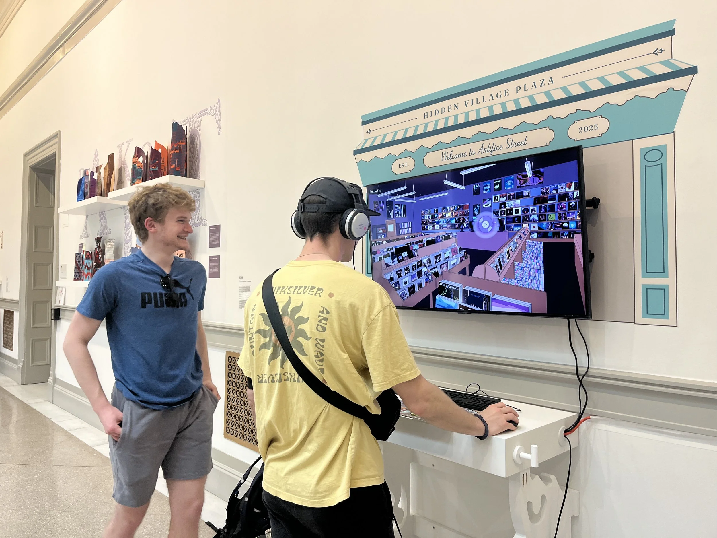
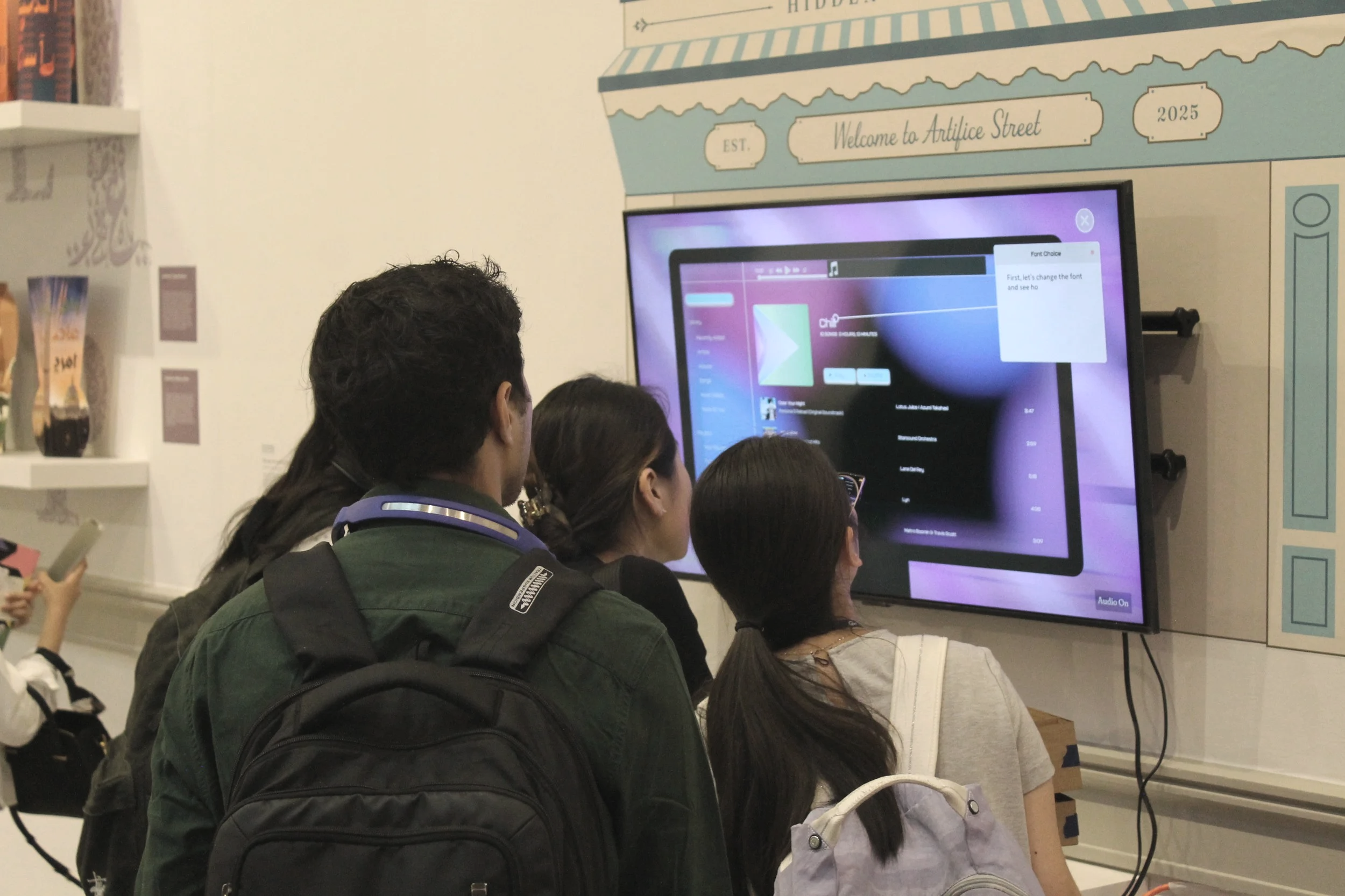
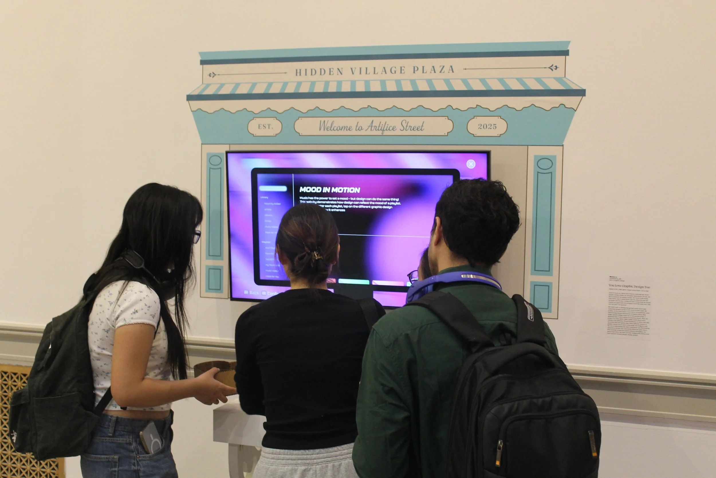
The Music Store
This activity shows how graphic design elements all uniquely affect mood, particularly the mood of a playlist. When prompted, the game will ask you to change three things: the font, the cover art, and the color of the buttons. They change to more fully support the mood of the playlist.
By the end of the activity, the fonts now communicate the tone of the playlist, the cover art is an interpretation of the playlist’s mood, and the color of the button matches the colors from the cover art. This activity teaches users that graphic design has a psychological effect on mood.
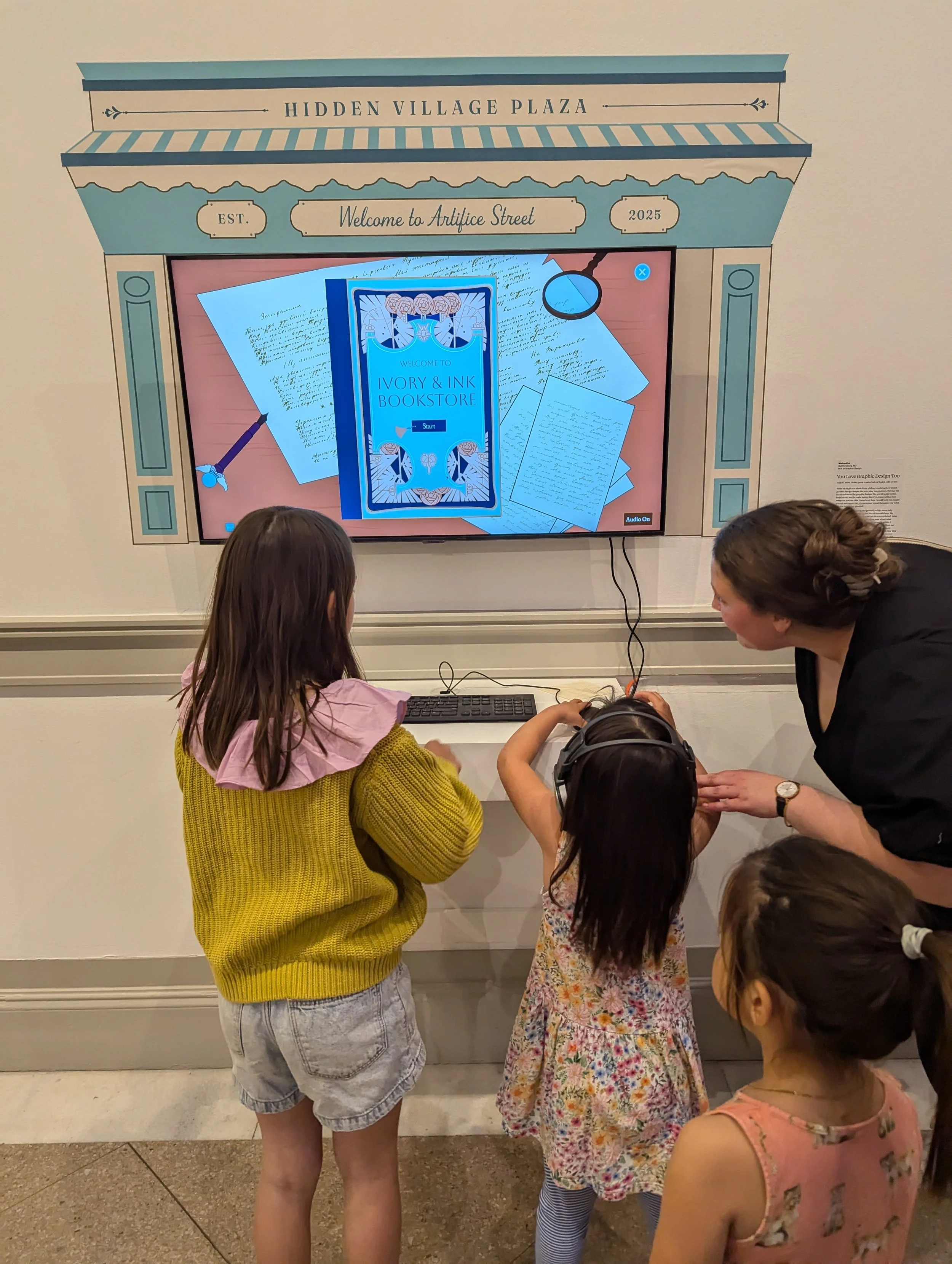
The Bookstore
The bookstore activity is based off the phrase ‘Don’t judge a book by its cover’, which doesn’t always apply to design! A book’s cover informs the reader of what the book is about, which helps the reader decide whether they want to read the book or not.
However, in a world where books do not have front cover designs, it’s suddenly way harder to deduce what the book is about, especially if the title is ambiguous. The user now has to guess which genre the book is, based on the title of the book alone.
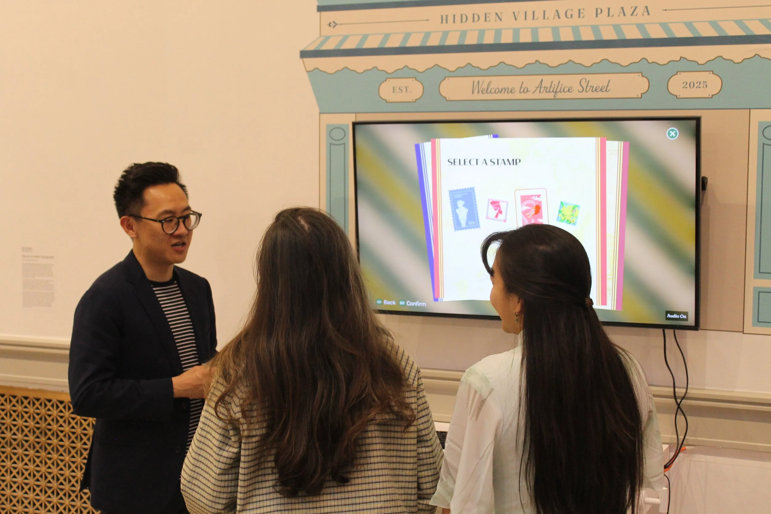
The Train Station
The user has to guess a country just by looking at a stamp’s design. This game reinforces the existing visual associations tied to the following countries: Greece, Egypt, China, and the Bahamas.
The user feedback I got on this game in particular was, “This is so obvious”. Yes, it is. But, that is the exact point of the game right there. Why is it obvious? Because of graphic design. Through graphic representations of each country, we have come to associate visual elements with them. That is the point of this game.
Lessons I Learned
One takeaway is that user experience is truly key to the success of any digital product. It was proven to me again and again, when users tested and played my video game and really liked the experience, it was due to so many UX decisions I made. At every turn, I asked myself if the user was ever overwhelmed by what was going on in the game, if the user could easily escape and regain control of the system, and if any text or button or other interactive element didn’t make sense.
The second lesson is that because a truly good user experience is frictionless, it means that it will rarely get the appreciation it deserves. All the user may be aware of is that it feels good to use the product, and that may be the end of it. The design and the designer remain uncredited. But that’s okay. As designers, our goal should still be to create beautiful and intuitive products, even if no one will notice the effort put into them.
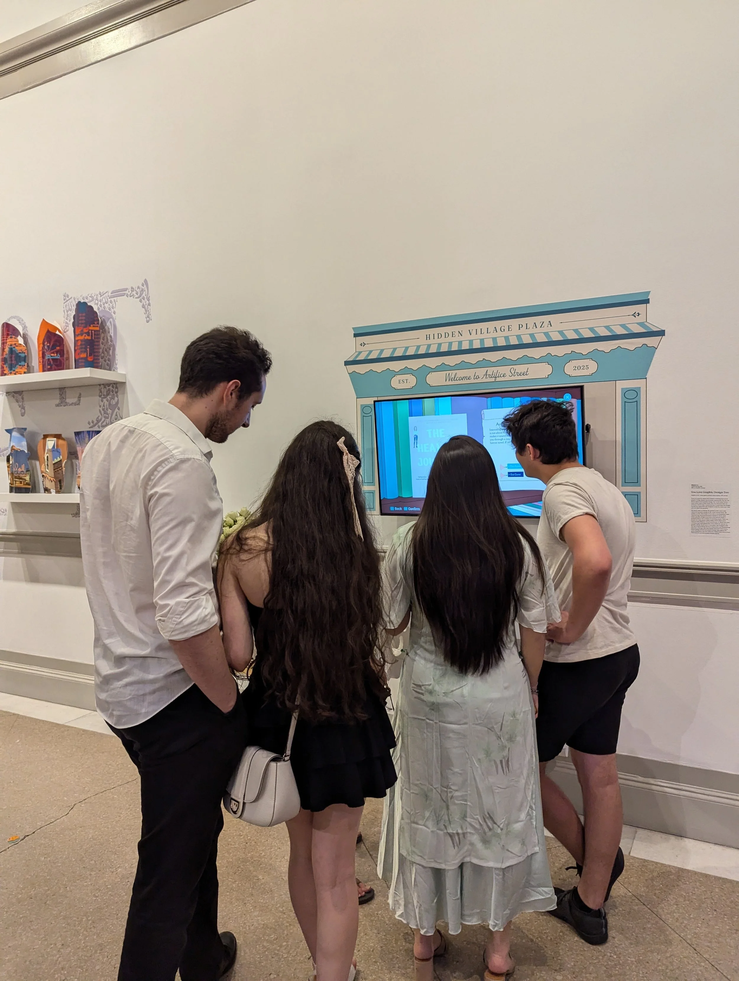
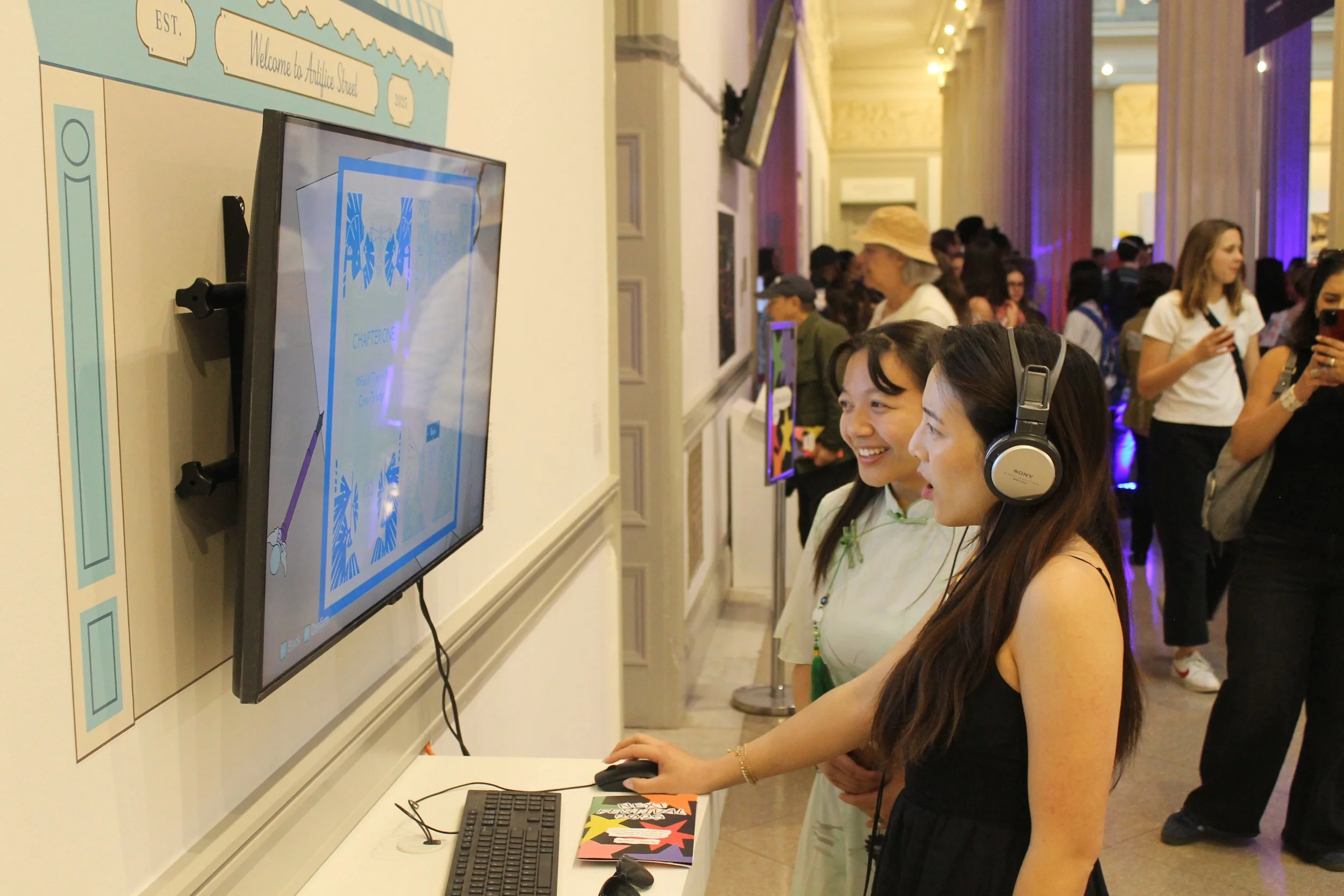
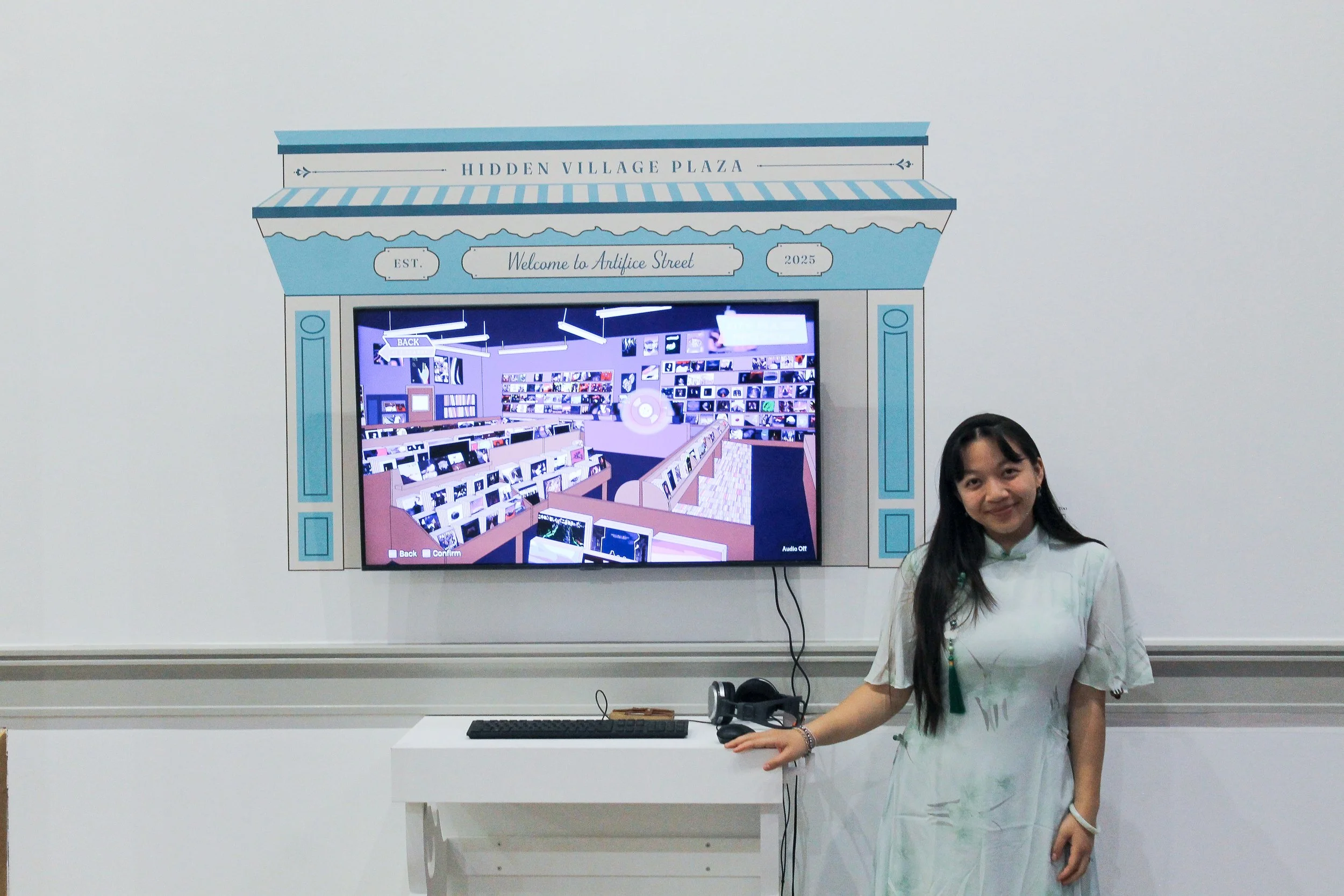
After working on my video game for 6 months, I finally got to exhibit it to the public at my school’s annual senior thesis exhibition extravaganza, called the NEXT Festival. I’ve attended these festivals in previous years as well, and I always wondered what I would present for my thesis when my time came. Finally, it was my turn, and it ended up being a fantastic experience. I was overjoyed that people were actually playing my game. The two semesters' worth of work finally paid off. Here are some of the photos I took from the NEXT opening night!
Thesis Exhibition Gallery