Apple Music
Concerts Near You Feature
This project is a case study imagining how users could discover upcoming concerts in Apple Music, a feature that currently does not exist. I designed a Concerts Near You feature that tells users about live events from artists they love, while staying consistent with Apple Music’s existing visual language. The goal was to extend Apple Music’s user experience by bridging the gap between users and finding tickets, thus adding a feature that is incredibly useful and would add high value for Apple.
❋ Role
❋ Timeline
UX Designer
3 months
❋ Skills
❋ Tools Used
Product Design
Information Architecture
Prototyping
Figma
The Challenge
I’ve been using Apple Music since 2015, right after I switched over from Spotify. It is undoubtedly the app that I use the most (I have over 250 playlists … ask me about them sometime). Because I’ve been with Apple Music for so long, I often think about what it is that makes the user experience in Apple Music so successful.
However, there is one feature that Apple Music does not have yet. A Concerts Near You feature where you can discover which artists you love are performing near you soon. Currently, users have to rely on third-party apps or social media to find concerts.
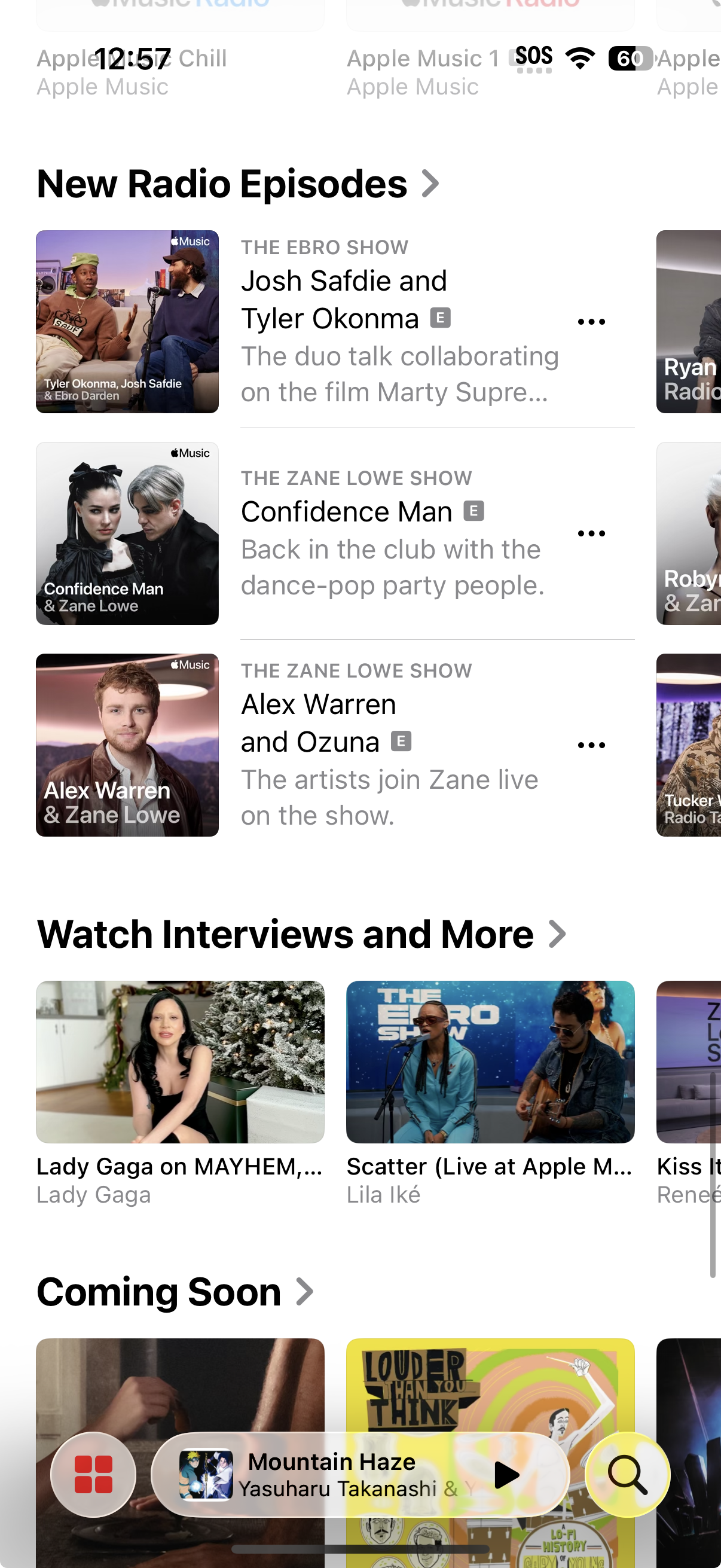
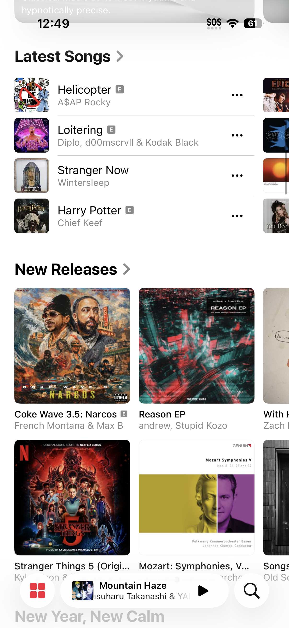
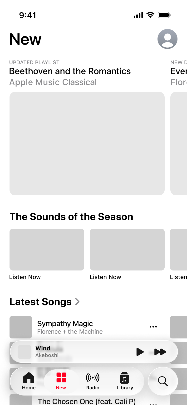
Current screenshots of Apple Music’s ‘New’ page.
Many sections are exhibited, but none for Concerts.
Competitor Analysis
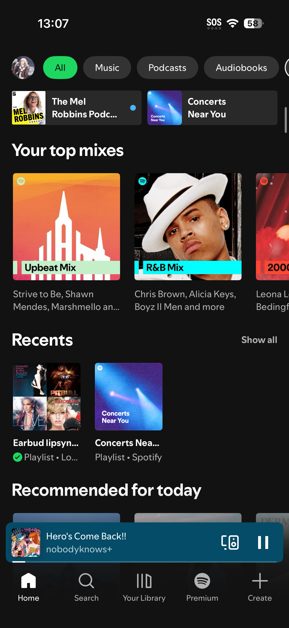
I examined Spotify’s Concerts feature to understand how concert discovery is currently being handled in a major streaming platform. One of the first issues is the hierarchy: it feels unfocused and confused as to what a Concerts page is supposed to offer. When you land on the Concerts Near You page (middle screenshot), the two biggest icons are a shuffle button, and a play button. This page is designed like a playlist page, not a concerts page.
The individual concert pages provide basic event information, but there are elements with unclear value scattered throughout the page. Analyzing Spotify’s approach made it clear to me how easily a feature can lose impact when hierarchy and clarity aren’t treated as the most important aspect. I made sure to make clarity my highest priority.
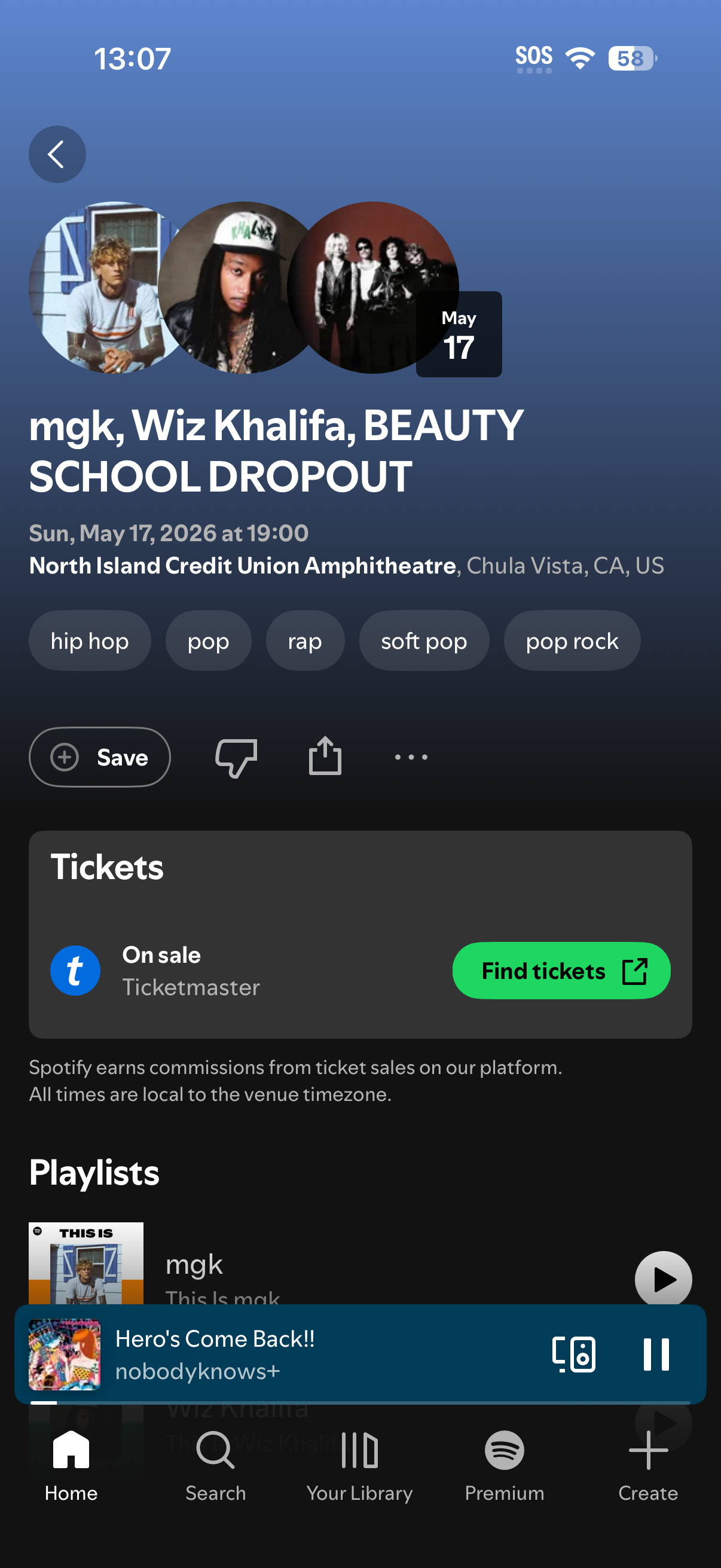
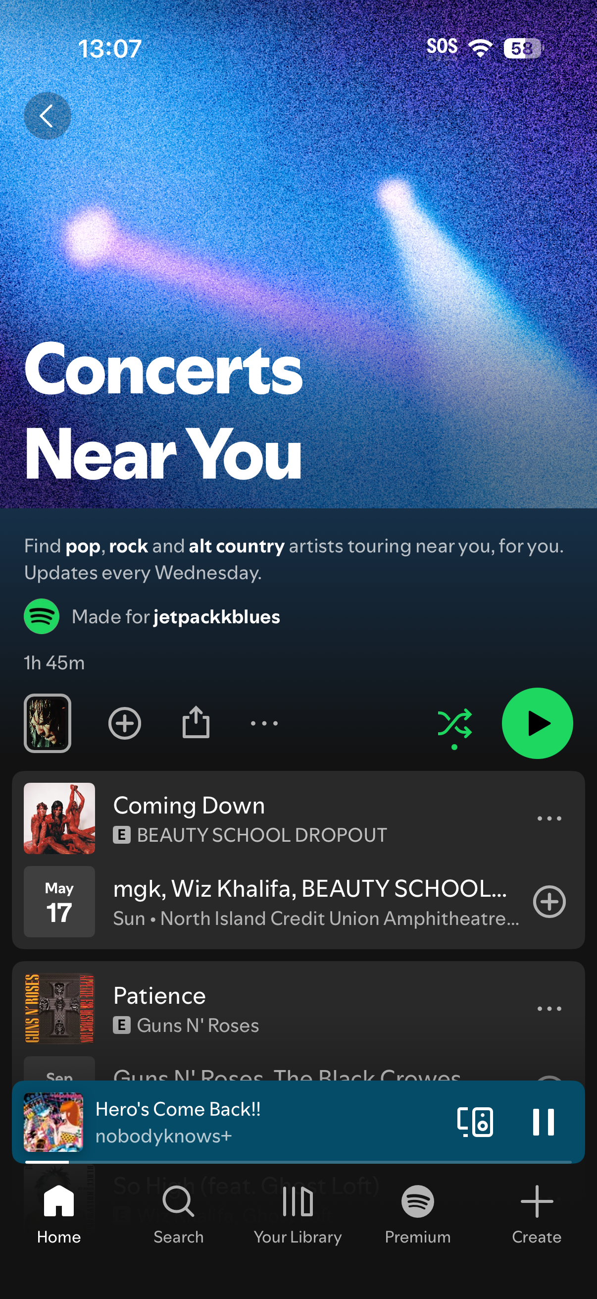
Screenshots of Spotify’s Concerts feature
The Value This Product Would Bring to Apple
According to Spotify’s head of business development Jon Ostrow: In 2025, 228,000 artists had concerts listed on Spotify. 182,000 had those listings clicked on by fans. 74,000 artists sold tickets as a result.
As of publicly reported 2025 data, in Q3 2025, Ticketmaster sold ~89 million fee-bearing tickets and generated approximately $798 million in quarterly ticketing revenue.
An affiliate or referral integration in ticketing could involve a small commission percentage; between 5-15% of fees, or a fixed fee per ticket. According to the Congressional Research Service, Ticketmaster average fee revenue is ~$8.99 per ticket on certain pricing models. If Spotify received even a modest share of that fee revenue on tickets sold through their platform, the revenue would be quite meaningful.
Given the scale of revenue generated through Spotify’s live-events partnerships, this feature would provide high value to Apple Music. There would be a huge increase in new Apple Music accounts made, and overall users converted over from other streaming platforms.
In this case study, I explore how a thoughtfully designed ‘Concerts Near You’ experience in Apple Music could deepen user satisfaction, and drive subscription growth. Currently, Apple Music provides you with just the listening experience of music, and ticket-purchasing websites provide you with the actual ticket. My case study connects the two, and allows users to discover concerts through Apple Music itself.
User Flow Planning
I began with a crucial step, which was laying out the user flow. During this phase, the core of the work was actually user flow and information architecture, not UI polish. Because the “Concerts Near You” feature is embedded within Apple Music’s existing ecosystem and not a standalone product, the main challenge was determining where the feature should live, and how users would naturally discover it.
I mapped every realistic entry point (Home page, New page, and searching for an artist), and evaluated how each user flow would match Apple Music’s current models. These decisions made the case study very IA heavy, because each design decision had cascading effects across navigation.
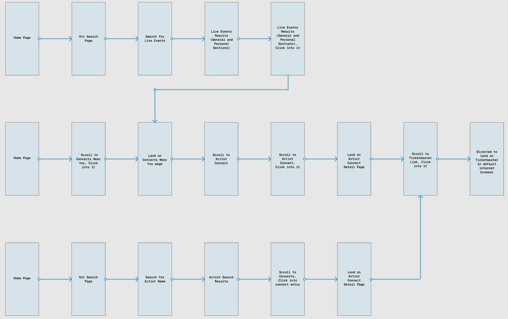
User Flow Map
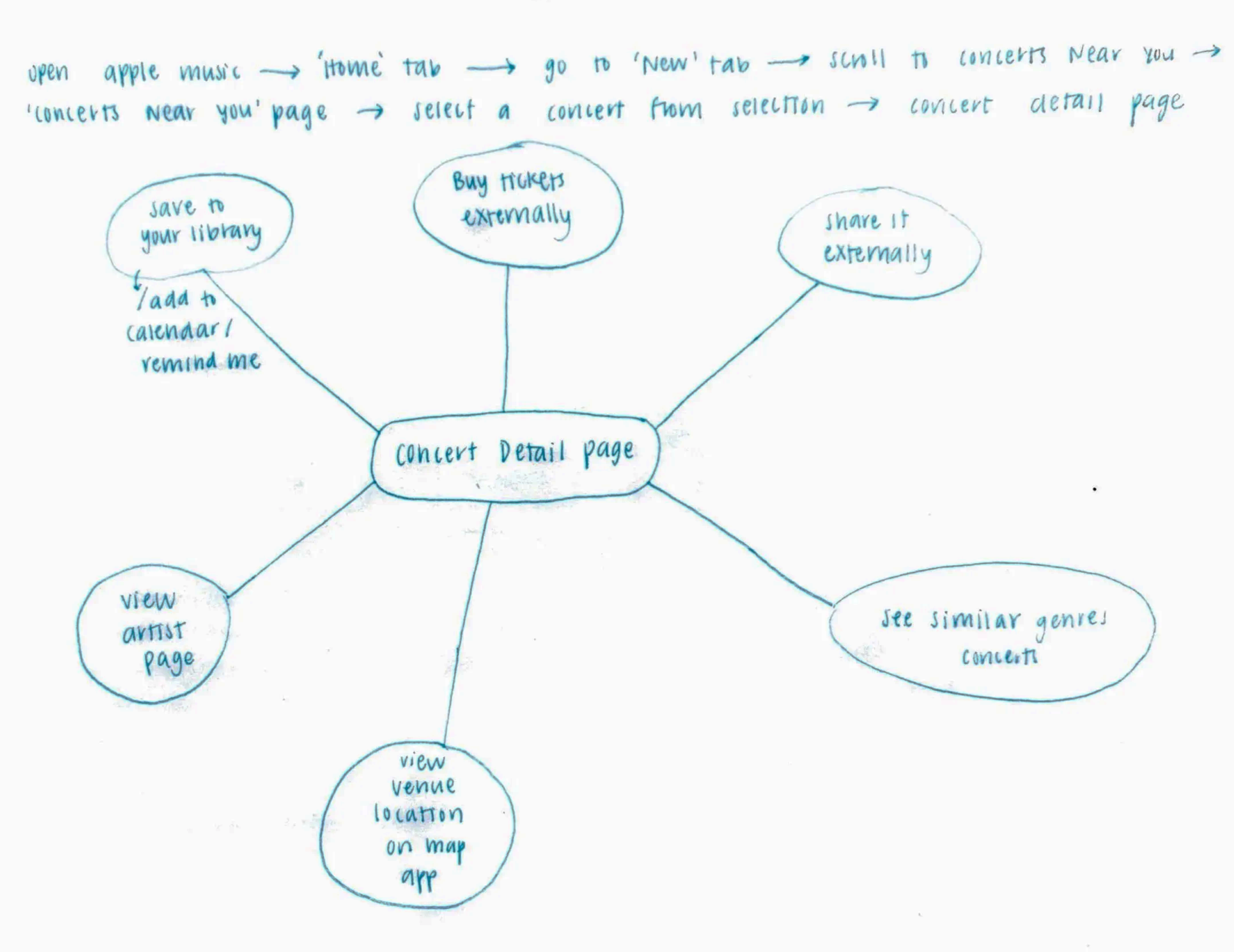
Concert Detail Page diagram sketch
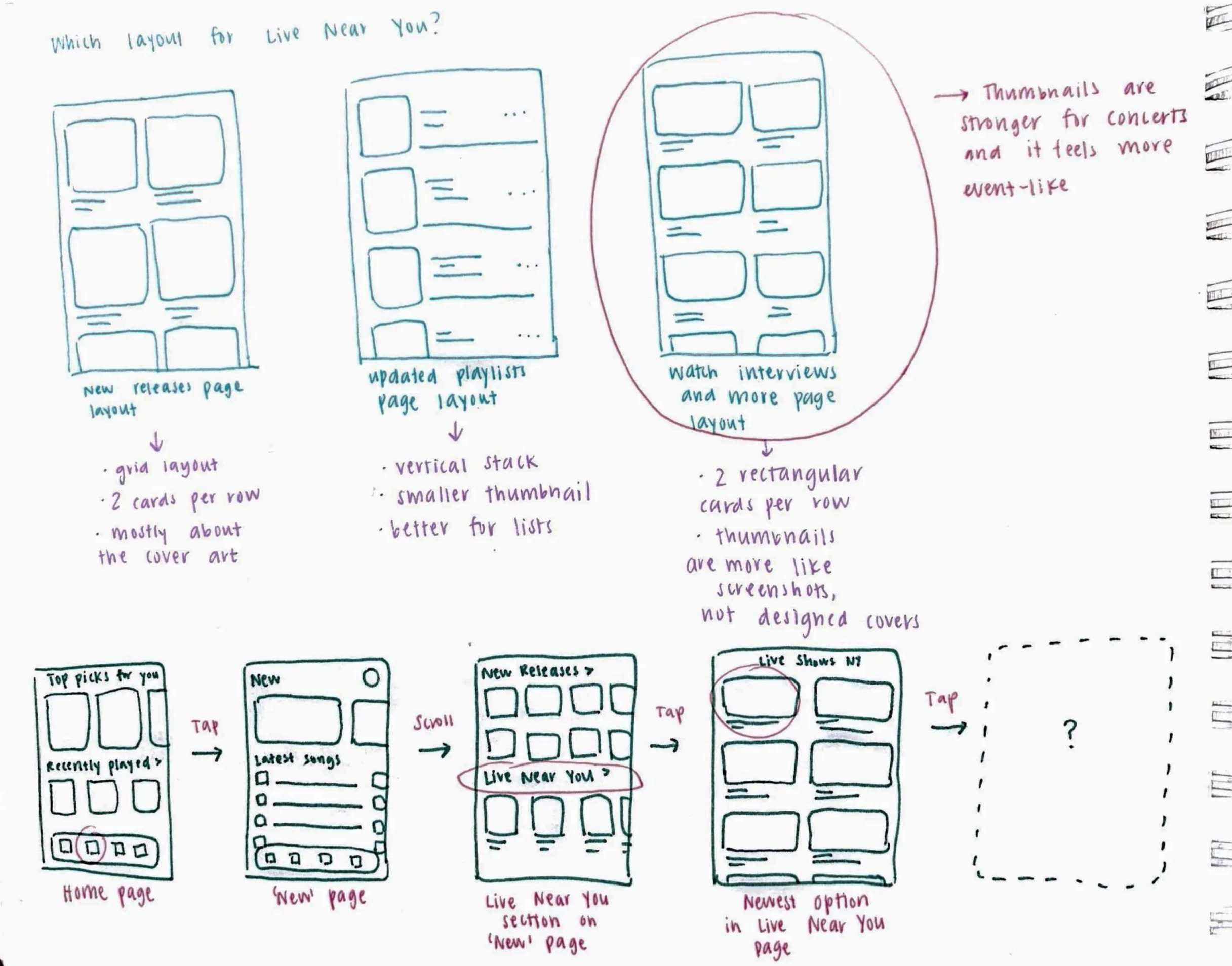
Planning layouts
Low fidelity wireframes
User Testing and Feedback
I tested the mid-fidelity prototype with four participants to see if the placement of the Concerts feature was working. There was minimal feedback on the interaction and flow, but two participants independently said that the Concerts section should go on the Home tab rather than the New tab.
I disagreed at first, because my reasoning was that logically, concerts qualify as ‘new’ content. But the user feedback highlighted that logic doesn’t always match user expectation. Especially in an established app with strong mental models.
Based on this insight, I moved the Concerts section to the Home tab instead of the New tab. This shift helped me see the importance of designing around user expectation rather than relying only on logical grouping.
Should the ‘Concerts Near You’ section go in the New tab or the Home tab?
Final Designs
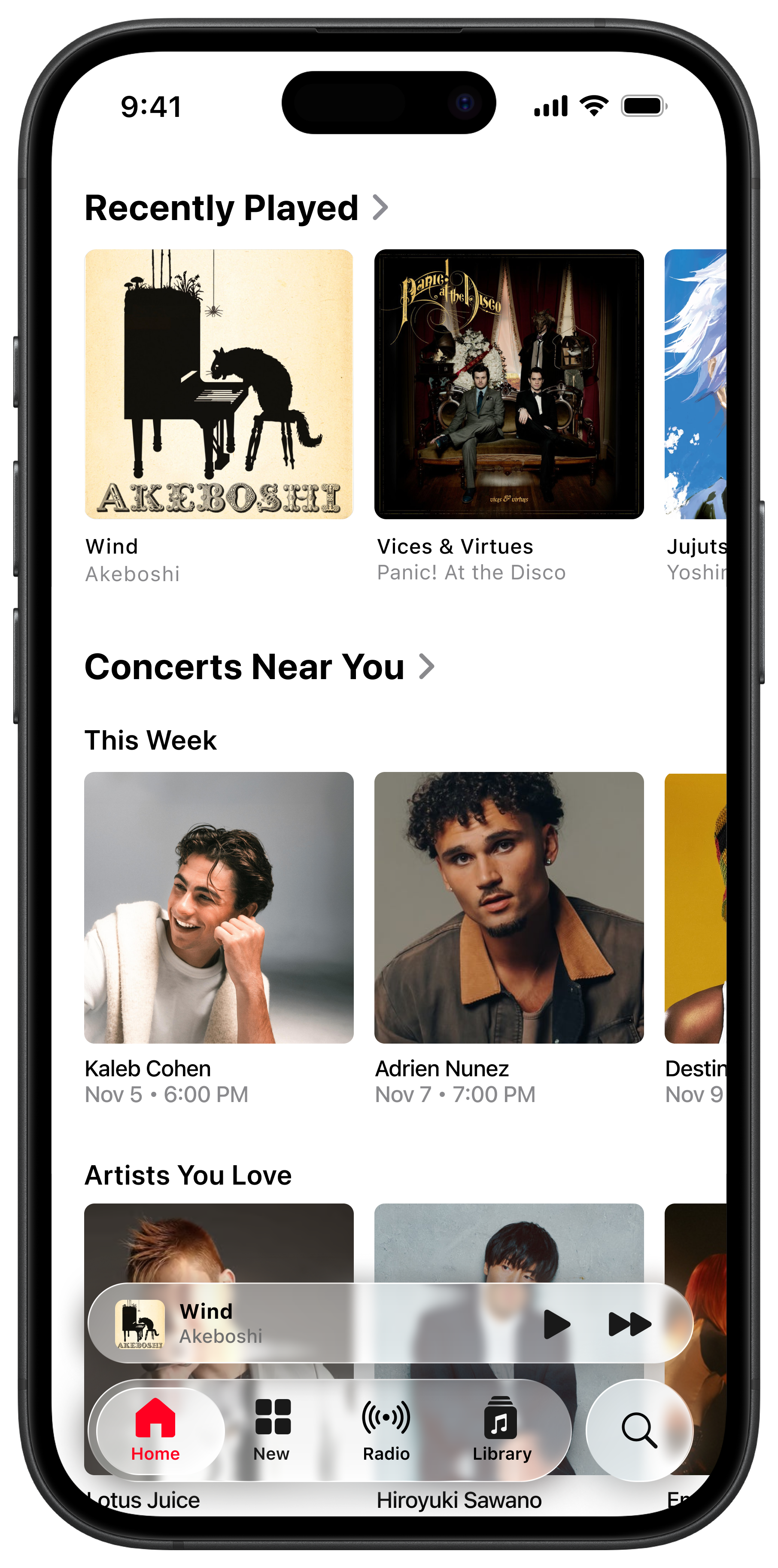
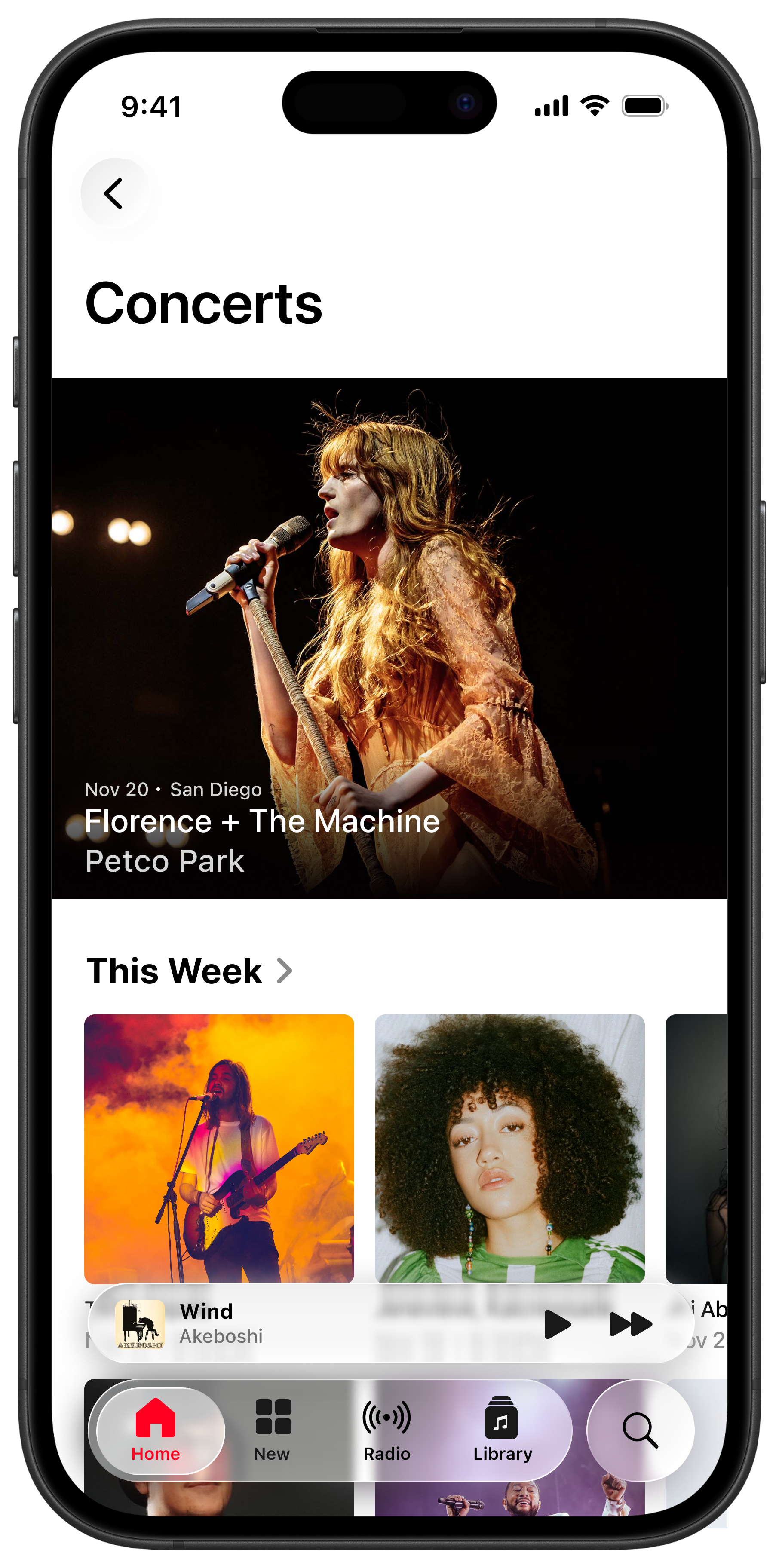
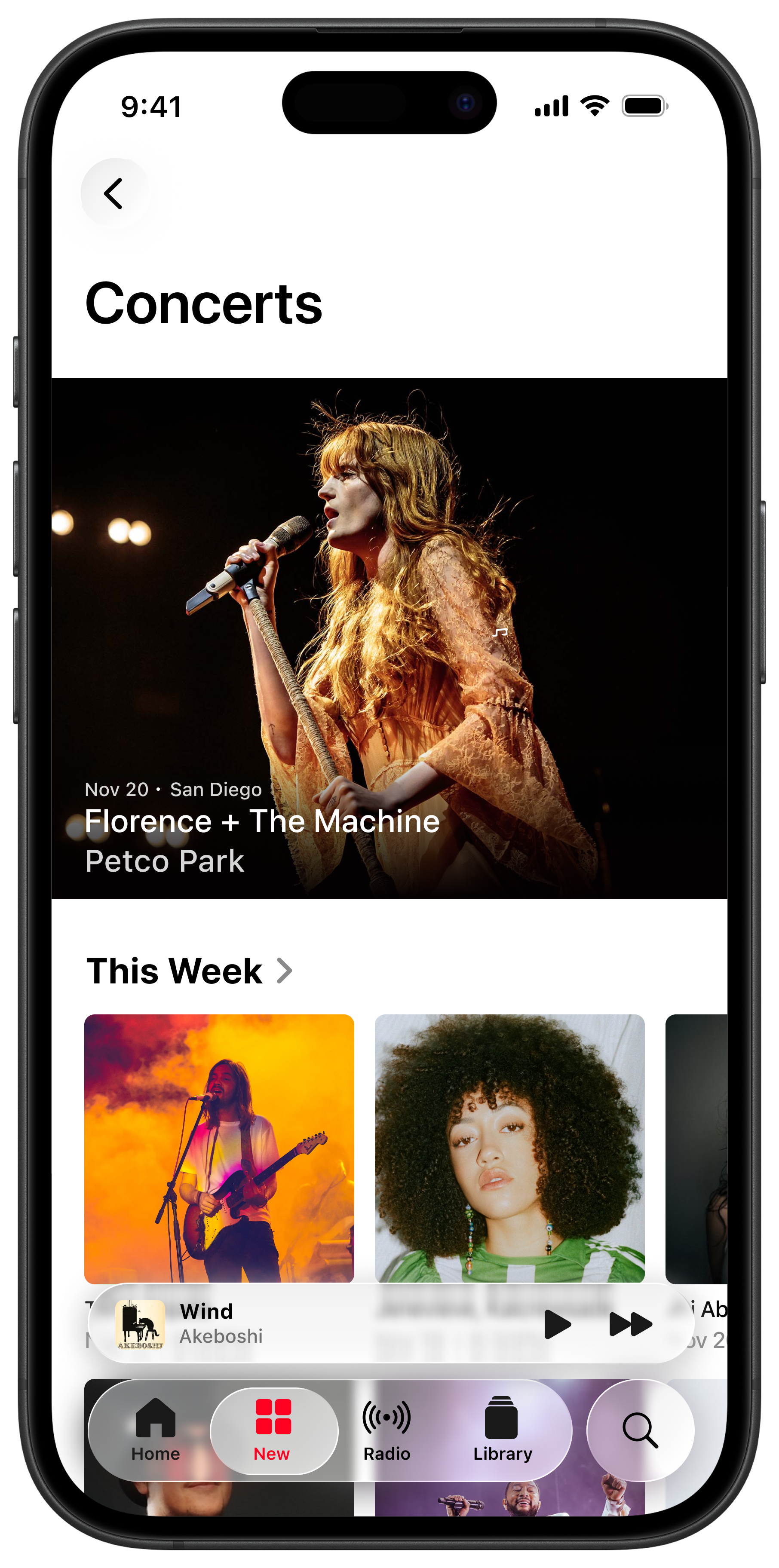
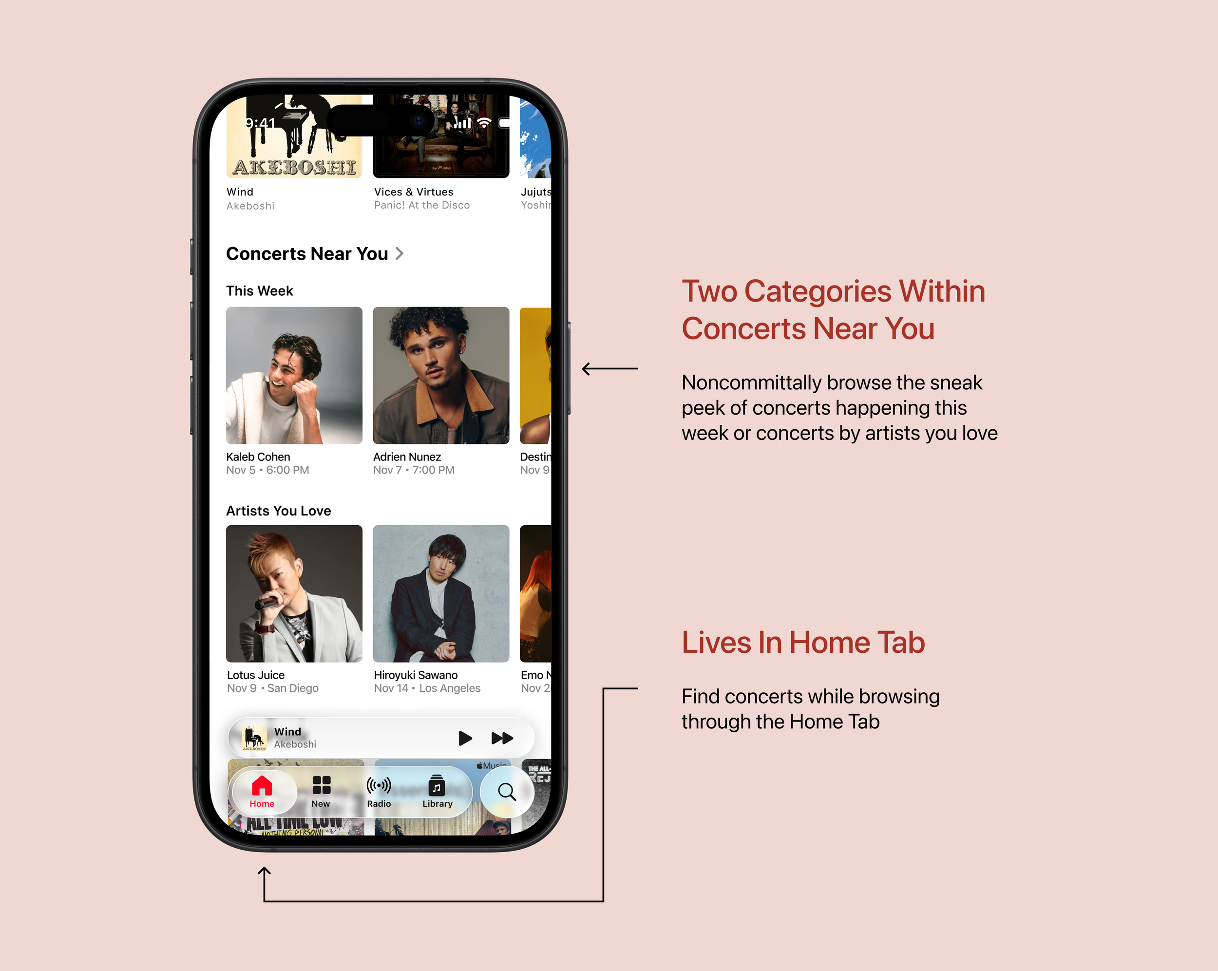
Concerts near You Section
This section is in the Home Tab, and shows up as the third section while scrolling. The Home Tab is where Apple Music shows things with personalized and ongoing value. Listening and discovery mutually coexist here. For placement of the Concerts section, the Home Tab was ultimately chosen instead of the New Tab, because New is understood as new releases and editorial content.
In this section, there are two subsections: This Week, and Artists You Love. This decision caters to the two functions that concerts serve: seeing your favorite artists live, and discovering unknown artists through live shows.
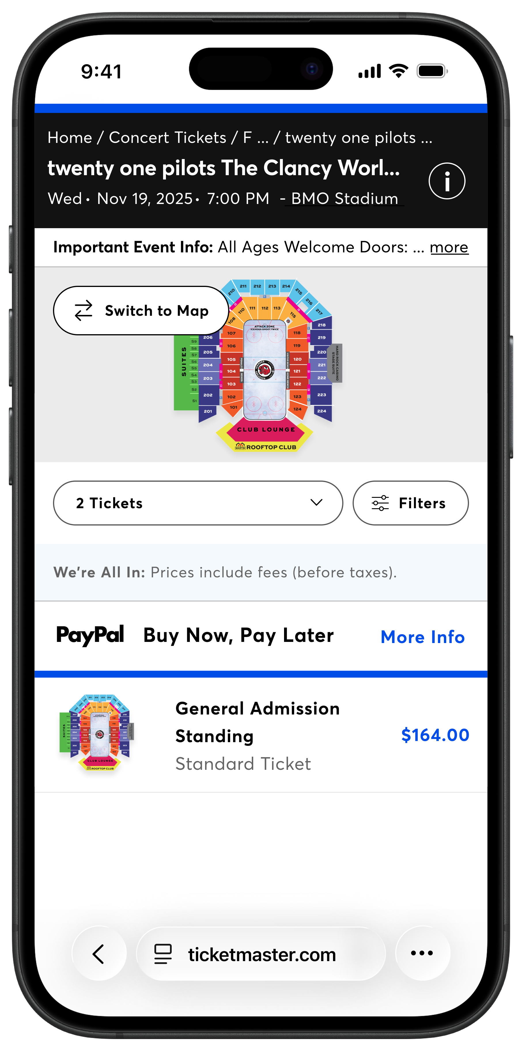
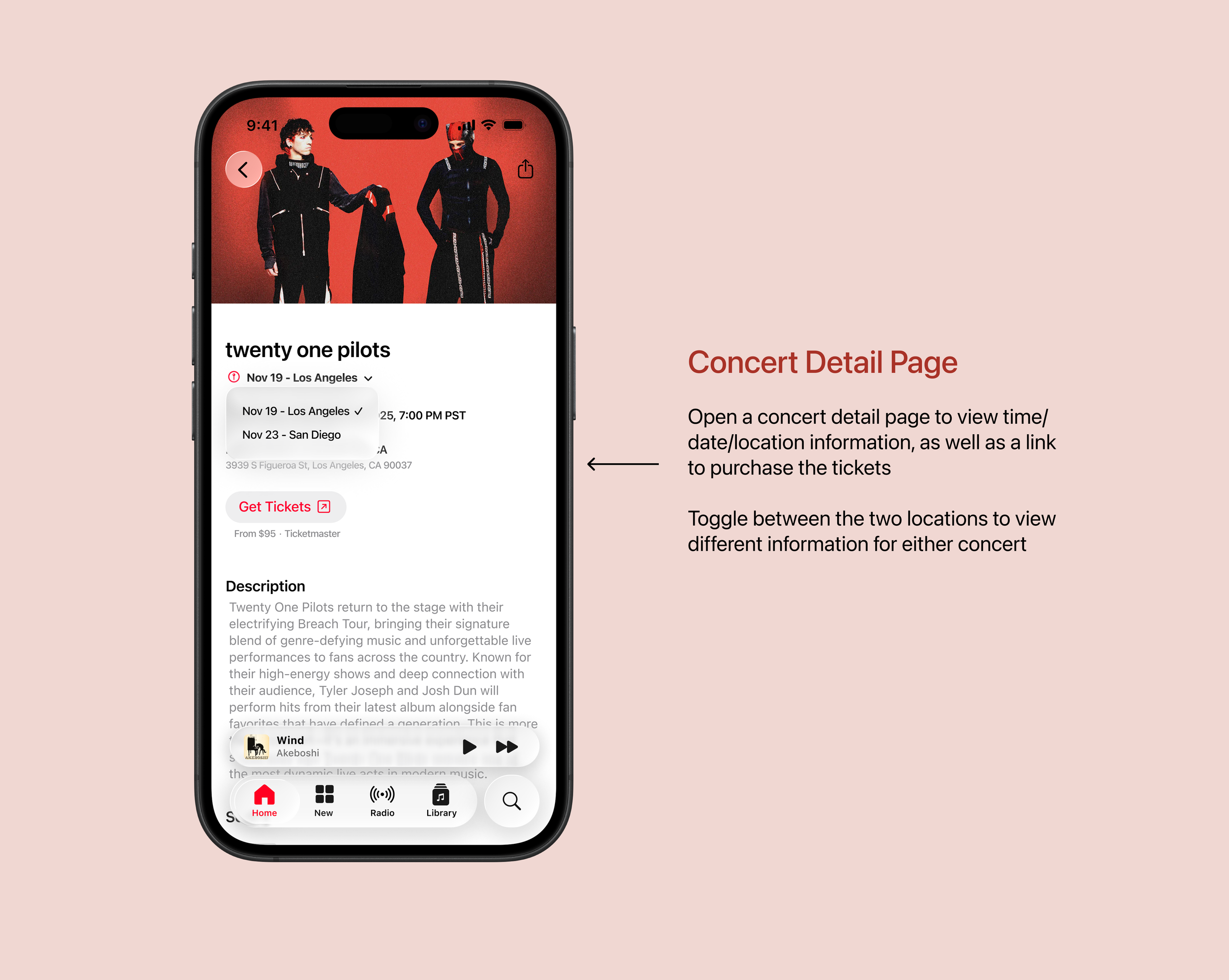
Full Concerts Page
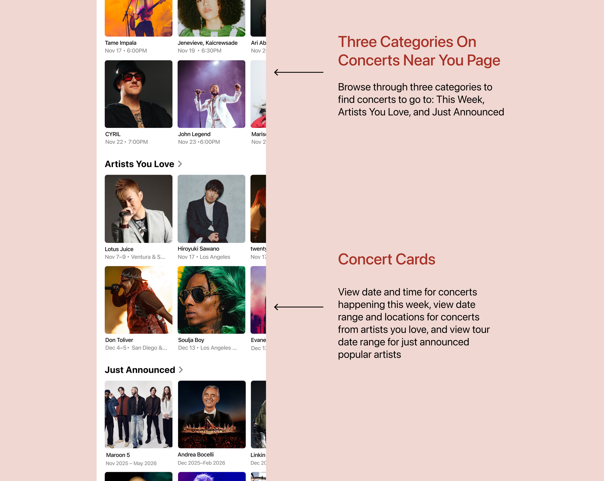
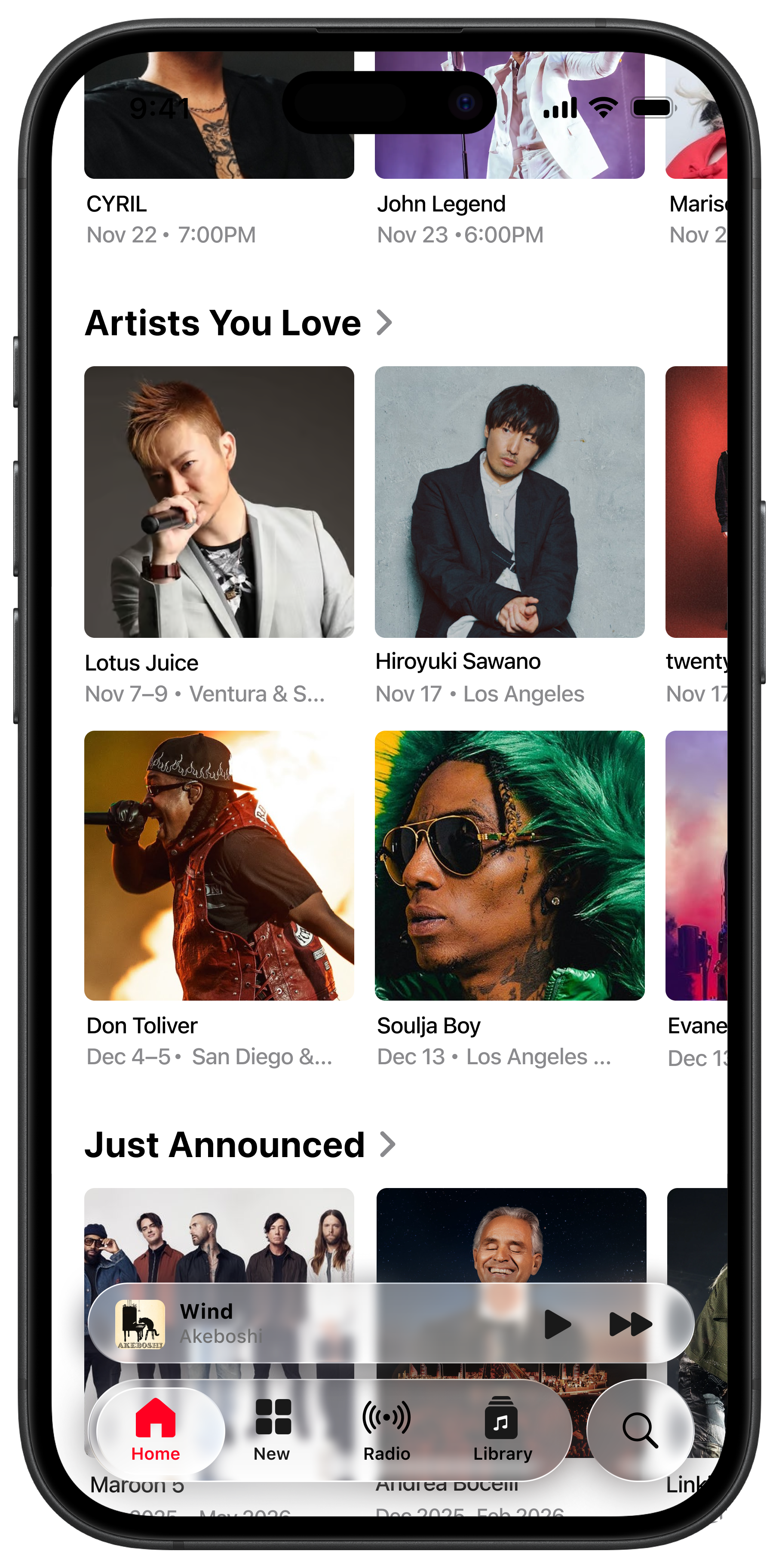
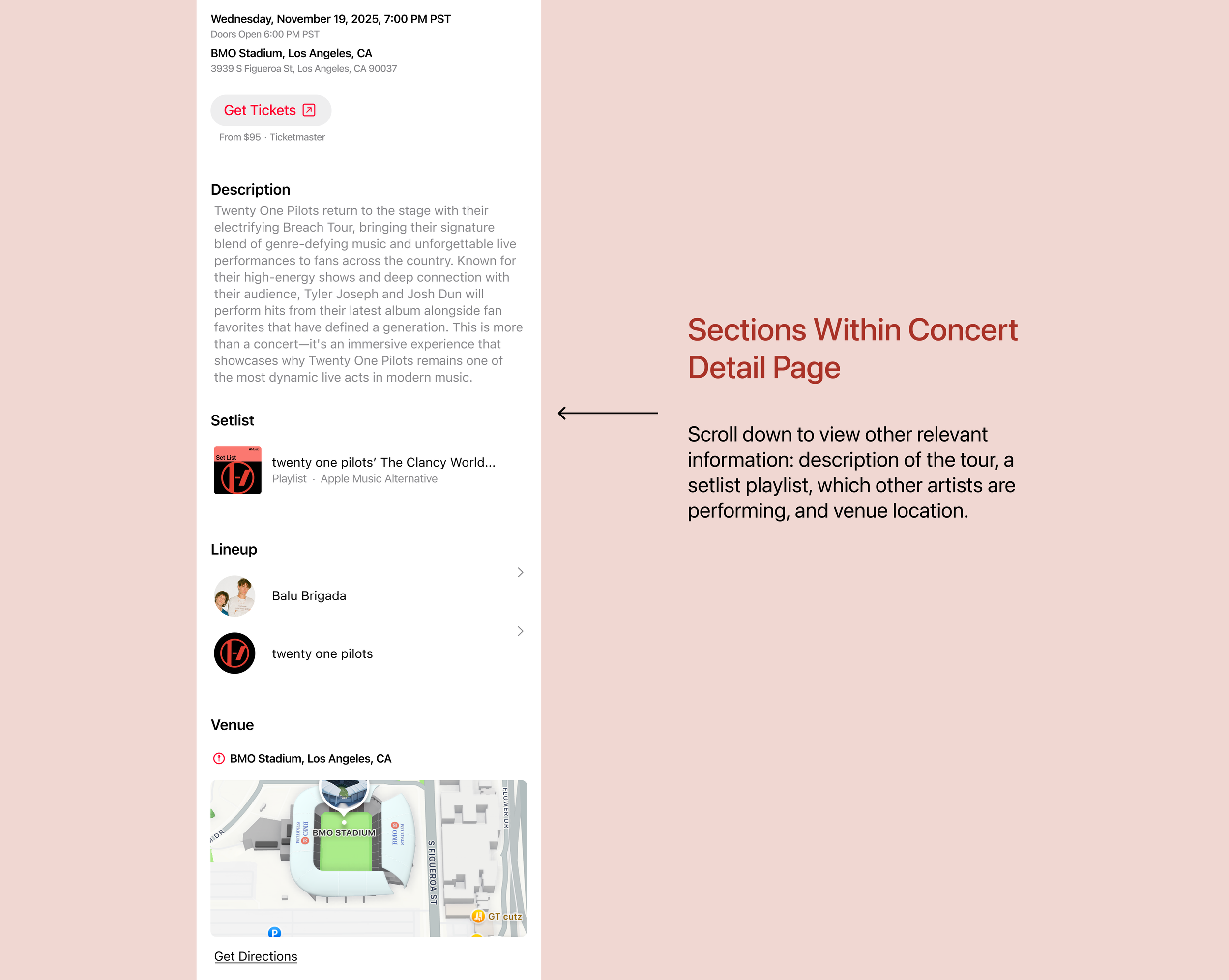
Now that the user has pressed on the Concerts Near You page, the subsections open up to two rows, and there are three categories total: concerts happening this week, concerts from artists in your library, and tours that have just been announced.
The information provided for the concert cards differ depending on the section. For the This Week section, date and timestamp are most important because they are happening soon. The information in Artists You Love includes a date range and two locations (the two major cities closest to the user). The information in Just Announced is a broader date range, encompassing the artists’ tour dates.
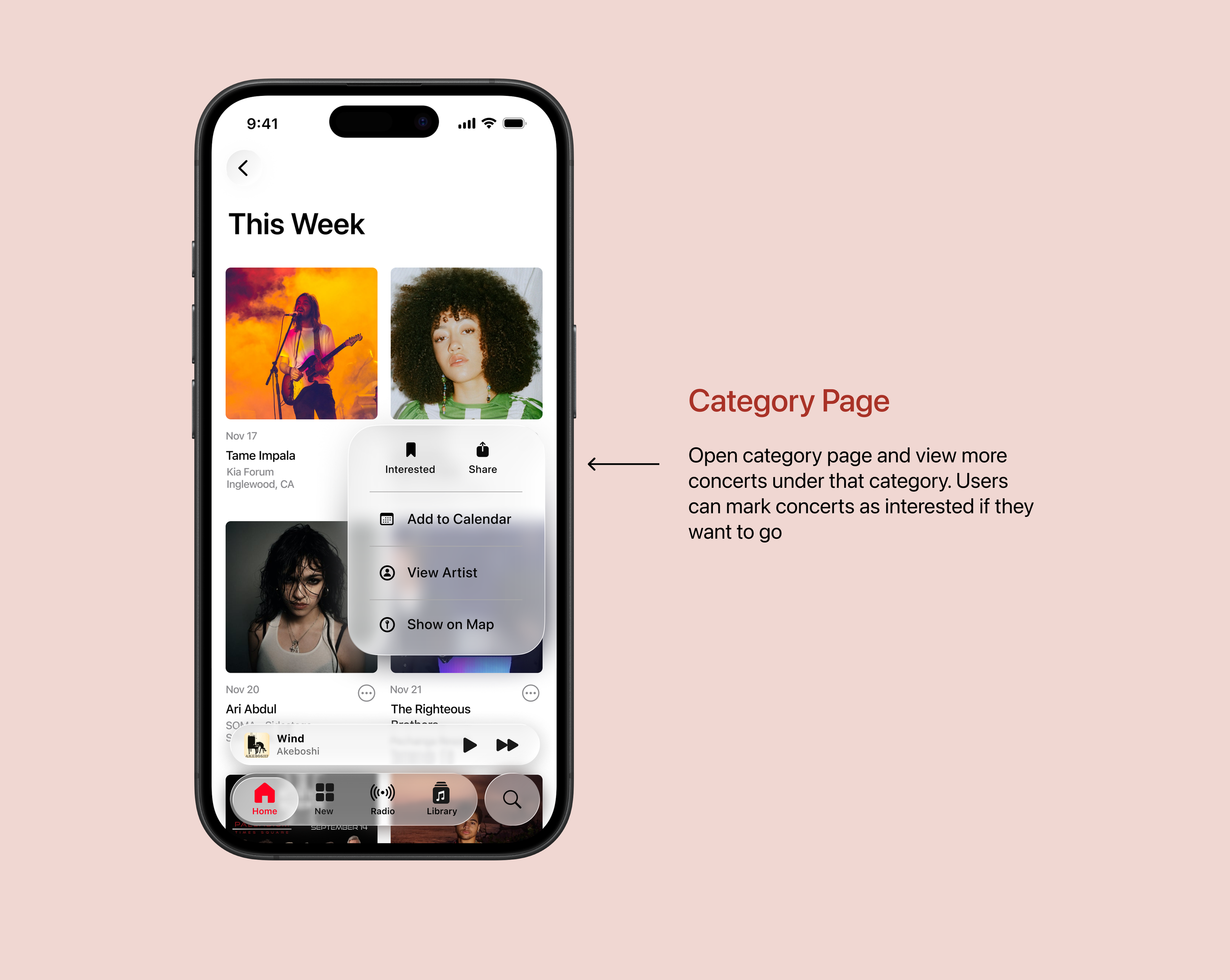
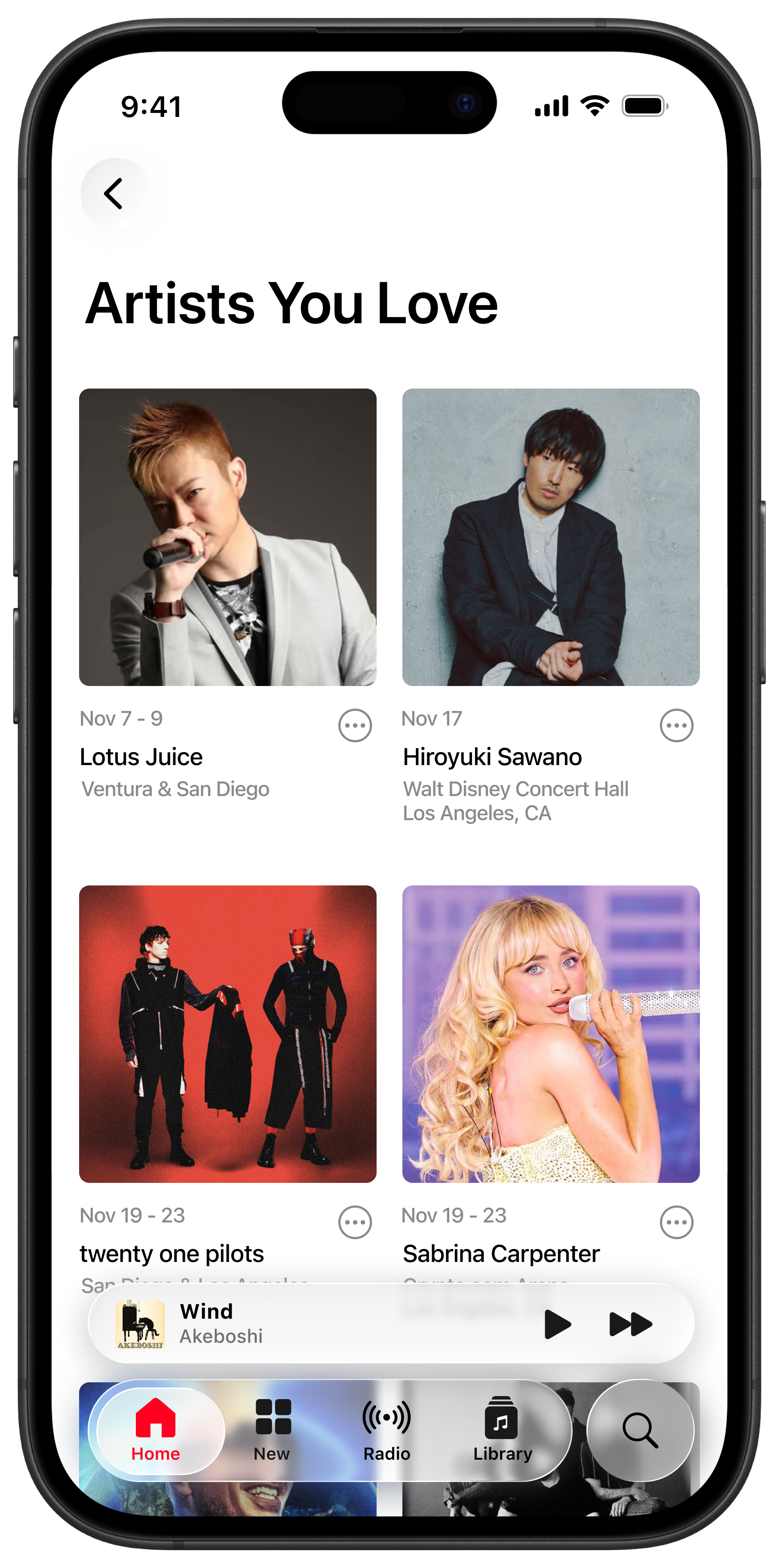
Each category within Concerts Near You gets their own page as well. Once on this page, the layout becomes a two-grid system. The information provided for the concert cards once again differ depending on which Concerts category you are on; for the This Week page, each concert card has the date of the concert, the artist name, the venue name, and the city name.
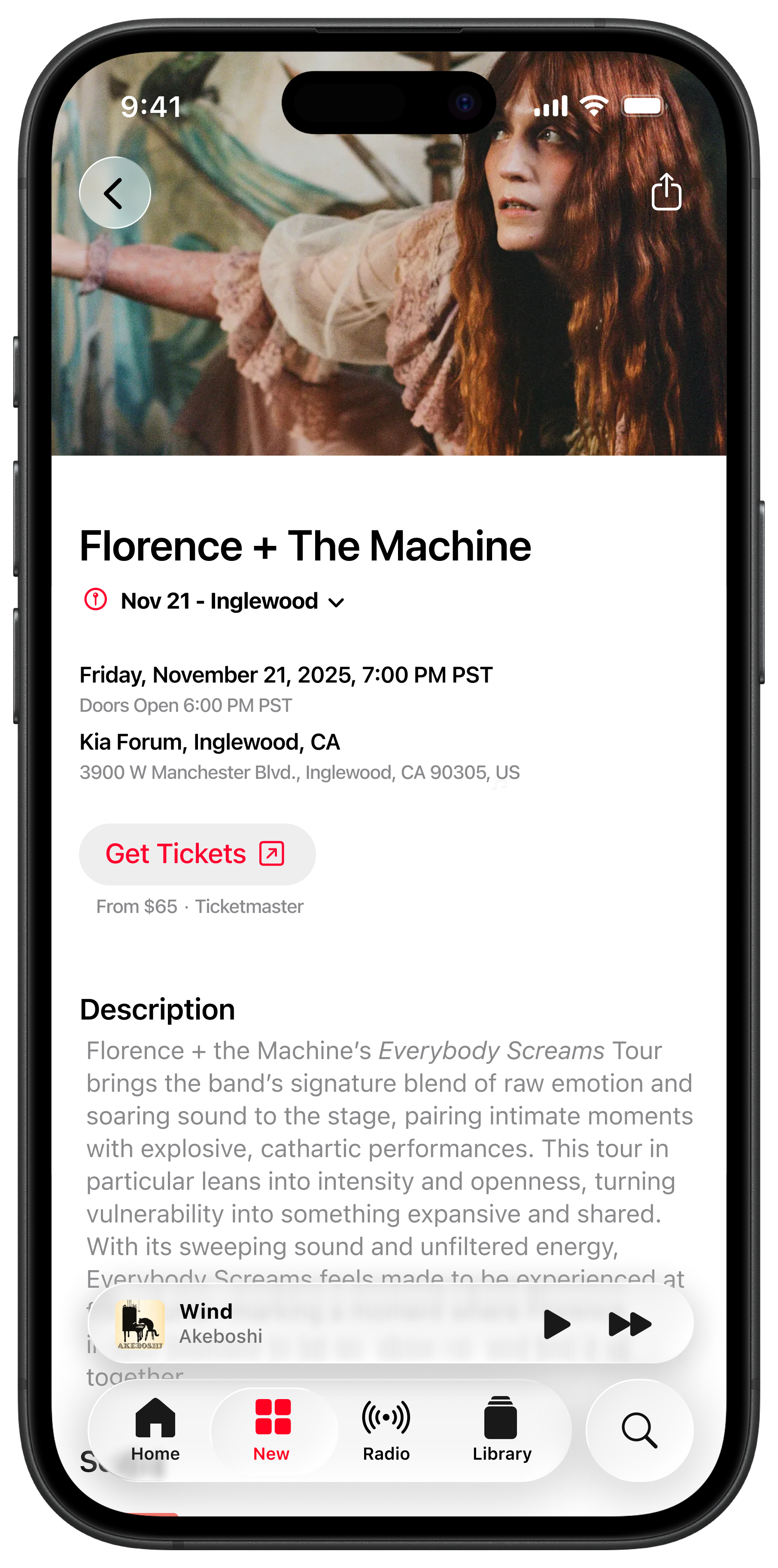
There are several actions a user can still take using the ellipsis icon. Users can mark concerts as interested, share it with a friend, add the event to their Apple Calendar, go onto the Artist page, or show the venue location on Apple Maps.
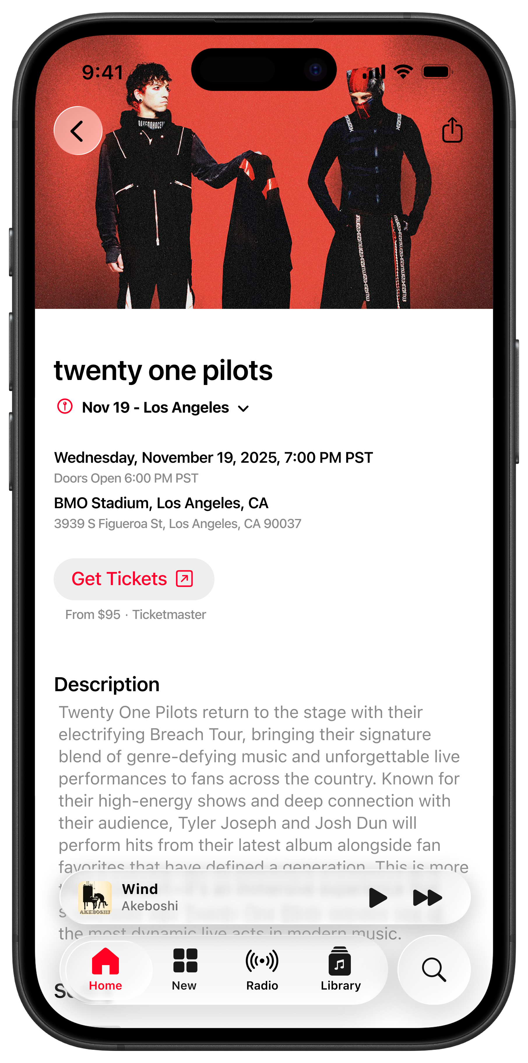
Upon opening the Concert Detail Page, the first information provided is the date, then location, then timestamps. However, because there are two locations, the user can press a dropdown to toggle between either location to see the date/location/time for each concert. I decided to provide this option in case the user cannot make it to one concert, but can go to one in a nearby major city.
Below the concert information is a button that takes you to an external ticket-selling website.
This was the section where I had to be most careful to avoid Spotify’s layout. Pertinent information to a user potentially attending a concert would include the description of the concert/tour, a setlist (since Apple Music already has a running series of artist setlists), the lineup of who is performing at the concert, and a map of where the venue is.
It was crucial here to keep the sections’ typography hierarchy extremely clear and straightforward.
Feature Walkthrough
To demonstrate the full experience, I recorded a walkthrough of the Concerts Near You feature, showing how a user discovers a concert, explores the details, and understands multiple show options.
Lessons I Learned
This case study highlighted the importance of designing within an established system. Because Apple Music has deeply ingrained patterns, every decision I made had to be filtered through the question: What would an Apple UX Designer do? I had to closely study how Apple Music structures hierarchy, when it uses grids versus list layouts, what colors are used for metadata versus icons, how big the modal dialogs are, where they’re placed, and a hundred other design decisions that I took note of. Designing under Apple’s brand meant I had to innovate and introduce a new feature without changing any of their design rules.
Another fun challenge was figuring out the information architecture. The success of the Concerts feature was less about visual design and more about where concert information fit into a complex ecosystem. And since the topic of concerts are so time-sensitive, I was constantly evaluating what information needed to be immediately visible, versus what could be deferred. This process reinforced how strong IA can reduce cognitive load and increase user engagement with the feature.